(Archive) Advertising District / Baker Lake Amusement Park
-
 18-February 13
-
Airtime Offline
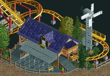
Coups that's stunning man. The barn and plane are awesome. Can't wait to see the screamin' swing even if it's the Pac standard that we see at NE now. I wish you'd only have queues that are a full tile wide and not half a till. I also still hate that path, I think the plain concrete or crazy pathing would look far better.
Yea diagonal tunnels have been done in rct2 for a long time now. -

 Maverix
Offline
Tunnel was done with black tiles and land blocks, so not a true diagonal tunnel.
Looks great though coups. -

 Steve
Offline
Agreed. This park really is turning into something special. Great work, Coupon!Coups, you keep getting better and better.
-

 oli414
Offline
(My first post on this forum!)
Amazing work. I like to see all those details, It really wants me to really go to that park! -

 Arjan v l
Offline
Looks nice!
Is that an eco friendly kiddycoaster with it's own power supply?
I think i see a wind generator. -
 inthemanual
Offline
Looks nice!
Is that an eco friendly kiddycoaster with it's own power supply?
I think i see a wind generator.
That would be such a Washington thing. Coups, you know what to do. -

 Steve
Offline
Really nice, the windmill is awesome. I can't help but think the colors of the station with the colors of the coaster contrast a bit too much, though. I'd suggest playing with the coaster colors, since I personally like the scheme you have for the station.
 Tags
Tags
- No Tags


