(Archive) Advertising District / Baker Lake Amusement Park
-
 18-February 13
-

 FK+Coastermind
Offline
The station is gorgeous, but i agree with Pac, that twist makes no sense. You have similar rides nearby and its in too small a space. I would cut that out and put in a small building or some good foliage there. Something themed to compliment the otherwise lack of theme for this entire area (and, well, park).
FK -

 CF
Offline
I was just looking over the pages. Brilliant! So i watch them again
 , evry screen, evry detail is just breathtaking, the foliage is pretty need to, just one thing i dont like, the colors on that spinner on the last screen, butt that's just it
  keep up the good work!
-

 BelgianGuy
Offline
I think your flume would look better if it's lifted up above the water, makes it more realistic and you can add track details then to make it look way better than that...
 -

 JJayMForce
Offline
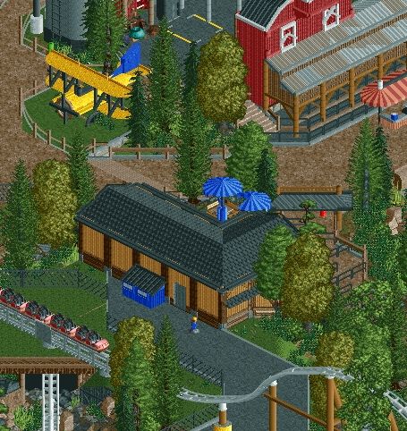
Dude, screen looks amazing, dat airplane wow. I really like that brown building at the bottom too.
edit: you might be missing an awning piece on one of the umbrellas. -

 Fizzix
Offline
Lovin the atmosphere you've got going on. Nice Sky Screamer;) Nice barn and biplane as well. You should check out Hyatt's Northwest Adventures. There's a Mt. Baker coaster. As well as a chairlift.
 -

 Sephiroth
Offline
I spy a diagonal tunnel. I may be wrong, but I don't recall seeing that done before in RCT2. Nice job.
 -
 Coupon
Offline
fizzix why would you even suggest i haven't noticed the mt baker coaster before brah.
][ntamin shhh -

 Fizzix
Offline
It was before this whole little 'phase'. Me and your mother are worried about you, you know.
 -

 Twiggy
Offline
That crappy screen editing is really pissing me off, Coups. I want the scribbly black paint back, it was clean and gave the whole screen a sense of high quality.
 -

 Louis!
Offline
I spy a diagonal tunnel. I may be wrong, but I don't recall seeing that done before in RCT2. Nice job.
I've done it.
 Tags
Tags
- No Tags



![][ntamin22%s's Photo](https://www.nedesigns.com/uploads/profile/photo-thumb-221.png?_r=1520300638)