(Archive) Advertising District / Busch Gardens: Ports of Adventure
-
 26-January 13
-

 Pacificoaster
Offline
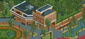
You are truly progressing quite quickly. The park services and its adjacent structure have some great bones. However there a few things that I would consider when building. 1) Perhaps don't use the thin deco walls for lining your paths but instead maybe using the deco trim from time to time. 2) Be aware of your path choices and how much you vary between the two. 3) The foliage could be upgraded by not going overboard on the flower object.
Overall, I see much promise here. Keep it up bud. -

 Liampie
Offline
I love this quite a lot except for the fact that the path patterns and the flower/planter patterns don't exactly match up, especially in the first screen. They should complement eachother. Hard to explain.
You've got a wonderful sunny atmosphere going. -

 Steve
Online
This really is shaping up nice. Solid improvements, definitely. I agree with everyone's suggestions already, but I would also recommend revisiting the roof of the taller building. In a setting thats relatively high standard, it comes off as mediocre to me. Either keep it flat or have the eaves all the same height. And don't use the corner roof pieces either, they're terrible, hahah. Keep it up, dude!
 -

 BelgianGuy
Offline
I think you'd be better off not filling the park with giant planters, I mean it's cool sometimes but you're having a large number of large planters atm so try to look out for that park/planter ratio...
 -

Disney Imagineer Offline
Yeah. I'll start watching that more closely. In the park I'll be able to add other things like kiosks/midway games to fill empty path. Right now the path going towards the right where the blue flower planter is has a very wide path, so until I get to the entrance I'm trying to fill up the space. Flowers were the only things I thought could work here.
 Tags
Tags
- No Tags


