Fiesta! / fiestAK
-
 13-September 12
-
 AK Koaster
Offline
Well, first fiesta,
 here goes nuthin'
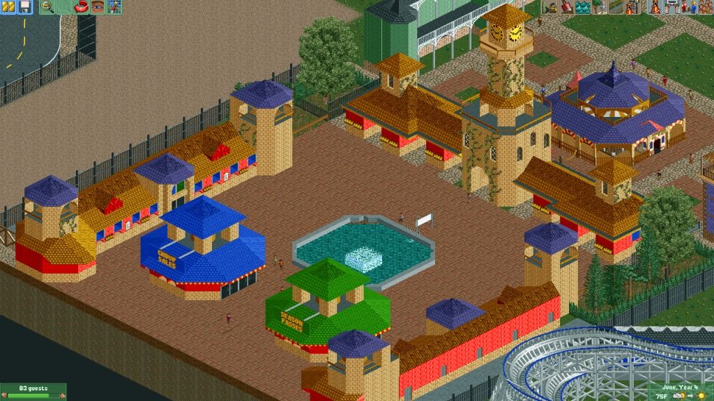
The entrance to my newest park, Fantasy Valley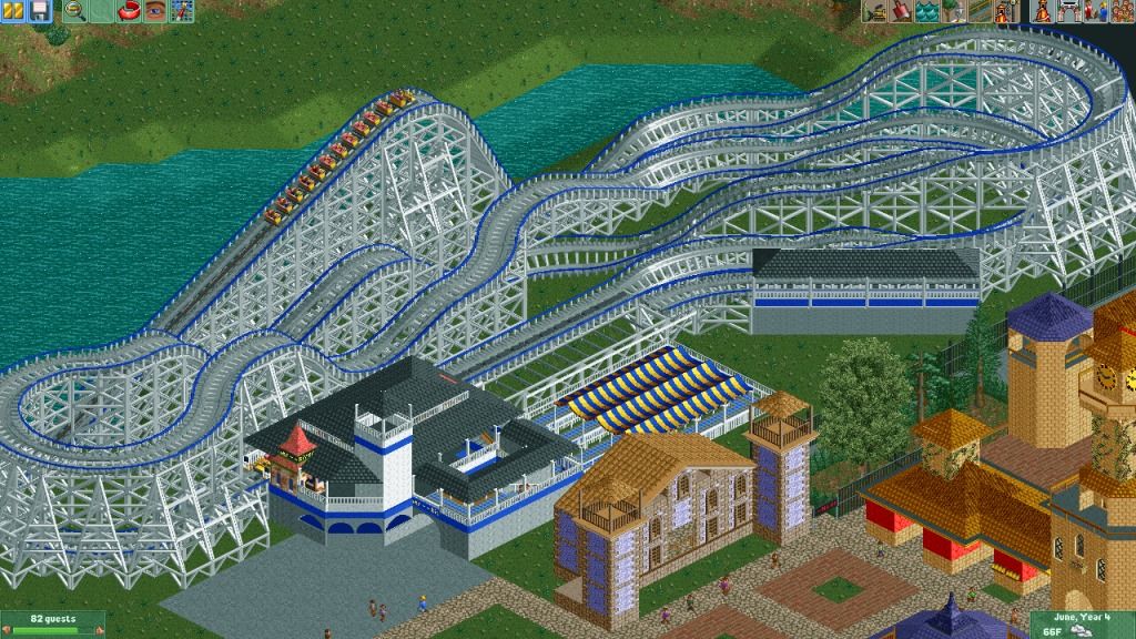
The park's old wooden coaster, RiverLiner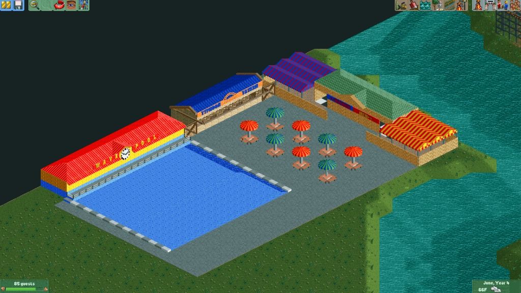
and the beginnings of the water park, Fantasy Falls
And then my ongoing work: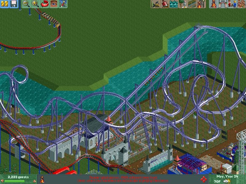
a yet-to-be named B&M Invert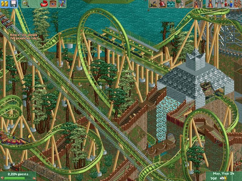
a floorless coaster named "King of the Jungle"
That's all for now
Comments Welcome! -

 Wanted
Offline
I see potential.
Not really liking the archy, but the Floorless screen is chaotic and I always enjoy that
-

 Ling
Offline
Your supports are the most prevalent feature that I notice in those screens, so I'll focus on those. You need to introduce flanges, if only to break up the colors somewhat. You appear to have over-supported in a lot of places, and I think several of the spots where they connect to the track could be improved by trying to more closely mimic real-life examples. I'm not a huge fan of the meandering layout of the invert, but the first half or so looks good.
 -

 AK Koaster
Offline
Thanks for the advice. ^^Ling: been working on the flanged supports, unfortunately I don't have the flanged pipes added into that scenario. (it was my own workbench, and it kinda sucked) but I could dat-check them in. The other thing is that RCT in general is glitching like crazy (tree glitches & white glitches, as well as random error trappers). You can find some nice half-trees in the floorless picture as an example. But I might be able to solve it eventually, because I want to release the park at some point.
 -

 Xtreme97
Offline
The invert layout looks pretty good, but get's very messy and loses flow towards the end. Also, I think the entrance is a bit too colourful. Other than that this looks nice!
 -

 5dave
Offline
That looks promising.
The first screen is missing variation, especially texture-wise. Also you could spice it up a little with greenery and stuff...
Second screen is a bit boring and I don't know which direction you want to go theme-wise?
The pool looks bare and yellow/red combo doesn't work well. Looks too cartoon-ish.
The layout of the invert looks nice, although the MCBR is a bit short, isn't it? It also could use some landscaping and planting.
The floorless looks nice too but the colors are strange. Also the station could be done better if you want to make it look like a pyramid? Try using more 1/4 and 1/8 blocks to make the steps instead of the rooves.
"MFG" -

 AK Koaster
Offline
So excited for a fiesta. However, it has unfortunately come at a bad time for me, as it is midterms week and my poor computer has lost windows (along with most of my older parks and projects that would belong in this topic)
With this said, I have a nice little project going at the moment, but without access to the game I can't post any pics of it. So, I'll post the only good pic I have from my major project, which most of you have seen already, but is the only screen from my park that I have access to: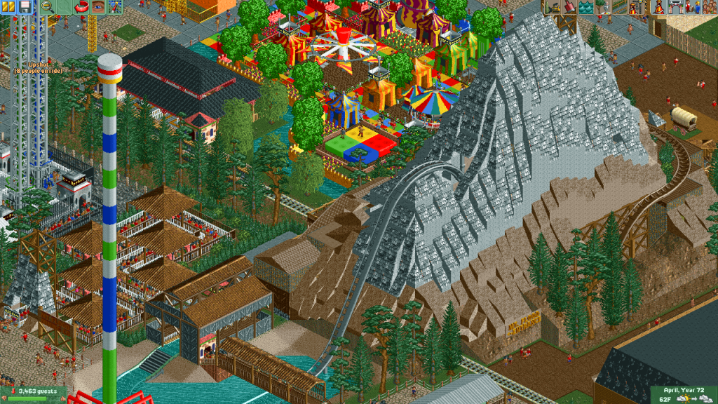
Mt Flood, probably my favorite part of this park. So glad I was able to save it and the rest of the park, and I should be picking up with it again later
EDIT: For the record the trees and the obnoxious colors in the background HAVE been taken care of since this screen was taken.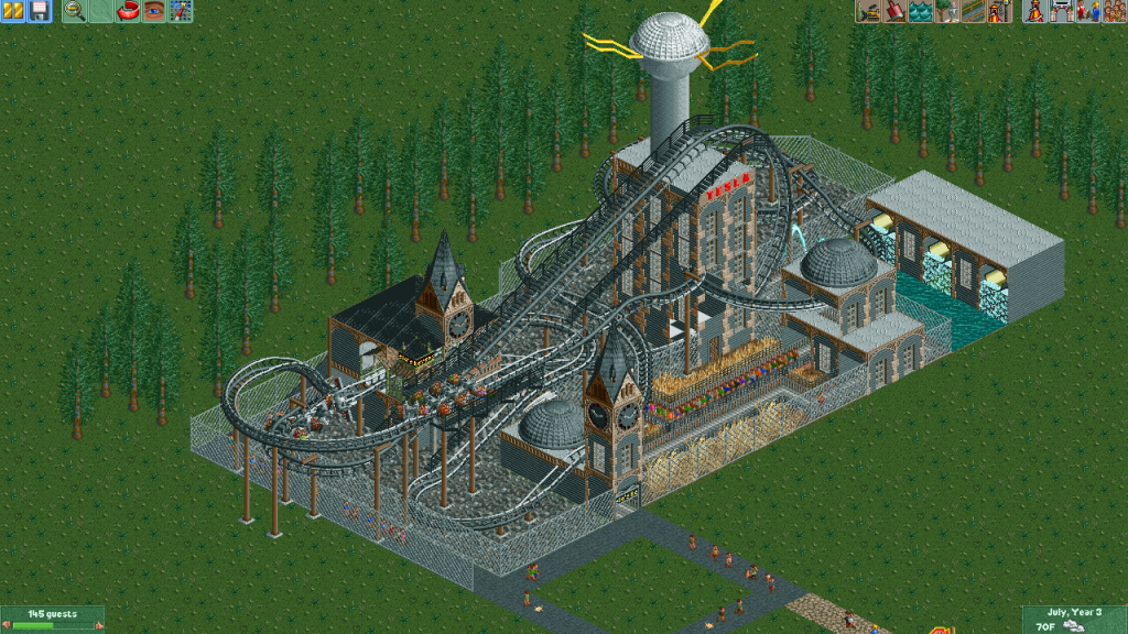
Also, an old dump-place item that I had lying around, Tesla's Revenge. This creation got wiped with the rest of my hard drive, but oh well
And again, HAPPY FIESTA EVRYBODY />/>
/>/>
-

 Liampie
Offline
You should pay more attention to planning and composition, because you got some really good ideas.
 Tags
Tags
- No Tags
