Fiesta! / Fiestx
-
 12-September 12
-
 Maverix
Offline
What's going on in Hudson Crossings.
Maverick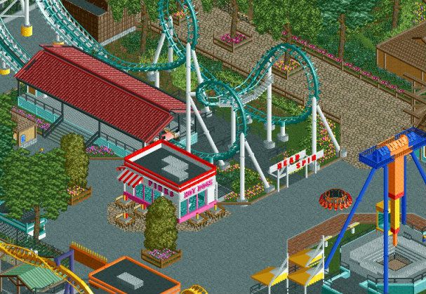
Head Spin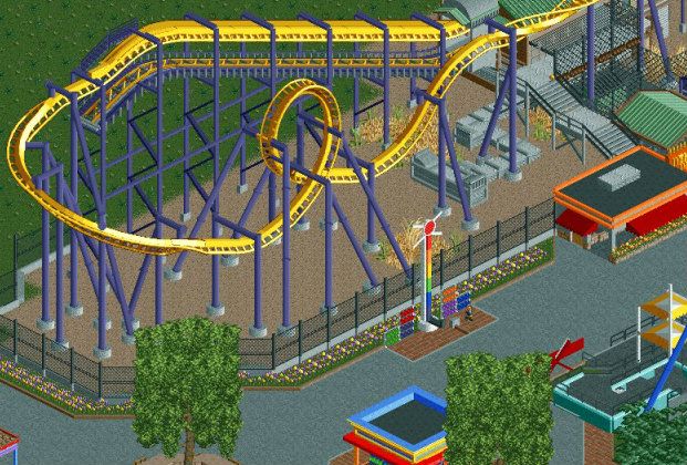
Thunderhawk (B:TR clone - park was owned by Six Flags at one point)
Enjoy! -

 Pacificoaster
Offline
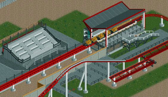
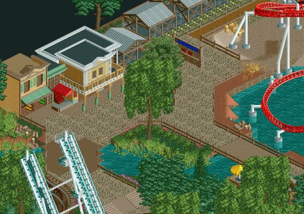
Nice work Jimmy. That second screen is great however, the sign of Head Spin is a bit low. Really enjoy that little Pink's.
 -

 JJ
Offline
As much as this style normally bores me, I LOVE the second screen. The park however is almost entirely flat right now, so if you could add some elevation changes here and there to make it seem more interesting that would be great. I also love that thingy in the front of the coaster in the third screen <3
 -

 Ling
Offline
I actually really like the queue in the background of the first screen, and the supports on the Batman clone look great.
 -

 Louis!
Offline
You've got the detailing perfect, however it's all so sterile and theres not a great deal of atmosphere. But kudos to getting the details right, its something I've always felt you needed improvement on. Great stuff.
 -

 FK+Coastermind
Offline
^^^ agree with that. wonderful details, shows off ur skill, but just looks like a generic park. still great, but not amazing. and get some peeps in there, they will help bring it to life.
FK -

 5dave
Offline
I agree that it is indeed a bit boring.
Maybe you could add some stuff that raises the interest - like debris here and there, maybe remains of a defunct coaster that stood on the place where the B&M is now?
Also the fact that there are now path objects, bins and such and no peeps makes it even more dead.
From a technical aspect though, these screens are top notch!
"MFG" -

 Maverix
Offline
Going to address some of the things you guys pointed out.
The park is/ will be peepable, I just prefer to build without them in there as they are a bit distracting, although I will open up the park for testing every so often. Just with fiesta I wanted to show the stuff now and didn't have time to let the peeps roam.
With the elevation changes, it just so happens that the parts I have done are all relatively at the same height, but don't worry, the park has a valley at one end and a lake at the other so it's not just flat land.
I'll try and spice up everything as I go on, right now I'm having a good bit of fun with this though and I want to keep that going. -

 5dave
Offline
That screen is a lot more interesting!
Clean, quaint and realistic.
Some more details like technical stuff, mechanical stuff, canopies and foliage and you're set!
"MFG" -

 RCTNW
Offline
Nice work Jimmy!
The first screen is so-so but the others are really nice. Intimidator shows great potential
Keep it up
James -

 Louis!
Offline
Nice screen
 The stadium is really nice. And yes nothing says fiesta without a few unfinished screens
-
 Mattk48
Offline
hey Disney Imagneer, this is from last fiesta. This park was submitted unfinished.
http://www.nedesigns...amusement-park/
^I dont get your joke
 Tags
Tags
- No Tags


