(Archive) Advertising District / Stroud Fair Amusement Park.
-
 20-August 12
-

 salsaontop
Offline
@ivo - Thanks I noticed that newer players have different styles.
@Mr.coaster - I would like to change to giga coaster trains but haven't got 8 cars working.
-

 JR-Imagine
Offline
I like the new roof a lot better. I think the black looks great between the brown and whatever colours there may be.
-

 Austin55
Offline
first screen is very good because it's completed. Roof is much better, not a big fan of that object though.
 -

 salsaontop
Offline
New update on wooden coaster called Bigfoot.
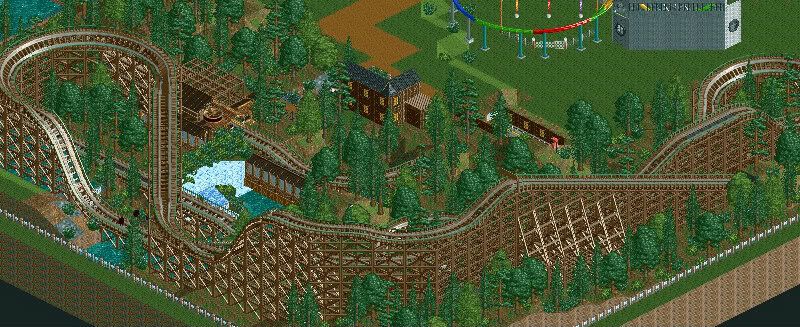
^Overview of the ride.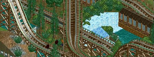
^I like this image.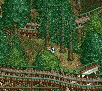
^Reports Bigfoot isn't an ape?
Thanks for viewing and comments so far. I haven't gone much in depth about this ride as I felt it would be easier to criticise the entire thing to get a view of whats good/bad.
~Salsaontop~
-
 AK Koaster
Offline
I like how the coaster is integrated into the landscape by weaving through trees and dodging waterfalls. The layout seems kind of weak, but its hard to tell because the supports are blocking the view. Otherwise very good work, I look forward to seeing this finished.
 -

 Austin55
Offline
The bigfoot on the loose is very fun and creative, Very good
I think you could do with some more low lying foliage, bushes and grasses and stuff, around your trees, zero clearencing might help.
While you have 8cars open I dont think it'd hurt to own and add some foliage to all surrounding land and perhaps get rid of that fence.
Lastly, that one slanted waterfall object kinda messes with the flow of things, it just doesnt look as good in my opinion. -

 salsaontop
Offline
^Thanks, just for you the layout from another angle. I suppose my only excuse is that I don't want giant coaster layouts as this is just a small park.I like how the coaster is integrated into the landscape by weaving through trees and dodging waterfalls. The layout seems kind of weak, but its hard to tell because the supports are blocking the view. Otherwise very good work, I look forward to seeing this finished.

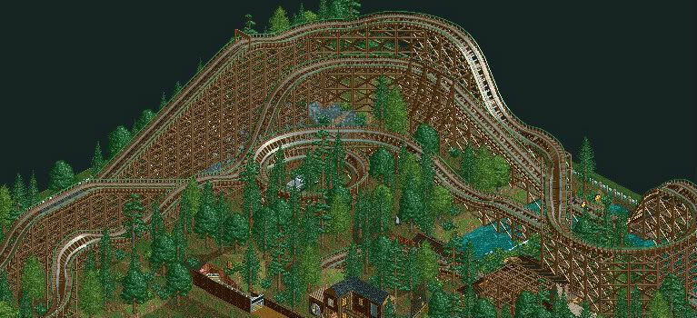
^I don't have the 8cars trainer it really messes up my laptop as it's actually a mac. However when I next try RCT I'll try it again. As for the waterfall I think I'll change it back. Thank you for your constant feedback. It really is helping me improve.The bigfoot on the loose is very fun and creative, Very good

I think you could do with some more low lying foliage, bushes and grasses and stuff, around your trees, zero clearencing might help.
While you have 8cars open I dont think it'd hurt to own and add some foliage to all surrounding land and perhaps get rid of that fence.
Lastly, that one slanted waterfall object kinda messes with the flow of things, it just doesnt look as good in my opinion.
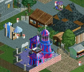
-A snack building I'm working on, inspired by Arjan v l's World Of Creations I saw a building similar to this...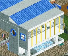
^ Feedback on any problems with the building is always appreciated.
~Salsaontop~ -

 Arjan v l
Offline

Nice to hear you draw inspiration from my work.
Walls seem a little thin, you could use deco or quarter blocks to make it look thicker.
Keep it up.
-

 Ling
Offline
The woodie has a very, very awkward layout. For the structure, your textures don't match up (look at the sides of the roof pieces vs. the walls), and it would help greatly if you built walls on the same plane. Building on the same face on the opposing grid creates the gap you see there. If it borders shops, zero clearance will take care of that.
 -

 salsaontop
Offline
^I see what you mean about the walls. My laptop won't work with zero clearance though so I have problems with that, but I will try to fix it. In terms of the woodie layout I don't really see it is akward, may I ask why you see it as awkward as I know you are quite good with coasters.The woodie has a very, very awkward layout. For the structure, your textures don't match up (look at the sides of the roof pieces vs. the walls), and it would help greatly if you built walls on the same plane. Building on the same face on the opposing grid creates the gap you see there. If it borders shops, zero clearance will take care of that.
Arjen v l - Ling pretty much expanded your comment, thanks for it though.
-

 Arjan v l
Offline
Most users here build coasters that are very realistic in a sense that they are very well tought of and not builded in a couple of minutes (not saying that you did).
I'm just starting to understand a little about building a coaster.
There are rules for building coasters mostly ,just like in real life.
It takes a lot of thought and experimenting to make a nice coaster.
Some tips:
Elements like half/loopings corkscrews etc. are to be used by certain procedures.
A coaster needs to have a good flow ,for a smooth ride
Pacing should also be balanced, i guess.
Interaction with paths or squares (peeps can watch the ride),or water/landscape/buildings.
Like i said ,i don't really know a lot about the realistic rules of coaster building yet,
but i know these points are definately important for a decent coaster.
-

 Ling
Offline
The little hump in the pre-drop, for instance... I'm not sure why it's there. If you want to slow the train down in anticipation of the drop, I would use brakes. But that doesn't really make any sense, especially on a woodie, and all it's going to get you is worse pacing. The first major hill seems like it's afraid to make use of the entire canyon. Wide turns at the top of a hill like that strike me as odd - the train should not be moving fast enough for that, and it just spreads your layout out even more - generally the more compact, the better. I would also try to incorporate single 45*-angle pieces at the bottom of your larger hills to give the illusion of a wider, more even element. Your MCBR is also a little short. The way the helix is nestled into the "elbow" of the ride beneath the first drop is nice, though. Needs more custom support work overall.
 -

 salsaontop
Offline
@ Arjen v l-Yeah I see how that works the coaster is smooth it doesn't even top 45mph. I feel the pace is quite good also. The interaction with peeps is minimal unless in the queue line because it's meant to be one of those more secretive rides, like say 13 at alton towers. In my honest opinion if any coaster on this site could actually be built in real life (Providing it won't injure/kill anyone) then people would say it is realistic. That's just the way I see it
@ Ling- the small dip before the first drop is due to limitations in RCT2 I want it really to be more banked and smoother. In terms of the first drop I never really wanted the coaster too close to the floor. I suppose the real reason why it may not seem like in real life is because, as you know you can't create the angles you want in RCT, as in it gives you something like 10 turning options. I will work on custom supports as you mentioned.
Thank you for pointing me in sorta the right direction.
 Tags
Tags
- No Tags
