(Archive) Advertising District / Stroud Fair Amusement Park.
-
 20-August 12
-

 salsaontop
Offline
Hello everyone on the NE forums. I'm Salsaontop and wanted to show you my current project so that you guys (Who I know are some of the best at RCT that have ever lived
 ) can give me some advice, criticism and feedback. This is Stroud Fair Amusement Park although I think I'll change the name. It's set on a small 80 by 80 map as I don't have time to work on bigger projects.
Onto the screens.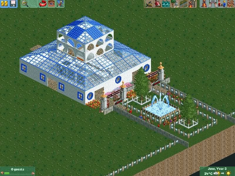
^The parks current entrance. They just seem to be my weak -point and far to basic for my liking. Anyone think they may no the answer?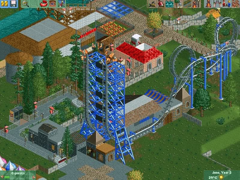
^This will be around the centre of the park. The coaster is called Fader and is an inverted Boomerang coaster. Unfortunately I don't have the right cs sets to custom support yet.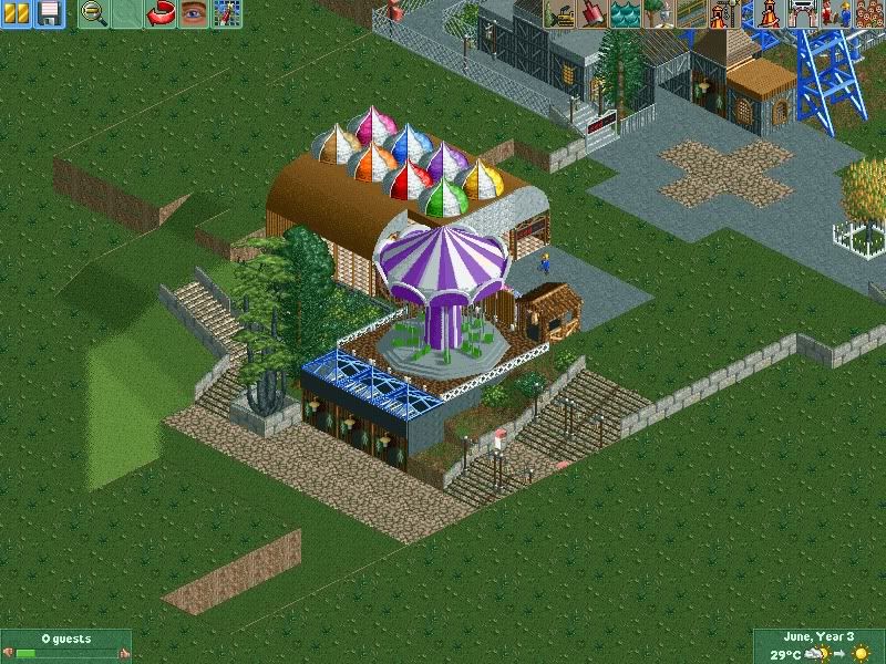
^Next store is a ride called Cliff edge, as riders will soar over the park below. (I wonder if I should get rid of the cliff edge I currently have and replace it with a more natural look.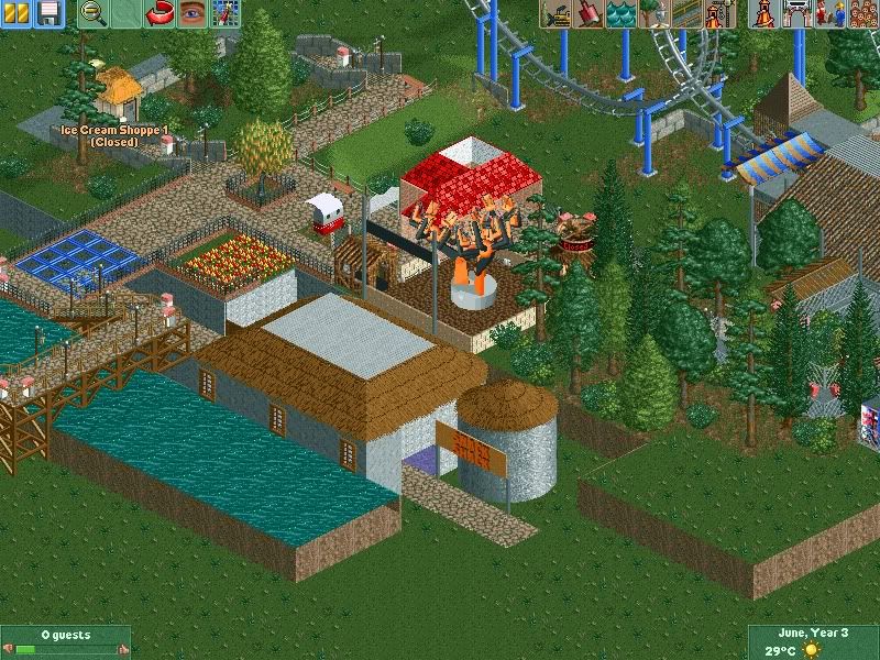
^Snack shack and above it Hellraiser. The bridge leads over to the future north side of the park. Thanks to Arjen for the glass bridge trick.
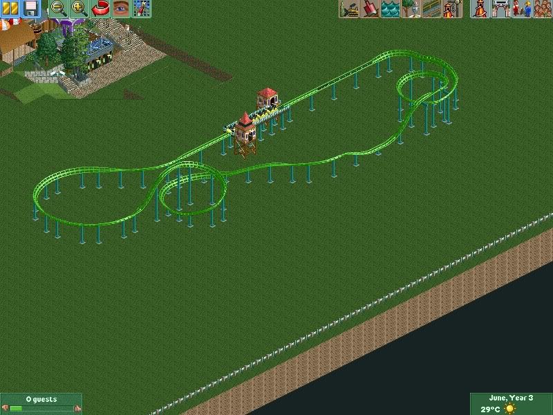
^Finally a family friendly launch coaster TimeWarp.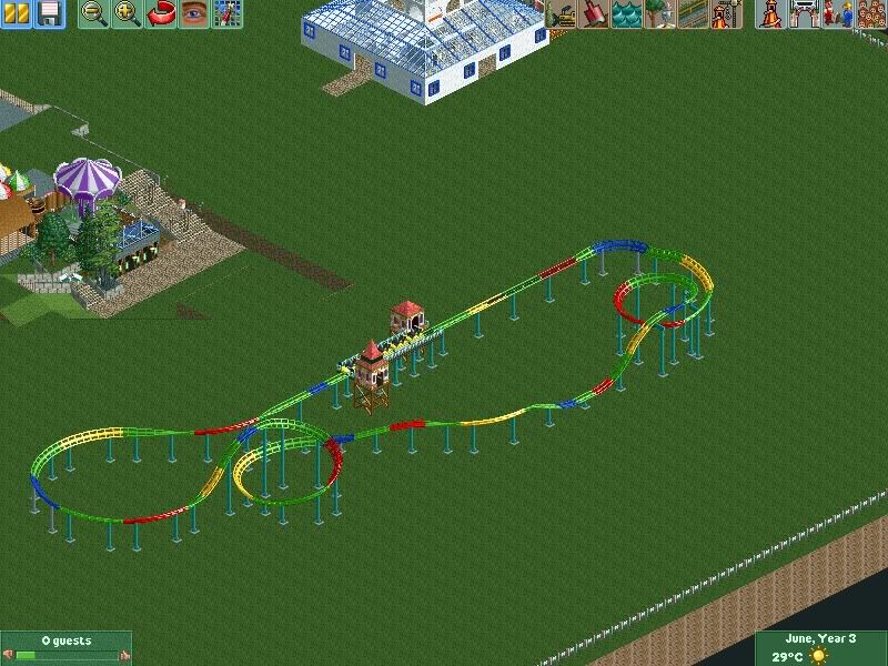
^Which version of TimeWarp do you prefer?
Thanks for viewing.
~Salsaontop~ -

 BelgianGuy
Offline
I actually think for a kiddie accel that's a pretty cool layout, I think if you take the advice and criticism people will give you to heart I think you'll be great...
one thing I'd suggest though is spread thingsmore out and put more thought into some of your path layouts and architectural shapes because right now they're pretty much all boxes... also the ideas in the layouts you post are refreshing! If you want to go realistic in terms of style I advise you to learn using the custom supports as they do add a lot to your park that way in terms of visuals and believability.
Also try to get a decent hacking foundation like the invisible trick, the dummy trains, stationary stuff and all those nice things, these are all tricks that are easy to learn with the 8cars trainer and don't take all that much skill, this'll open a lot of possibilities for your building style and personal aesthetic development in the game itself. I advise you to take a dig in the ask the experts topic for a while and simply try stuff out that has been posted by more senior members, it's really usefull!
I like the ideas you've shown here and I think the only thing you lack is the clear execution of those ideas and the way you implement them in the park and the aesthetics you seem to want to achieve... A bit more thought and effort will get you a long way and I'm looking forward to seeing you devellop here on the site and seeing your screens!
BG -

 Fisch
Offline
try to have some more done before showing screens or opening a topic, especially since you already posted a pic that shows most of this in the dump place today.
I'm saying that because people are very critical of advertisers who try too hard to get attention and therefore post a new pic like every day. Keep your update rate at like once per week or if your building speed is a lot quicker then perhaps adjust the update rate accordingly. But you need to make sure not to show everything so there are some surprises left when people open the park once it's done.
There's not much to say about the park yet. I like your ideas like the cliffedge right but perhaps you need to be a bit more extreme about things like that. At the moment I don't really see a cliff and the riders wouldn't really be as high up as you want them to be. Try to make cohesive areas that follow certain themes and them put them together in a way that the park has a nice flow. Do you know yourself what theme you're going for at the moment? I don't think so and that's something you should make sure of.
Aside of picking a theme you also need to think about how to give it as much atmosphere as possible. For that I usually think about the area I'm planning from the path's perspective. Plazas including nice architecture surrounding those usually give off more atmosphere than a park that's really far spread apart. -

 salsaontop
Offline
^Thanks very much BelgianGuy. You've hit the nail on the head with one of my biggest weaknesses in terms of not always being able to build what I want to build because of limitations. If the 8 cars trainer can help me improve then I will download it. (Not now however as its getting late.) I agree with custom supports and will be practicing on other rides first. I will continue to work on my park layouts and am hoping to be able to use diagonal pieces also which I feel add another dimension. Thank you for the feedback and criticism it is much appreciated from someone with as much experience as you.
-

 posix
Offline
http://www.nedesigns...ndpost-p-599983
Posting the same screens in various topics fragments things. I'd stick to one. -

 salsaontop
Offline
Sorry for double post something went wrong on post edit.
^@Fisch damn, I've just wrote a long reply to your answer but it didn't edit the right way.
Anyway thank you for the criticism on the park. I agree with your views on the ride Cliff Edge and thank you for the advice on the entrance plaza. I will work on it. In terms of update speed this is about 1-2 weeks old but I have this file to show as I didn't like the way the park was heading. In terms of theme I suppose this is an experiment, but is designed to be fairly generic. I can't thank guys like you enough for taking the time to criticise and advice me to help me improve. Thank you.
~Salsaontop~ -

 salsaontop
Offline
SORRY FOR DOUBLE POST: something went wrong on the edit post menu.
^^@Fisch damn, I've just wrote a long reply to your answer but it didn't edit the right way.
Anyway thank you for the criticism on the park. I agree with your views on the ride Cliff Edge and thank you for the advice on the entrance plaza. I will work on it. In terms of update speed this is about 1-2 weeks old but I have this file to show as I didn't like the way the park was heading. In terms of theme I suppose this is an experiment, but is designed to be fairly generic. I can't thank guys like you enough for taking the time to criticise and advice me to help me improve. Thank you.
^@Posix. I thought the one I showed was updated if not I'll just leave it for now. I'll stick with this thread though as that way I can check all comments coming in and respond faster. Thank you for pointing out some tips on the other page though, it is much appreciated. -
 SixFlagsTexas1994
Offline
I would simplify the themeing elements on "Fader". To me it looks as if you have several styles attached to one ride, and they don't really gel together.
 -

 BelgianGuy
Offline
if you need help with 8cars, pm me and I can get you up to speed with the basics... aswell as give you the trainers themselves...
 -

 salsaontop
Offline
^Thank if you could PM me that would be great. I've downloaded the 8 cars trainer so I'll try using it today.
 -

 salsaontop
Offline
^Thanks I didn't want it to be the exact same as all the other ones in real life.
Talking of real life I've... well changed the kiddie coaster a bit. It's themed around colours now and is called Spectrum. The basic story is that the world is losing colour into grey and needs to be fixed. I suppose the picture shows that.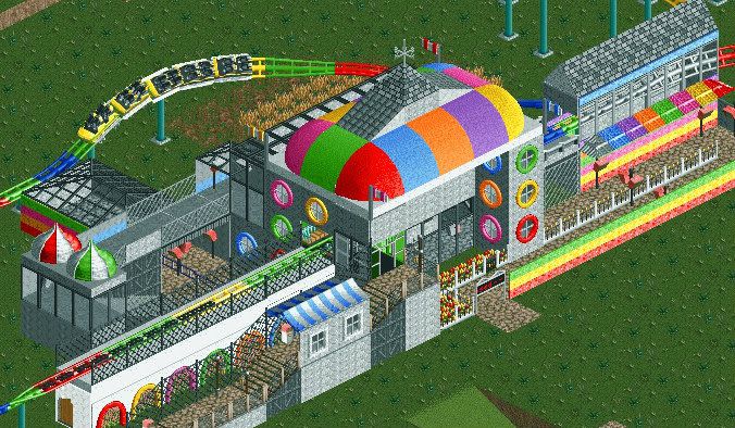
^The station building. I'm still thinking about what should be put around the coaster layout, any thoughts?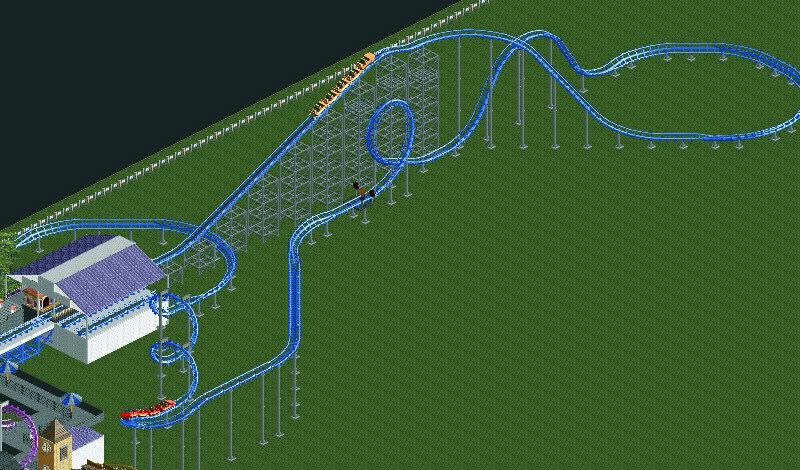
^This coaster isn't in this park or at least not yet I just wanted to know what you guys thought about the layout. Is it realistic?
I've made some other changes from what you guys suggested but I'll show them at a later date.
Thanks for reading!
~Salsaontop~ -

 Cocoa
Offline
theres no such thing as too colorful. there is such thing as using colors incorrectly.
as for what you want for the theme, I would suggest building a whole series of buildings completely in grey. then use a different, smooth texture in small details and on walls to suggest paint has been splashed over the buildings or whatever. Right now you just have colored windows and a colored roof on a grey wall, which doesn't suggest color taking back over a city. it just suggests someone wanted colorful windows and a colorful roof with a grey wall. what you need is a bit of a sinister, prison-compound sort of city that is completely grey which gets attacked by color or whatever.
that layout is not really realistic in the sense that arrow would never build a coaster like that. they would never have a long flat turn after the first drop and then a large airtime hill. arrow would probably have a turnaround at the top of the lift and then a straight drop into the loop. -

 Arjan v l
Offline
If you need some examples from real coasters ,then check out the site 'RCDB' (RollerCoaster DataBase),you'll find many coasters there.
Another usefull thing can be ,to look at POV (Point of view) fragments from rollercoasters on youtube.
Hope this is usefull info for you.
-

 salsaontop
Offline
@Cocoa - Thanks for the comment that is a good idea. I don't want it to be too dark though as it is a kids ride but I will definitely attempt what you said in the comment.
@Arjan thanks for the glass floor trick and also the website. I will look into changing my layout. Good thing it isn't in this park.
~Salsaontop~ -
 MorganFan
Offline
If you want to go for something colorful for that station, I suggest looking at Heaven's Kitchen's work. The team's parks all use eccentrically colored buildings, but are always organized.
Good luck. -

 salsaontop
Offline
^Good idea! I remember one park they did on a blank white map so will look for it!
 -

 ivo
Offline
Looks like an extreme fun building. I always love that a lot of newcomers have a very different way of building because they are not influenced by sometimes limited opinions of the community. Looking forward in your new stuff!
 -

 Mr. Coaster
Offline
I would change spectrum's trains to the looping coaster or giga coaster trains, because right now they seem to have Over The Shoulder Restraints.
 Tags
Tags
- No Tags
