(Archive) Advertising District / Spessart Park
-
 17-August 12
-

 RWE
Offline
I like this. But be carefull with brown in this park because I think to much brown will make it boring.
Sieht toll aus. Ich würde aber darauf achten beim Parkbauen nicht zu viele Brauntöne zu benutzen. Dann könnte es langweilig werden.
Gruß RWE -

 Fizzix
Offline
I really like the foliage. That tree in between the stairs is pretty cool. Love the drop tower as well.
 -
 SixFlagsTexas1994
Offline
I like the atmosphere, the architecture, and foliage! I guess the brown color is...I dont know
 -

 Austin55
Offline
Haha I had to look up Tripsdrill's tower ride, that's awesome! Nice effect on it to haha. Your version looks great, just hope the lines dont get to long!
 -

 Fisch
Offline
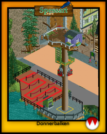
I like it but as always I'm afraid that you're not putting enough thought into ride placement and layouting the areas. One thing I learned while stuyding architecture is to question every aspect about things I built. If you don't have an answer to why that ride should be built right there in a theme park and not somewhere else then don't build it. That'll make for a much better flow in the area...everything should have a purpose. Now this ride is themed to a treehouse and the name is "Thundertimber"...why would it be standing in the water without anything around it? Why is the queue the way it is and not just completely connected to the platform doing zick-zack moves without that little bit of water in between?
I think it'd already be a lot better if you just did something like this with the queue. That way the tree isn't in the middle of nowhere anymore.
-

 BC(rct2)
Offline
^haha
I like the change that you did on paint, it will look better and it will work better for the peeps. -

 Jonny93
Offline
Thanks a lot for the comments! I am glad that the most of you like it.
@RWE: I will be careful with brown.
@Pierrot: Which colors would you change?
@Fisch: Thanks for your advice. I want to have the ride there. A huge tree near the water makes sense for me. But i changed the queue.
Here is a new picture from the new log flume:
Greets Jonny93 -

 Ruben
Offline
Not sold on the wooden middle section of that mill, feels like it needs a corset or something. Other than that it looks like pretty decent stuff. Like the overall atmosphere.
 -

 BelgianGuy
Offline
I think the turn of the flume can use something to keep water waves from the boats from dropping all over the path unless that's your intention...
the windmill while a cool idea does feel a little bulky for it's height, maybe making it higher will make the scale fit better?
Also the tree house could feel a little more tree-y, maybe use some bushes or the liam big tree things to make it give a more treehouse feel cuz now it's like a hut on platform... -
Colorado-Fan Offline
I think he "recreated" the tree house very well:
http://www.coasterfr...4.04.09/010.jpg
I don't like the drop of the log flume that much. I also think the turn of the flume needs something to protect people walking under it of getting wet. -

 BelgianGuy
Offline
Recreated yes, but I think it could be made more appealing in the game by adding a little more to it no?
and yeah try using bobsled track banked to have wave control, look at tsunami in TPWOA in my page, you'll see what I mean there -

 Cocoa
Offline
maybe put a fast-food sort of restaurant in the bottom of the windmill and then put tables and benches with umbrellas around it? that would look really nice. and maybe a house or some sort of building attached to the bottom of the windmill?
nice work though -

 Jonny93
Offline
Thanks for the comments!
After a visit at the "Holiday Park", i was very impressed by the new entrance section there und hugely inspired. I decided to restart my project and use some good things from the old version.
@Ling: Thanks i am glad you like the log flume, i will see what i can do with the color of the tree house.
@Ruben: I like the middle section, i think its realistic. Here is my inspiration:http://airtimers.com...73398_thumb.jpg
@BG: Thanks for the tip with the bobsled, i will add it for sure in the new version. I will also have a look on the treehouse. Your points are right and i will see what i can improve there.
@Cocoa: The idea with the restaurant is great. I will add something like that.
@AC: Thanks
Here is a first picture of the new version of franconian village:
I hope you like it.
Greets Jonny93
 Tags
Tags
- No Tags


