(Archive) Advertising District / Arjan's Creations Topic
-
 15-July 12
-

 pierrot
Offline
jesus, finally you spread your wings..this is why I voted Arjan for Most Promising Member.
 -

 Arjan v l
Offline

Thanks for the wonderful comments everyone.
Lol pierrot, i didn't expect you to vote me as most promising member...i feel honored.
I'll probably replace the pic. for an updated one soon and add some more text.
I was a bit too hasty to show this...therefore i forgot to even mention the park's name.
I'm going to refine it some more and think about jonny's comment about it being a bit too sterile, i was also trying to create a custom sign for it yesterday, but it got screwed up, i'm not good enough at editing yet, so i'll think of something else.
there will be more to see later on.... -

 Louis!
Offline
I actually dislike this, and dislike the objects that have been made too.
Probs just me though. -

 Jonny93
Offline
I guess the sterile view comes through the colors and textures. They dont interact very good in my eyes.
 -

 Arjan v l
Offline
Aawww... Louis, i was really hoping you would like this, it saddens me that you don't....
But don't dislike the new objects yet....who knows what you can make with it.
Jonny, i understand what you mean, but i don't have more textures available atm.
The structure is based on the convex and the curved items, it's also very experimental.
I haven't made those curved items in more than three textures: Marble, Castle and brick.
The Wooden textured blocks are the most difficult to make imo, it would give more options in this structure, i know, but atm i'm not really encouraged to make much more objects, since it's so hard and frustrating to do.
Thanks guys.
I'll see what i can do to improve it. -
 Faas
Offline
On the one hand I think it is really cool what you did.
On the other hand I think it is not really cool as being an RCT-park. There is no atmosphere and I think a theme like this will bore pretty quick when done in a full scale park. -

 Arjan v l
Offline
Thanks Faas.
It's understandable what you said, i was also afraid of that to happen.
Very modern style is not atmospheric most of the time.
But still... i want to make this for ME, regardless of what others will think about it.
I've come to the conclusion that i should build for myself and not for accolades.
If someone likes it...that's nice, if someone doesn't...tough luck.
I'll try to enhance the atmosphere, but i'm not going to change the approach towards this project.
Building for fun and what i like is the best motivation for me.
-
 RCT2day
Offline
Dude, that's insanely awesome. I would turn the Manta-like fountains around so that it looks like the train is creating the splash rather than the riders getting sprayed.
 -

 Arjan v l
Offline
Thanks!
It's based of Manta.
I'll try it the other way around with the fountains.
More screens will come in 24 hours. -
 Mattk48
Offline
I love the atmosphere is that screen, the colors just seem to mesh together so nicely. Roller coaster element is placed perfectly, only thing I don't like is the section of grey path at the bottom.
Give us MORRRRR -

 FK+Coastermind
Offline
Dude, Arjan, all these past screens look fantastic. You have certainly found a style all your own, which i think is really important or a builder. These screens really show an innovative, fresh, and atmospheric look. I'm excited to see this progress
FK -

 Arjan v l
Offline
Thanks everyone.
It's nice to hear that i'm finally understanding a lot of park making aspects.
That gray path stays though, sorry, but i like the contrast it gives.
More screens will come soon. -

 posix
Offline
Good stuff. These colours have almost become an Arjan trademark now. I like them.
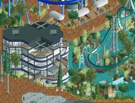
I think that building is a bit too complex. It's interesting, but it's also ambiguous and strange. Next one you make, I would give more focus on restaurant indicators. Tables always work well. Perhaps you're having too few. If it's supposed to be mostly housed inside the building it's a bit more difficult obviously. -

 Arjan v l
Offline
Thanks posix.
You should see the building from different angles, i guess.
It's quite complex, i just love that...complexity.
You will see more 'strange' structures, it's fantasy.
There are only 2 buildings inspired by real architecture.
I'm also thinking about some sort of sign for it, to make it more recognizable.
The eating area is inside, consisting of 2 floors.
There's also a terrace on top, but that isn't peepable.
And there's air conditioning inside, since it's tropically hot outside.
There are also other restaurants though, with a terrace beside or in front, you'll see those later.
Lol, you made me laugh about my color choices though, i'm glad they work out, since it's still something i'm struggling with a lot.
The atmosphere is coming along nicely, i finally know how to pull it of now.
Thanks for the advice you gave me in the past, i'm really learning from that.
As well as the other advices given to me by others.
Thanks everyone.
-

 Jonny93
Offline
Wow Arjan, i am really amazed how much work you put into the new custom scenery objects.
You found your own style, which is really good. I am looking forward to see this released. -

 Arjan v l
Offline
Thanks Jonny, it's always nice to hear that someone appreciates the designing of new objects.
I'll release it gladly when it's done.
Another screen...
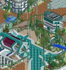
You're looking at a part of the kiddy coaster.
There's going to be a small playground where the train currently is.
I'm just trying to figure out what.
 Tags
Tags
- No Tags


