(Archive) Advertising District / Arjan's Creations Topic
-
 15-July 12
-

 Cocoa
Offline
i like that. it has a nice tropical, chilled out vibe to it. reminds me of busch gardens. something in the atmosphere of that screen is actually quite inspiring, even if it is just accidental
-

 Arjan v l
Offline
Thanks , it's being voted right now ,so enjoy it when it's released.
Nothing was accidentical ,it's really planned this way.
-

 Arjan v l
Offline
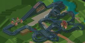
Wooden dueller design coming up ,just like Liampie mentioned ,i'm allready working on the next one.
The synchronization is nice and the ride is pure fun ,you'll see.
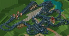
This is just the coaster design.
Landscaping and interaction will come.
'Ugly' straight pieces will be covered by landscape and rockformations.
I've also been working on a park that's bigger than Doomed Domain ,but that's on hold for now ,until my skills have improved.
-

 Mr. Coaster
Offline
I'm not so wild on the lifts at the end that just seems like it could be easily avoided. And the ending seems to just putter out, like you lost inspiration so you said "oh ill just put a straight section here and cover it up with rocks and terraforming." But the front half looks good.
 -

 Xtreme97
Offline
Never have a lift before the station. It makes it look as though the trains couldn't complete the layout and that's never good.
 -

 highroll3r
Offline
good improvement but i think the layout should go under the path not over. its the perffect place for some interaction.
 -

 Arjan v l
Offline
It's been a while...
Last mentioned design has been put on hold, since there was no more inspiration to finish it.
I've been dying to make something like a water park merged with an attraction park.
So i've started one...
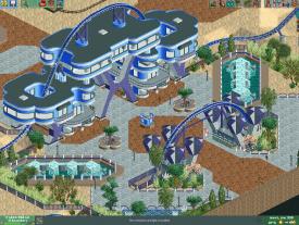
Here's the park's entrance with a lot of new manufactured items.
Hope you like it as much as i do...
Enjoy.
-

 Jonny93
Offline
Those concave and convex objects are pretty fantastic work. I like the screen, it seems it have some similarities to your past projects. Only thing i dislike is the fact that it feels a bit sterile to me.
 -

 Liampie
Offline
That's awesome, but as jonny points out it's quite sterile. Not too sterile though.
 Fits the style you're going for.
Love the camelback. -

 Arjan v l
Offline
Thanks Liam.
Yeah those camelbacks there are great, aren't they?
To me being a peep, that would really get me excited to go into the park, really inviting.
So i thought that would be a fantastic idea.
I agree with what you said about the style.
Modern style is clean most of the time. -
 AK Koaster
Offline
Love when you do these awesome futuristic areas. The structural components and the building interaction with the coaster is insane
 Tags
Tags
- No Tags
