(Archive) Advertising District / Arjan's Creations Topic
-
 15-July 12
-

 Arjan v l
Offline
Thanks trav, i'm glad you feel that way.
I've changed my aproach towards the game, thanks to posix. -

 gir
Offline
I think the buildings look nice, but I disagree with the comment about the composition. Something about this screen just feels awkward--maybe it's the large courtyard. Things just don't seem to flow well. The architecture is still really strong though, good work.
 -

 Fizzix
Offline
It's got a really nice feel to it. Well done, you're improving greatly. I agree with the fountain-water idea.
 -

 Arjan v l
Offline
@ Shotguns? : Thanks ,i'm glad you like it.
@ gir : You might be right about the composition/flow, it was totally different before.
I squized it in litterally. So the flow suffers from it a little ,i guess.
Thanks for the feedback.
@ Fizzix : Thanks ,i'll work on the fountain soon, i'll update when ready.
-

 posix
Offline
Think the changes you've done are doing it well. The layout we were talking about is much more recognisable now. Good job.
 -

 Arjan v l
Offline
Thanks posix.
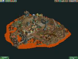
I've made a lot more changes, i'm finally starting to understand cohesion, i knew what it meant ,but somehow didn't know how to form it. That's changed now and it's starting to become more fun again.
The black casttle in the upper left corner is also up for change.
Don't know what to do with it yet ,but i'll figure it out.
I've squized in some houses on the cliffs around the park ,made some stairs to them, it's really coming together nicely.
And yes ,i made that layout more recognizable, and i'm still working on that area to make it better. The feeling that it's disjointed isn't there any more ,it's starting to feel more cohesive, ...finally.
-

 5dave
Offline
That looks really great Arjan!
The only thing I don't like are those hideous trees!
"MFG" -

 Arjan v l
Offline
Thanks 5dave.
I hope you can live with those hideous trees, i don't have better ones, that are that big. -

 Liampie
Offline
That's whre you have to be creative. Well, you don't have to, but it's what I and many others prefer. For example you could use my tree objects to create the trunks and make the tops with wooden beams and stuff.
 -

 Arjan v l
Offline
I've thought of that Liampie.
I've seen many 'custom' trees with trackitecture ,poles ,posts ,supports ,name it.
Only using the smaller trees is also an option, but that wouldn't give enough diversity i guess.
I'll check the h2h6 parks for custom trees ,and i'll think about what to do.
Thanks for the advice though.
-

 Arjan v l
Offline
Current state 98%.
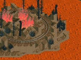
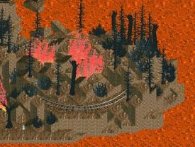
I've got a blackhole AGAIN (Just like my last park), i hate blackholes.....
But... i've managed to hide it.
You can see it chipped away a piece of rail.
The ride also can't be modified anymore ,because it causes an instant error trapper.
But it's finished ,so it doesn't matter anymore.
Before:

After:

The park will be send to olddtfan for testing within a couple of hours.
It will be submitted soon.
I hope you're going to enjoy it, i know i did ,even with the setbacks i had.
Edit: Sorry Liam ,but no trackitecture or whatever trees ,i just don't like em.
 Tags
Tags
- No Tags


