(Archive) Advertising District / Arjan's Creations Topic
-
 15-July 12
-

 Arjan v l
Offline
^^ I'm gonna aproach you on aim ,if you don't mind.
Let me know, you seem to have a good visionary of what it can become.
Edit: Never mind, you haven't seen the entire park yet,
I'm deliberately not showing the highlights of my park ,because i want that to be a secret. Maybe i'm over-confident about it snatching Gold, but it's special.
You'll see very different things in there, wich i haven't seen here before.
I'll finish this park with my highest dedication and a lot of nifty ideas.
Gold, Silver or Bronze, i'll let the voters be the judge of that.
Edit: The tips you gave me are helppfull though, i'll give it some thought.
-
 Mattk48
Offline
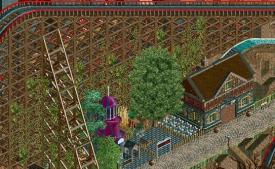
That is a very interesting look. I think i like it, but it doesn't fit in to the themed area you have in in. Also i don't like how you supported the coaster.
 -
 ScOtLaNdS_FiNeSt
Offline
That screen is pretty good but its not great. It needs more supports for the coaster. Also im a bit confused with the theme as the last screen looked very barron and almost doomsday like yet this screen is full of green lush foliage. Its just somewhat confusing.
Dont take this to heart, basis of what i have seen its not going to get gold or silver. Might struggle to get bronze. Again thats from what i have seen. No offense again but i think the reason your latest park got bronze was because of the quality of some of it but mostly down to the size. there was enough decent stuff there to warrant it.
As i said before its a very good idea and looks promising but with smaller parks the quality needs to be higher than the screens i have seen so far for an accolade.
Maybe it is special and at the end of the day as you said the judges will have the final say.
Just dont get your hopes up, good luck again. -

 In:Cities
Offline
Thats such a pretty screen. Maybe its the colors, but I simply love it. Keep going!
 -

 Hex
Offline
You are one of my current favorite builders. You are fairly new to the site and show so much potential. That's a very nice screen. As for the ivy i think it looks nice. I always liked putting vines on my buildings in Minecraft, so it may be a preference of mine. Anyways, keep going!
-S.C. -

 Arjan v l
Offline
@ Mattk48: Thanks for the comments, but why shouldn't the foilage 'fit in', i'm a little confused, as well as i'm confused about the supports not being ok.
Could you perhaps explain?
It's fantasy btw. ,so i'm not going for realism. The ride is supposed to have a feel of danger.
@ ScOtLaNdS_FiNeSt : Thanks for the reply, since this isn't at the edge yet, you don't see burnt trees, i'll do burnt and dead trees at the edge close to the lava, and nice foilage on 'higher' ground, i know it's a ghosttheme, but that doesn't mean that i'll do only burnt or dead foilage, i want to mix it up, i'll take a look at it from overview and close by and i will determine if it's good or bad, i'll have to think about that. As you all know ,i'm still quite new at this, and i'm still struggling with the huge choice of items nowadays.
Like i said before ,there are definately 2 rides that will lift your eyebrows, wich won't be shown untill release.
I've lost the attitude that it should get gold, maybe i'm beeing a little over-confident.
@ In:Cities : You are always so kind. Thanks.
@ SuicideCarz : I'm happy that i'm beeing one of your favourite builders, thanks.
I'm taking all comments serious ,and i'll seek improvement. -

 RamSam12
Offline
Looks like you sacrificed supports in order to fit that slide next to the coaster. I think it would look better with either more custom supports or none at all on the lift.
 -

 Arjan v l
Offline
Looks like you sacrificed supports in order to fit that slide next to the coaster. I think it would look better with either more custom supports or none at all on the lift.
Well ,actually that wasn't the thought behind it, to lose supports for the spiral slide to fit in.
I've done the same on the other side of the coaster (mirrored), i can either lose the spiral slide (wich i don't prefer since that's the only ride there, and i'm afraid it might look boring without it). Or i can lose the custom supports, but then it might be criticized.
I'll think about this ,any good suggestions are always welcome.
Thanks for your comment.
-

 Austin55
Offline
I think a fountain might be to cheery for the area, maybe make it out of "lava" and it'll be awesome!
Maybe a bit more overgrown foliage to finish that creepy look, and your set. Good atmosphere. -
 MorganFan
Offline
If you're going for a creepy look, just leave the water out of the fountain entirely.
 -

 Arjan v l
Offline
Thanks for the comments and ideas everybody.
Lava fountain does sound cool Austin55 ,i'll give it some thoughts.
Or maybe a blood fountain?
Or empty?
I'll think about it.
-

 pierrot
Offline
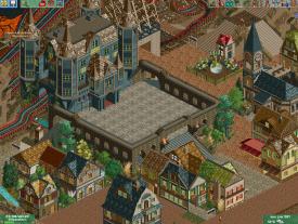
great work dude, you're so good at castle structure, probably one of the best castle I've seen.
foliages are too ramdom and didn't fit well though. try to mix darker trees, bushes.
 Tags
Tags
- No Tags
