(Archive) Advertising District / Arjan's Creations Topic
-
 15-July 12
-

 Ruben
Offline
I think the concept isn't that bad, and your work so far looks promising, but I have some problems with this stuff. Mainly:
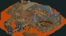
-In the first screen you showed us I think the shapes and colors are okay, but the textures are way off. Apparently it's only me but I find the brick texture blocks you used on the left building hideous, and the black castle looks very plastic to me due to all the simple plaster wall.
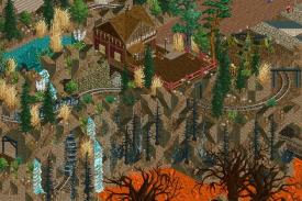
-For the Second screen my biggest comment is that it misses detail, fun, exciting details. Why only landblock landscaping? Where is the foliage? The fun little structures/buildings a mine train needs? the exciting water(lava in this case) falls that make a mine train come alive?
It looks promising, but I think your finishing touches are just kind of off, or in some cases simply not there. Hope you can do something with this, cause it'd make this park a lot more exciting. One way or another, good luck with it!
-

 Arjan v l
Offline
I think the concept isn't that bad, and your work so far looks promising, but I have some problems with this stuff. Mainly:
-In the first screen you showed us I think the shapes and colors are okay, but the textures are way off. Apparently it's only me but I find the brick texture blocks you used on the left building hideous, and the black castle looks very plastic to me due to all the simple plaster wall.
-For the Second screen my biggest comment is that it misses detail, fun, exciting details. Why only landblock landscaping? Where is the foliage? The fun little structures/buildings a mine train needs? the exciting water(lava in this case) falls that make a mine train come alive?
It looks promising, but I think your finishing touches are just kind of off, or in some cases simply not there. Hope you can do something with this, cause it'd make this park a lot more exciting. One way or another, good luck with it!
Thanks Ruben.
You're probably right about the variation of textures in the black castle ,i'll see what i can do with it, i'm still having some problems with variation of textures, i will work on that. I'm not sure about the bricked one ,maybe you should see it from the other side.
It has a real grim look to it, wich definately suits the theme.
About the minetrain ,it's definately not finished ,it was more a screen with a question about the banked curves and if i should remove them or not.
I was afraid it might effect the score if i removed them ,since in reality there are banked curves in minetrain coasters.
You might see an update (small part of the coaster) in time.
You will love it when it's completely finished, it's going to be awesome and very well thought of. -

 Arjan v l
Offline
Update:
Concept is done. I've figured out the placement of the paths and rides.
The park will have 4 rollercoasters ,a waterride and other smaller rides
The coasters are based on the more 'old style' ,so no inversions.
There's a woody wich will interact a lot with the landscape and other rides.
There's a minetrain coaster wich you probably have never seen executed this way.
Also a smaller minecart coaster ,that's going to be full of crazy ideas.
I've choosen for a virginia reel coaster also, for that old feel.
That coaster will also be executed in a fine way.
The waterride will also interact with the woodie.
You'd probably think ,that this park will become coaster heavy, but since i'm trying to really fuse the coasters with the landscape ,it just doesn't feel heavy.
Don't start wining about foilage or other stuff. It's the concept ,the rest will come.

-

 Ling
Offline
I really like the woodie, but not its colors. If you can keep up the same style of architecture as you have on the bridge, I think it will be impressive.
 -

 Liampie
Offline
Very ambitious and it looks promising, but I hope you can make it all cohesive. Your last park felt disjointed...
 -

 Arjan v l
Offline
I'm sorry, i should have mentioned that the colours aren't chosen yet.
there will be several castles ,not to much though ,i don't want to screw this park up by that. I'm definately taking this park DEADserious.
I'm going to try to make it as special as i can.
It will be a great step up compared to the last park i've released.
Nice to hear you like the woody btw.
I hope the pacing is ok on this one, i think it is.
A lot of thought went into that layout and the other layouts as well.
Thanks for the comments Ling.
-

 posix
Offline
Looks nice. Good to see your steady improvement. I would criticise an overfocus on terraforming though. Do it later. It's very flexible and usually filler material.
 -

 Arjan v l
Offline
Thanks B.C.
Thanks posix.
But what do you mean exactly?
Am i overdoing the landscape?
I'm trying to create a cruel landscape ,wich i.m.o. suits better with the theme.
How much would you rate it so far?
Better then 45% ,i hope ,no offense intended.
-

 ScOtLaNdS_FiNeSt
Offline
I think what posix is saying is instead of making all the landscape just now and then squeezing buildings and stuff into whats left.
Build your vision and then fill in the landscaping, As he said its usually filler.
Its looking good. As it is right now i would say 40%. Keep going. I dont think you should have showed the full "basic" layout of the map though. -

 Arjan v l
Offline
Thanks ScOtLaNdS_FiNeSt.
I,ve only done landscaping for the rides so far, and around the edge of the island.
I'm not going to continue on landscaping, now it's time to figure out where my buildings are going to be, i've allready thought about food areas when i was working on the pathing.
Cohesion will be worked on.
The reason that i showed the full map is because i was curious what others would think about this concept so far.
I'm trying to step up my game.
-

 Super G
Offline
Finish this with the same quality as the bridgebuilding and it will be a high silver for me.
 -

 Arjan v l
Offline
Update.
I haven't show something for a while ,but i got something nice for you.
I hope you like the view if you can imagine yourself being there.
It's a part from the minetrain that's been showed before, but now finished, except for the upper right corner then.
I'm wondering what you think of this screen.
Ofcourse a little teaser again.
 .
.
The park is currently at 50%.
More screens will follow in time. -

 salsaontop
Offline
In my opinion if the rest of the park continues like this I can't see it getting less than a high bronze or even much better say a high silver. The terraforming is just ace. I always like seeing how people develop there parks too gain ideas. e.g. do they start off by building rides terraforming, back of the park etc. You seem to have a knack for building very nice looking buildings along with good terraforming. My only question on this screen is how is water going into lava? I know it's possible but why isn't there any steam to show the water evaporating? Otherwise it's looking really good.
Edit: I saw the steam
-

 J K
Offline
It looks awesome to me. A theme that we don't see often and packed with ideas and a nice atmosphere. Keep thinking outside the box and building cool concepts!
 Tags
Tags
- No Tags


