(Archive) Advertising District / Kidron Park
-
 12-July 12
-

 RCT2day
Offline
Liampie: Thanks, means a lot coming from you. It is a custom path I picked up by mistake in someone's download. Technically, it's not "scenery" though...
Ling: I agree with you and wish I could change it but I'm not sure how to execute that. Whenever I try, it just seems to look to bare and empty instead of occupied yet overly chaotic. I think I go with the lesser of two evils. Any thoughts? -

 Ling
Offline
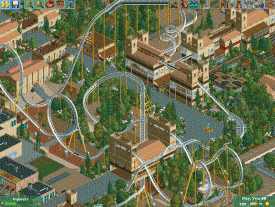
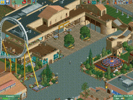
Just localize it. Have some dense trees and feather the underbrush out from there. Use the barrels and ruins and such closer to the buildings. Move the flowers closer to the paths and trim their numbers. Also make use of the land textures where you do have barren land (which you should have some of). Clear texture changes can keep it from being boring. Particularly in the courtyard screen though, just remove about 1/3rd of the bushes.
 -

Rhynos Offline
It's good to see NCSO parks being a bit more prevalent. This gives me ideas to add to my park. The pics you've shown here are very nicely laid out and I love the fact that even though you are using limited objects, you still make optimal uses for them and make each piece work on multiple levels. I especially love the use of the mazes as queue lines. Probably my favorite thing about this park (though I won't copycat that idea in my current park).
Thanks for showing this. -

 nin
Offline
If you wanted to go the extra mile with your paths you could lower the outermost paths (the edges) using MoM, just to keep yourself within the "no CSO" rule. To each his own though.
The screens are really good. Makes me want to build NCSO again. -

 RCT2day
Offline
^I would do that but there are so many paths now that it would be too much work. Besides, are paths really "scenery"? Your NCSO work was great, you should give it another try.
Thanks, guys. Means a lot that I have an audience who enjoys this. -

 RCT2day
Offline
The dive loop was done in the same way as Kumba's Kumba. But it is pretty akward, no way to help it. It looks better from other angles though.
As for the shrubs, I'm developing a bad habit of filling every tile with shrubs/trees when I have nothing else. Trying to break that habit as I continue and I'll revisit this area once I figure it out. Thanks, MA. -

 Arjan v l
Offline
As for the shrubs, I'm developing a bad habit of filling every tile with shrubs/trees when I have nothing else. Trying to break that habit as I continue and I'll revisit this area once I figure it out. Thanks, MA.
Zoom out regularly ,it helps to get a better composition. -

 Corkscrewy
Offline
I had the same problem with feeling the need to have some object on every tile. Just look at my Atlantic Adventures. Its something I've been working on as well. I like it otherwise man. That's the thing with those dive loops. They look amazing from some angles and hideous from others.
-Josh -

 Xtreme97
Offline
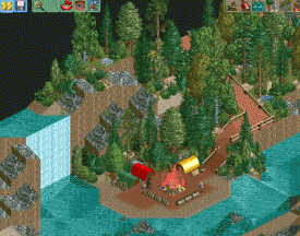
The campsite looks really nice and has a great atmosphere but I think you should change the sand above it (where the foliage is) for dirt/grass.
 Tags
Tags
- No Tags

