(Archive) Advertising District / Kidron Park
-
 12-July 12
-

 Hex
Offline
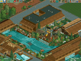
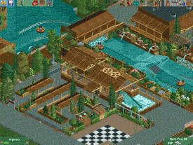
So the man famous for his NCSO Ball Park finally releases his next piece of art. Took you long enough to get it over here
 Fantastic work man, really really good stuff.

-

Felipe// Offline
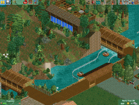
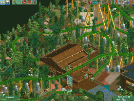
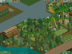
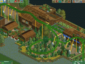
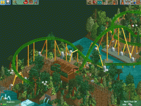
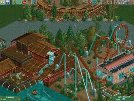
Supports are nice, so is the atomsphere. Be careful with the foilage but other than, it's great! -

 Xeccah
Offline
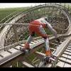
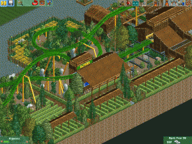
monotonous textures and colors. support work is good but I do recommend you add wooden catwalks on the lift, that is if you are using 8cars.
but good work nonetheless. -

 Ling
Offline
Don't name it Total Recall if it's going to be in the middle of a western section. Maybe something to do with its six inversions? Get creative. I'm not a huge fan of the way the supports look, but I guess it's a style.
 -

 Liampie
Offline
Ditch the custom supports. Leave the rest, it's good, although it's a little boring as well. Generic and flat.
 -
BigB Offline
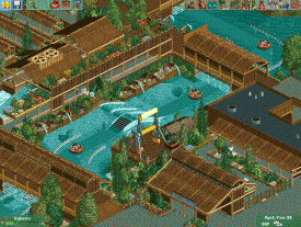
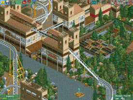
I liked the idea of a labyrinth as a Q ,
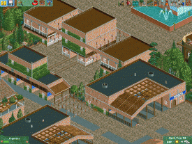
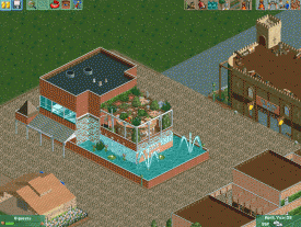
the building in general, especially in the entrance area, are boring.
Big, simple and not very detailled.
I think you could do so much more with NCSO.
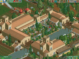
But I really love the overall layout of the park, it looks very plannend and clearly executed
-

 SoCalCoasters
Offline
If the boomerang is in the Western Section you should totally named it Revolver (six bullets six inversions
 )
)
-

 Liampie
Offline
I love it and I can't wait to see this park finished. How did you do the fulltile paths? I didn't notice them until now.
 -

 Ling
Offline
^looks like CSO.
You don't need to absolutely fill every single quarter-tile. Some of the foliage looks a bit disjointed and overdone in those screens. I would tone it down a bit.
 Tags
Tags
- No Tags
