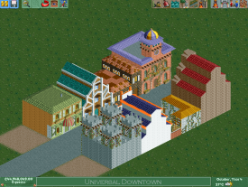
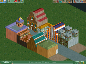
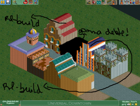
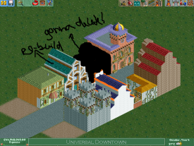
(Archive) Advertising District / First Big Project: Navy Land
-
 11-July 12
-

 Six Frags
Offline
Pacificoaster; Disney's Tilted Acres basically revolutionized rct2 parkmaking as you know it today, and it even made iris install and accept WW as an NE accolade (which is a feat in itself
 )
)
And Iceman's Disney parks are unmatched imo. They have executed the Disney atmosphere almost perfectly. -

 Scoop
Offline
it is to tight you need to open up the gap between the two rows of buildings. also some look great and some are lacking detail. in the end everybuilding clashes with one another.
 -
 Coaster Cow
Offline
They aren't terrible. The small green one actually has some quite nice detailing on the lower level. The Arabian-style pink one is pleasant. They all are wayyy too blocky.
BUT: The ideas are totally out of sync. Not even at Universal would there be that kind of clash of theming. Look at Orlando's City Walk map; right away it is totally obvious that there is a cohesive force to the intentionally varied architecture.
The straight path through the buildings wouldn't happen either; it's inviting movement straight through the corridor. Even at Disney, where the chief purpose is to ferry people through to keep the entrance clear, Main Street has alleys and opportunities to explore and avoid crowds. This wouldn't serve to create an urban, bustling atmosphere like CIty Walk intends to do, it would force people to keep moving.
In order to understand architecture, even just for a RCT game, you need to be able to ask yourself: how should the inhabitants feel? What should I be making them focus on? Right now, even disregarding the lack of cohesion and sophistication in the archy, you are sending a message that this is not an area to converse and mingle but an area to be passed through.
Please just really put thought into it, and the lack of detailing won't even be as much of a problem. We just want thought. -

 Wanted
Offline
MY GOD! RIHANNA? Why!? What do you like about her? Or her music?!!?
I remember standing in line for Terminator at SFMM and there was live Rihanna playing on a loop. The whole line was talking about committing a mass suicide... -

 highroll3r
Offline
the buildings are in too much of a straight line thats the main problem i have with them atm. dont be afraid to use diagonals.
-

 Mr. Coaster
Offline
All I have to say about this park is that, to me, the overall theme doesn't matter, as long as its pulled off in a believable fashion. I am intrigued to watch your progress.
As for the screen, well what everyone above me has said. -

 BC(rct2)
Offline
I just want feedback about the park -_-MY GOD! RIHANNA? Why!? What do you like about her? Or her music?!!?
I remember standing in line for Terminator at SFMM and there was live Rihanna playing on a loop. The whole line was talking about committing a mass suicide...
@coaster cow, thanks for the feedback, I'm rebuilding the buildings now and I will try to do what you said
-

 Scoop
Offline
hey don't hate on rihanna she has some decent music like umbrella. we are playin the glee version mix with singin in the rain for our marching band show. yes its sounds pusyish if it is a word but it sounds amazing.
 -

 Pacificoaster
Offline
None of those buildings speak to me at all. I cannot identify what they are trying to be nor do they have any purpose.
 -

 BC(rct2)
Offline
Rihanna never had that music...
Come on guys, we are on the 57th reply and 30 or more is about Rihanna and not about the park, do you remeber that I'm gonna make theme zones about Linkin Park? Drake? Calvin Harris? Michael Jackson? For the haters of Rihanna:

-

Felipe// Offline
^Wow! Rihanna has never looked so pretty on a photo before..
About the park, your buildings don't show their purpose by no way, not that they should be obvious, but there's nothing relating them to anything, rides, restaurants, services.
Ok, there are some that are just "empty" inside, but this would be silly if it were the situation on all of them. Without a map in hands I'd feel very dumb to be lost in such tiny street.
Also, I advice you to rebuild the buildings a bit shorter, or to enlarge the street, so this'd be more visible. -
 MorganFan
Offline
I actually really like the chord progression of Umbrella. It should have stayed away from Singin' In the Rain.
As for the park, theme the last area for forgotten hits of the past or something.
I don't like where this is going. -

 BC(rct2)
Offline
I restart the park and now I'm gonna do step by step.
Now I start doing the hotel, witch is the entrance of the park.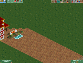
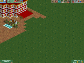
Now the park is called by "Worlds Of Music" and I re-organised the ideas:
Worlds Of Music
Zones:
> Music Downtown*
> Rock District
> R&B District
> Pop District
> Reggae District
> Dubstep District
*this zone will have "The World Stage"
 Tags
Tags
- No Tags
