(Archive) Advertising District / Nature's Glory
-
 28-June 12
-

 chorkiel
Offline
Reminds me a bit of concrete jungle and Terra progressia which is a shame since they were ''released'' in only a few weeks ago.
I'm not saying you should quit this though. It looks like you're having a nice planned start.
One suggestion though, as far as I know those are WW/TT objects, please get rid of them! I for one don't have ww/tt so I won't be able to view your park in game. -

 NiceyRCT2
Offline
'chorkiel', on 28 Jun 2012 - 10:50 PM, said:

Reminds me a bit of concrete jungle and Terra progressia which is a shame since they were ''released'' in only a few weeks ago.
I'm not saying you should quit this though. It looks like you're having a nice planned start.
One suggestion though, as far as I know those are WW/TT objects, please get rid of them! I for one don't have ww/tt so I won't be able to view your park in game.
Ok ill try to remove them, and ive dont know what those parks look like, plus ive been on this project for a while, so if mine looks like it, its a cowinkie dink. -

 Ling
Offline
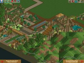
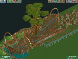
You have a solid layout, and the atmosphere is still pretty decent... but you have got to smooth out the landscaping and make the structures look more substantial. Not bigger - right now they seem almost wirey and too big for their purpose.
 -

 posix
Offline
That's not bad at all. I like the dark and earthy mood you have created. It's a bit difficult right now to make out clear features of the park as everything seems a bit mixed together, but maybe that will change as you build on. Well done on posting remotely finished screens, too. I would not give away everything you've built though. It's usually better to restrict screens to finished parts and hiding WIP areas, even if that means you'll only post one or two screens at a time.
 -

 Arjan v l
Offline
I like it, you have a real good feel for nature combined with natural materials.
Really different. -
 rct2isboss
Offline
Some of the landscape is a little blocky and a little to "perfect" and the architecture colors should be changed.
 -

 Fizzix
Offline
I like it, and agree with what posix said. I would also maybe consider changing the name? It's really close to Nature's Fury, which was a Design only a year or two ago. Maybe it's just me being anal, and in that case, keep the name!
 -

 Ling
Offline
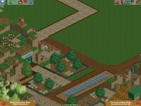
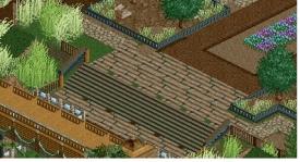
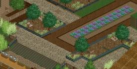
Invisible with a textured brick beneath perhaps? Or just continue the crazy paving. Too many different path textures make it look messy.
 -
 SixFlagsTexas1994
Online
Crazy Pebble paving would look good, They have it in "full tiles" to make the paving look crisper...
 -

 Camcorder22
Offline
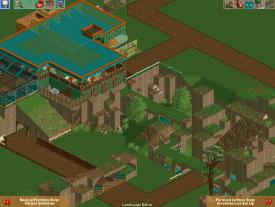
The atmosphere is solid although I'm not a fan of some of the objects used, that's just my preference though. Your land shaping needs some work though, just look at some pictures of real life formations and some RCT ones and study them closely, because randomly raised flat blocks isn't very appealing.
 -

 Scoop
Offline
'NiceyRCT2', on 28 Jun 2012 - 10:38 PM, said:

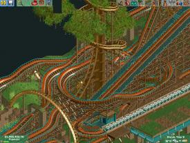
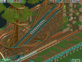
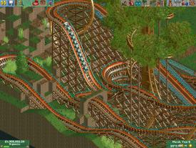
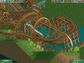
honestly Im not a real fan of the layout of the coaster it just seems to unrefined yah know it isn't very smooth but the scenery is spot onJust wanted to show some screens of my park, before I log off. Will see your comments tomorrow.
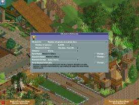
Thats basicly the theme of my park
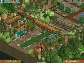
Entrance
Restroms, and other rides and such will go around here
An eating area and other scenery
Overhead shot/full entrance view
UPDATE 7/1/12
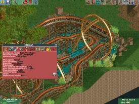
My main rollercoaster SEQUIOA
How about those numbers^^ -

 SixFlagsTexas1994
Online
Some of those screens I cannot view
However I agree with you on the layout's smoothness, but I like the large tree scenery.
Personaly though, I dont get the wooden planks... -

 Liampie
Offline
Where did the old pics go? And please post updates in a new post, this is confusing.
 Tags
Tags
- No Tags
