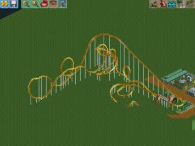
(Archive) Advertising District / The Mrbuckeye park thread (official)
-
 21-June 12
-

 Scoop
Offline
it actually doesn't kill them. I put a handyman on the path and it worked fine. besides this doesn't mean that there will be peeps in the park.
 -
 chorkiel
Offline
mrbuckeye, from a realistic point of view. If this was build in real life do you think people would survive that, or for that matter even step in that ride if it would (nearly) drown them..
 -

 salsaontop
Offline
You've really come on alot since your first post. I hope to be able to do the same within time. Keep up the hard work.
~Salsaontop~ -

 A.S.Coasters
Offline
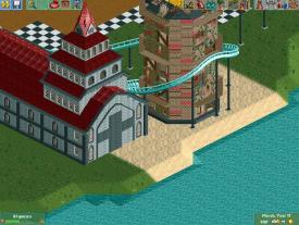
It would be better if you had submerged buildings around the ride with different terrain colors to represent roads.
 -

 Scoop
Offline
It would be better if you had submerged buildings around the ride with different terrain colors to represent roads.
That is what the black and white terrain is for. -

 Austin55
Offline
The buildings are good, but as far as a screen goes that it really.
There doesnt seem to be a point to it, it has no connections with pathway on this side of it. Add some pathway connections, finish up the landscape textures, some well thought out foliage, and this screen is looking a lot better. -
 MorganFan
Offline
Take out that steeple object.
But holy shit, yes, it is a great improvement over the Swedish Park.
Continue. -

 Austin55
Offline
Few things here.
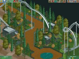
-The Fountain could use a water feature and some walls to keep from flooding.
-Don't like the black wood in the terrain, dirt is better, and could be improved via quarter tile landblocks.
-low lying foliage could use some work, grasses anc bushes and whatnot.
-Straight peices in cobra rolls are cliche for a reason, they look good.
-Custom Supports bro.
Btw, what are the cages for? -

 Mr. Coaster
Offline
Basically what Austin said, and i don't really like the all white color style, it seems to sterile and bright. Maybe a bit of grey in the track?
 -
 AvanineCommuter
Offline
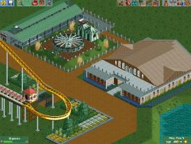
The buildings are a bit large and shapeless. Try to shrink the size of each building and put more thought into the shape and color of the buildings to make a nice overall composition. The coaster looks pretty cool, I'm looking forward to how you end up themeing the end of the ride.
 -

 Ling
Offline
Your coaster design reminds me of a certain B&M that starts with a "K" and rhymes with Kraken.
Just kidding, it is Kraken. -

 Arjan v l
Offline
I see improvement Mr. Buckeye.
Please ,don't use the mg lily flower bush on the ground ,use it in the water.
And the buildings need more thought, to create a more interesting shape.
Carry on.
-

 Mr. Coaster
Offline
I'm not sure what your'e trying to do with the half underground corkscrew thing, but please don't leave it like that, I think it looks really bad.
 Tags
Tags
- No Tags
