(Archive) Advertising District / The Mrbuckeye park thread (official)
-
 21-June 12
-

 Fizzix
Offline
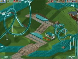
You need a tunnel around where the coaster dives into the water. Lower the water all the way, build some deco blocks around the coaster coming out, and 0-clearance absolutely and raise water.
I wouldn't keep the small roofs you have there the same color as the coaster, as the coaster's paint job (imo) should make it visible from the area, and add a nice pop of color. Try adding a scenic restaurant by the dive loop, maybe with a balcony on the back for peeps to enjoy the location on the restaurant. What theme are you going for anyway? It is unclear to me, atm. -

 Scoop
Offline
im really not sure at the moment. I thought it was going to be a world showcase type park but im not sure
 -

 RRP
Offline


more at http://www.rcdb.com
as far as themes and architecture go.Plan and test things.These threads are good
http://www.nedesigns...-little-things/
http://www.nedesigns...ovement-thread/ -

 Cocoa
Offline
i'm glad you put "(official)" in the thread title because otherwise if someone stole your stuff and reposted it we would never know which was real
 -

 Xeccah
Offline
i'm glad you put "(official)" in the thread title because otherwise if someone stole your stuff and reposted it we would never know which was real
You blew my cover, Cocoa!
Anyways buckeye, your getting better. keep looking at styles you like to inspire you. -

 Arjan v l
Offline
Don't do this, the admins won't like it and the rest here neither.
If people want to respond ,they will.
Kicking up your post to get attention won't fare well over here. -

 Pacificoaster
Offline
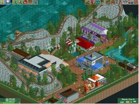
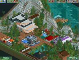
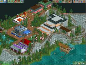
Seriously man? If people wanted to comment, they would. The thing is, since H2H has started, the ad district has been constantly spammed with work of this same quality. It's rushed, uninspired, blocky, and just boring. It's evident your using custom scenery, so why not try a bit harder to make something more aesthetically pleasing. Save the admins and accolade panelist time and don't submit this for judging.
 -

 AvanineCommuter
Offline
Some of the color choices are terrible, like that purple and brown building with the white roof and the bright red building. The layout isn't half bad but could use some work, especially the ending.
Like I've been telling everyone who is asking for feedback... LOOK AT REAL LIFE ARCHITECTURE!! Do you see anything in real-life (that you'd want to replicate in RCT) that looks like what you're building? Probably not! First step: type in your favorite amusement park name into google search. Click images. LOOK at the images for inspiration and PAY ATTENTION to what makes the buildings look pleasing/interesting. Replicate those ideas with your own twist in the game! It's not that hard, really... Don't just build a rectangle, put a roof on it and ask for feedback...
Sorry if this is harsh, it's not only directed towards you mrbuckeye, but I for one am pretty tired of these kind of posts filling the Advertising district. I completely agree with Pacificoaster: try a bit harder. It really isn't difficult if you took your time. -

 Pacificoaster
Offline
Understand we are not saying to give up guys, just put some passion into what you're building.
 Tags
Tags
- No Tags
