(Archive) Advertising District / Brazilian Works
-
 18-June 12
-

 Andrade
Offline
Hi, folks! This is my first post and topic here, but i'm not a newbie. I've read NE forums for years until decide to post my works of RCT2!
One of my curiosities, everyone here loves Brazil?
Theming and rides has been more detailed over the years in my parks and finally i'll show it on NE. I'm not a fan of intense hack but i've worked a lot to approach the theme (at least) to the parks and designs that i saw here.
Pay attention: i have three parks that i never stopped building (is a non-stop investment!) and you will find a couple of attractions inspired by disney, alton towers and different designs of members in NE.
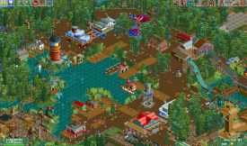
Look at these pictures below:
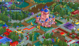
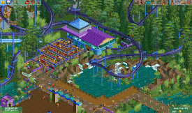
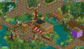
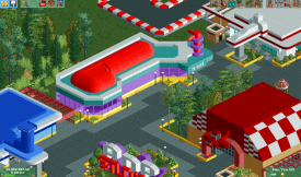
And the second park based in the world of music and movies
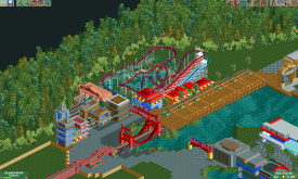
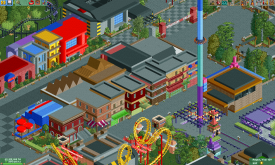
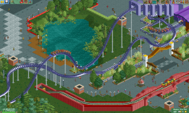
That's all, give me your opinion and i will show more pics! -
 Ling
Offline
Your buildings are pretty much all made out of the same texture, and I'm not sold on the colors. I like the look of the the coaster layouts for the most part, except that kink in the roll on the second picture.
 -

 In:Cities
Offline
Absolutely fantastic. It looks as if you are quite full of ideas!
Welcome to the site buddy:]
Please continue to post more! -

 Cocoa
Offline
wow! these parks are good in a very weird and confusing way. I absolutely love your use of color, and with a little more refinement and attention to detail you could really be on to something here. In general, the paths are a little too square and awkward, and facades are a bit too flat and boring. Foliage could also use a little work. Remember to put shrubs, flowers, bushes, and whatever underneath the trees. Also, a couple of places could use refinement in terms of theme, because I'm seeing lovely atmospheric colors that scream "wild west" or "new york" but there just aren't the details or theming to back it up... mine carts, country-specific foliage, and more distinct architectural details could really help you define a theme.
But that is just a little bit of advice to keep you going, because I really love what you've got and I just want it to get better
-

 RCTMASTA
Offline
This is what I imagine a refined RCTER2 might look like.
All in all, it's pretty good. Especially coming from a country that we really don't see a lot of around here at NE.
However, that repetitive dirt path in most of the third screen really kills that area for me. -

 Super G
Offline
Please custom Support your coasters. It will look so much better then it already does. Really love it!
 -

 posix
Offline
Very nice. You have a solid fundament style-wise and I would love to see that develop further.
 -

 leonidas
Offline
lovely Brazilian craziness!
I love the extensive use of color, the 50's architecture and some of the layouts.
Welcome! -

 Andrade
Offline
Thanks for everything! I can't believe, just waited more criticism and not congratulations!
@Cocoa: yeah, i explained that i don't use hack a lot, so my builds aren't more detailed and perfect, but i promise i will be better
@Super G: That's the problem! :/ Is so hard for me to add custom supports for the coasters and i'm lazy with it, anyone can help me?
Hopefuly in next days i'll upload more pics and some updates. -
 Camcorder22
Offline
With a bit of refinement and better object choice, you might turn out to be really good. Its obvious you have ideas, just keep looking at NE parks and real world parks and you might be onto something.
Since you wanted more criticism...In general you may have one too many types of trees going, and try not to group one specific type of tree together in square patterns as that looks unnatural. Add in some undergrowth with your trees and don't be afraid to mix some dirt or dirt/grass textures in there. Also, custom supports are your friend as others said. While a pain, its really just a process of looking at pictures of actual roller coasters and replicating the supports for each element, and using a lot of zero clearancing.
More specifically...
Screen 1: Castle is a bit blocky and I'm not a fan of colored bushes in a realistic setting. Even Disney probably wouldn't do that.
Screen 2: Clashes on colors/textures on station, path type is questionable, sloppiness on land blocks.
Screen 3: Don't like the purple building, also the one tile arch building looks too top heavy. Also people have given shit for the cycad plant but I personally don't mind it.
Screen 4: Floating building, and objects of the same type but different color right next to each other (eg some of your roofs) only works sparingly. The brown structure is also unappealing and confusing.
Screen 5: On the V8 Cafe, I find it looks weird to go from purple to turquoise with the same texture. Try putting in some sort of "transition" object like a quarter tile pole.
Screen 6: You're using a section of really vibrant colors next to a section with really dull colors and it doesn't look right. That and the color combinations could be generally better thought out.
Screen 7: My favorite of the screens. The buildings in the middle meet up at the path and align with each other at the same point, try varying it like you do with the buildings in the back. Also the grey rooves blend together, try coloring the quarter object on the top all black so you can distinguish between them.
Screen 8: Bright red brick wall stands out too much for its purpose, and if you're going to have fences around some of your paths, you should put them around all of them.
But yeah, if you keep an eye out for these sort of details your parkmaking will get better quickly. Its easier said than done though, cleanly executing ideas has always been my biggest hangup. -

 BC(rct2)
Offline
Wow, amazing job! You have so much ideas! And the best is that your ideas are originals! Great work.
 -

 Ruben
Offline
First of all: welcome.
Some nice stuff you've got there, especially screen 2, 3, 4 and 8 are quite fun to watch. You've already developed a nice unique signature style, which is good. What you now need to do is refine that style, some hints on what you could improve:
-Make sure you build with a purpose/plan, rather than just random buidlings (especially referring to screen 7)
-Please support your rides, custom supports make it look só much better.
Oh, and looking at your first four screens you should definitely check out a recently released H2H park: Worlds of Fun. (by my incredible teammates, yay! ) The style in that park feels to me like a very refined version of what you're going for in that first park, and I'm sure it'd inspire you bigtime!
Good luck with this.
-

 Andrade
Offline
Ok, i said i waited more criticism but i didn't want IT!!! hahaha, these positive comments was just a surprise for me, only this.
But ok, probaly i will make some changes in the park.
@Camcorder: how can i increase and improve the castle? about the colors of station, i like to keep colors in a similar texture on my buildings, so i think it is permanent.
@Ruben: thanks! i just checked worlds of fun before and loved it. inspiration? maybe in the future after a better look for this h2h park. about the screen 7, those random buildings is justified by a transition between a "london road" and a "new york road", this is the music part of park.
HELP ME! On screen 4 i tried to create a beach village after a catastrophic tsunami with an atmosphere of "abandoned buildings", how can i improve this??? This was to be an area such as amity cove in thorpe park -

 Andrade
Offline
Sorry for double post, but check before the date of last one, no one has ever answered me.
But i'm back for something special. In 2013 we will celebrate 5 years of Dreams Dominion! Since 2008 i never stopped building in this park, five years of a virtual dream like a real place, this is proof of my dedication and love, now, look at new pictures of the DD v.2013!!

News will come! Roller Coasters, attractions, shows and more!
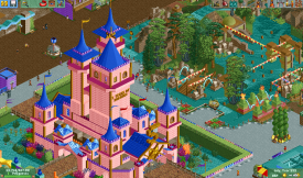
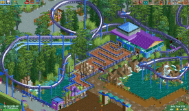
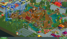
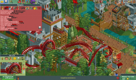
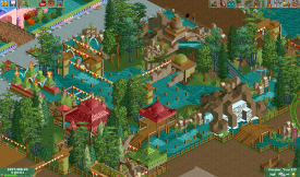
Have fun, despite my style in the game. />/>
/>/>
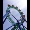
Yes, Hangman is a roller coaster layout of Kaboom by disneylhand, with some modifications
-
 AK Koaster
Offline
Really like the ZacSpin style Multi-dimension coaster. The rapids ride in the last screen also looks very well done in terms of scenery
 -

 Cocoa
Offline
very bright and refreshing. good work.
just that grey path with the stripey border that curves on the corners? bleeeech
 Tags
Tags
- No Tags
