(Archive) Advertising District / Zac's/ Shotguns?'s stuff thread.
-
 13-May 12
-

 Xeccah
Offline
Aww, I was expecting one of your GIF's to go with this as well. Guess its not good enoughRevolutionary! Great Idea! OMG!
 .
.
-

 Arjan v l
Offline
Don't worry to much about the sarcasm Shotguns? ,you're doing allright.
It seems that you're always full of ideas and motivation, but like said before ,use your ideas and motivation to build for fun and not for screens. Do you really need so much feedback all the time? I don't think so ,because you're definately talented.
Build a park or design and finish it, you can do it.
Screens are nice ,but a finished park or design is what i really would like to see and that also gives you points, right.
Good work, keep at it.
-
 ScOtLaNdS_FiNeSt
Offline
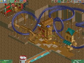
The half buildings seem very nice. But again as i think i said to you before, Finish alot more of what your doing before producing screens. I think when you have a half finished screen and you get compliments you dwell on them to much rather than building something. So keep going, If you need help finishing give me a PM
 -

 Cocoa
Offline
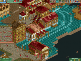
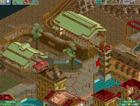
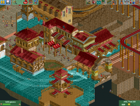
nice detailed work! just curious how you're going to pull that all together... I know too well the pain of having big blank spaces and nothing to do with them. btw, i would suggest using real water myself.
 -

RMM Offline
i feel like you focus completely on one structure, one minute area, and because of that, you fail to bring multiple parts together to complete the big picture. -

 Ruben
Offline
good start
Agreed. And I could use this comment on almost every screen you've shown lately. And thére lies your problem, maybe it's time to try and keep your attention at óne specific project? It's much more rewarding to finish stuff, or at least create something substantial. -

 Super G
Offline
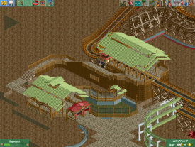
I adore that coaster station. The rest looks nice too, I just don't like that green building in the first screen, there are just too much details in there.
 -

 Xtreme97
Offline
The artificial water looks really ugly and glitchy and those two trees are very badly coloured. The station is great, but it really doesn't look like it belongs in that setting.
 -

RMM Offline
i like where you're heading. it's different.
try to build for a week or two and then post a screen. that way it's obvious that you built what you want and not what you think we want.
 Tags
Tags
- No Tags
