(Archive) Advertising District / Zac's/ Shotguns?'s stuff thread.
-
 13-May 12
-

 Ling
Offline
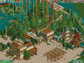
I don't like the foliage, it seems very disjointed with everything somehow. The architecture and all looks pretty nice, though.
 -

 Hex
Offline
I agree with Ling about the foliage. I also think that that wooden roof could use some depth if you get what I'm trying to say. Make it more than just an angled roof. Spice it up. Other than that I'm liking what I'm seeing. I'm a big fan of the Arabic / Village themes.

-

 Xeccah
Offline
Speaking of, I am weeman from TPR, so ome of the screens I've shown there may be a part of this park.
 -

 Xeccah
Offline
BC it is nsco or what seems to be. you can't get much more detailed than that.
It is ncso. -

 Xeccah
Offline
^^Have you looked at fizzix's stuff? His stuff is way more detailed than this..
Yeah,but I would say his is too detailed, to the point where it starts to look messy. -

 BC(rct2)
Offline
That's not true, in NCSO you have so many ways to detail buildings, you just have to discover them with your mind and be original, yep is not easy, but if you wanna create cool things you have to do itBC it is nsco or what seems to be. you can't get much more detailed than that.

-

 Scoop
Offline
so cool and quality isn't your style.
haha
Anywho I digress. honestly it is a little slack but that is just my taste because i don't prefer nsco. other than that its decent. -

 BC(rct2)
Offline
No, and if you're saying that, you're offending the other players that don't build NCSO.
 -

 Xeccah
Offline
That's not true, in NCSO you have so many ways to detail buildings, you just have to discover them with your mind and be original, yep is not easy, but if you wanna create cool things you have to do it

First of all, I implement well over half of those, but thanks for the concern.
And can you please stop bitchfighting? -

 Ling
Offline
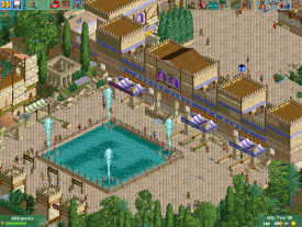
I like the second screen, of the entrance. However, there are glitches everywhere. There are what appear to be giant full-tile flower beds stuck right on top of the paths, clipping with their sprites so only showing up around the edges. Paths don't quite connect in various spots (particularly near the building at the top left of the screen), and I think it needs path details that aren't just smacking down ruins in the middle of it. Could maybe use one more color blended in as well, although I admit I like the scheme you have going now.
The first screen is less fun to look at, for similar reasons. The foliage is everywhere, the ruins all over the paths are just too much, and the overhang doesn't appear to be supported (simply unfinished, I take it). I don't like the color of the flowers, nor the way they just sit on the water. If you're going to cram foliage into that area, make most of it under the water. -

 K0NG
Offline
^^Have you looked at fizzix's stuff? His stuff is way more detailed than this..
But, Fizzix can't build a magical, floating trellis. These guys did.
'nuff said.
3:06
 Tags
Tags
- No Tags


