(Archive) Advertising District / Zac's/ Shotguns?'s stuff thread.
-
 13-May 12
-

 chorkiel
Offline
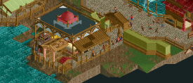
Great improvement! I'd say ditch or recolor the water though it looks terrible as of now.
 -

 Ruben
Offline
Are you secretly Liam and Levis' lovechild?
No really, your style looks like the perfect blend of their styles. It has a lot of detail, but also that touch of fantasy. And the overall color scheme is one I haven't seen in a while. Which is good, 'cause it's refreshing and different from most work on NE lately. Please just get rid of those water objects and find another solution, they're ugly and glitchy.
I like where this is going at. Hope you can find the motivation to finish it.
-

 Liampie
Offline
Are you secretly Liam and Levis' lovechild?
Oh god no. All I can say is organise your work because it makes your work much more better. Those RoB-reminiscent screens are your best yet.
-

Wicksteed Offline
sorry, I don't really see the great improvement in these last screens. They are good screens, don't get me wrong, but the only thing that changed, is that you're using a newer bench and thus building more detailed. But theres not more atmosphere or ideas in it. -

 Ruben
Offline
sorry, I don't really see the great improvement in these last screens. They are good screens, don't get me wrong, but the only thing that changed, is that you're using a newer bench and thus building more detailed. But theres not more atmosphere or ideas in it.
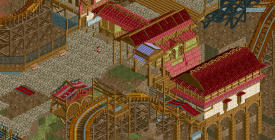
Have you seen that 4x2 building at the bottom of that first screen? The tower at the 2nd screen? That bridge at the third screen? That's what the improvement is, it's getting a lot more creative, refined and ''unique''.
@Liam: Come on dude, even you have to admit that it sure looks like it. XD -

 Xeccah
Offline
thanks for the comments, release topic might be coming tomorrow because i'm over halfway done.
 -

 Fizzix
Offline
For the most part, I like it. The fake water brings it down for me though. Nice color scheme, and cool archy. Interested to see this in game.
 -

 Austin55
Offline
The Q and station in screen 2 are really great, I especially like the walkup to it. BUT on everything else I think the thing that I don't like is that your trying do a lot of detail but I don't think you have a good grasp on it yet. IE, it's messy. Not every wall needs a window, not every window needs a roof.
Good stuff though, keep at it. -

 Xeccah
Offline
You shouldn't be coloring the water at all. Just use normal water.
you see, i cannot do that now -

 Cocoa
Offline
^yes
It seems like you are getting quite proficient at detailing but it is not really coming together as a whole. one thing that really sticks out for me is the wooden coaster roof, why use trackitecture if you don't need to, and it detracts from the overall 'detailed' look of the roofs as a whole? it just looks silly, and as if you just though "everyone at ne loves trackitecture, so I'll just throw some in there." also, that shade of green needs to go. barf. there certainly is a proper way to use that color, but you're not pulling it off.
maybe we just need more finished screens though, its hard to tell.
 Tags
Tags
- No Tags
