(Archive) Advertising District / New LL Design Project [Cyclone]
-
 30-March 12
-

 posix
Offline
'gir', on 10 Apr 2012 - 03:31 AM, said:

So good to read from people who understand the gameWow. Technically it's all very good, but overall the screens seem very stiff, if you know what I mean. Almost everything has some sort of boxy character to it that just doesn't sit well with me. The colors are also so muted, you need to spring some life into this park! Some flowers wouldn't hurt.

-

 MikaRCT2
Offline
The busses don't look very good imo. Those tires are made of wood, but the tram on top isn't
-

 SSSammy
Offline
it's loopy landscapes, and those buses are bloody fantastic. you build a better one.
 -

 MikaRCT2
Offline
I don't have LL so I can't make one. I said that they don't look very good imo. I didn't mean to say that they're badly made, which they aren't.
 -

 insan sıradan
Offline
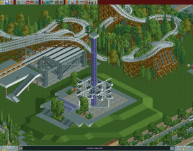
This is new custom flat ride motivated by
http://www.flatrides...ges/condor.html
But, I think it's messy...and please give me opinion how I improve it.
-

 posix
Offline
That's a pretty good Condor. Maybe a little too boxy and square? I think bobsled cars might be a better choice. Since they are pretty small you could perhaps use the diagonal ones as well, meaning 8 cars per arm. This would make the circles more recognisable as well I reckon.
 -

 Fizzix
Offline
Yeah, that looks great, although I agree with posix' idea to put the diagonal cars on there as well.
 -

 imawesome1124
Offline
I don't really know anything about LL, but this is great and the Condor is really well done.
 Tags
Tags
- No Tags

