(Archive) Advertising District / New LL Design Project [Cyclone]
-
 30-March 12
-

 MikaRCT2
Offline
It's good that you put some effort in the supports, but yeah, just keep the standard supports
-

 Cocoa
Offline
The game that is in the images is RCTLL? or RCT1?
LL is an expansion pack for rct1. without it, there's very little in the way of scenery or architecture to work with.
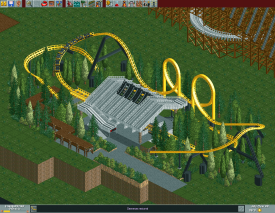
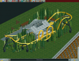
what you have is OK, not that fantastic. If you're going for realism, the schwartzkopf makes no sense because it has no visible launch section and a weird layout, and anyway schwartzkopf didn't make launch coasters like that (but I guess he could have?). And the woodie layout seems pretty good, but I'm worried that it would get too slow for the majority of the ride.
to fix the yellow one, put the station at the end of that long stretch of flat track, and put a brake run leading into the station. Then put launch sections on the straight bit that contained the station before you moved it. -
 Corkscrewy
Offline
I actually kind of like it now that its got some scenery. Oh, and using the signs as posts is great.
The first screen in this thread is hilarious. Everyone has a green light.. seems to me that might be cause for a couple accidents..
-

 Cocoa
Offline
I don't understand why your launch section is so damn tiny and yet you have a giant strip of straight tack just before it? seriously, turn that straight into brakes and a station and then after the turn have a proper sized launch.
^I'm pretty sure those are green street signs
-

 Louis!
Offline
It looks a lot better now it's complete. It will be interesting to see where you take this though.
 -

 insan sıradan
Offline
Hmm...
Thank you for replies and I'll refer to your opinions.
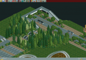
This is park's some places.
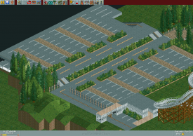
*Parking Lot Final
Hmm, louis said that yellow fence is not suitable for road, but I used it for centerline...
If it is not suitable for centerline, than please give me another fence object to alternate it.
*Fedestrian
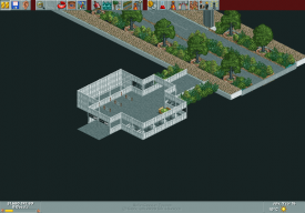
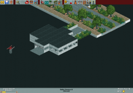
*Park Entrance(NOT complete)
-

 Ling
Offline
I don't think those cars/trams/buses/whatever in the road are really necessary... they just look awkward. The parking lot looks good. The park entrance could use a little more level variation, angles, and colors. Right now it's a giant black & white box.
 -

 pierrot
Offline
yeah. I'm not a great fan of that entance too, pretty poor for park entrace imo.
like Ling said, you need to make it looks more welcoming. -

 Louis!
Offline
I quite like it.
I don't remember saying the yellow fences were unsuitable though you must mean someone else!
But whoever said that, I agree with them, they look a little out of place. Try the bone fence which would make them look white.
I agree with the entrance comments, it's a bit small and not very grand, where typically the entrance to a park is the best looking area (at the time of it's construction) as it's the first thing people see when they enter.
But it's nice. -

 posix
Offline
Yeah, I think you may want to try different fence objects there perhaps?
I think the screens are pretty interesting. Just alwasy crazy to me to see this ultra-hacking style.
What I would suggest is that you adjust the ground textures a little. It looks a bit unnatural that everything is just grass underneath. I would mix some jungle or dirt texture where it makes sense. -

 gir
Offline
Wow. Technically it's all very good, but overall the screens seem very stiff, if you know what I mean. Almost everything has some sort of boxy character to it that just doesn't sit well with me. The colors are also so muted, you need to spring some life into this park! Some flowers wouldn't hurt.
 Tags
Tags
- No Tags


