(Archive) Advertising District / New LL Design Project [Cyclone]
-
 30-March 12
-

 Ruben
Offline
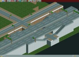
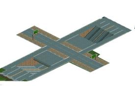
I don't know a lot about LL, but I do know I think this is some of the most realistic LL-ing I've seen done.
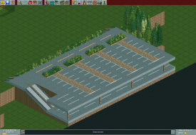
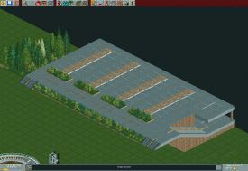
 Only thing is that the ramps are rather short, don't know if you'd want to voluntarily drive up that highroad in its current state.
-

 Dimi
Offline
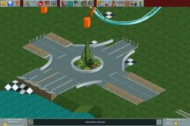
If you're going for full realism the ramps are too short, especially in the left bottom of the second screen, but otherwise it looks very well done! I like how you used long instead of short stripes and how you did the roundabout.
 -

 pierrot
Offline
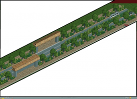
add some guardrail on both sides at the first screen, then it will be perfect screen.
-

 insan sıradan
Offline
@Ruben//Thank you very much
I'll modify ramp length...
@Dimi//Thank you, too
@pierrot//Yeah I know...
But there is not suitable fence object I think. -

 posix
Offline
Looks very nice but I would use the roads that are in LL already as much as possible.
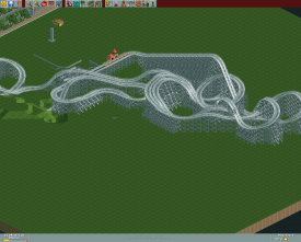
I don't like the barrels much. They've just never worked as pillars or beams for me. I suggest to try the glider coaster instead, and if you want to hack as much as you do, maybe finely stacked steep track pieces of steel wild mouse coaster like pierrot has been doing it.
What I really like are the glass fences as signs. Works very well I find.
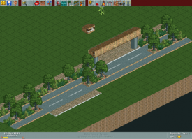
The quality of the BRT screen is in fact a bit low. I can't really see too well what you have there but the trees look nice. It's rare that people make this tree look good. -

 posix
Offline
Haha, the busses are ace!
I'm afraid I don't recognise these gates though. I think I've never seen something like this in real life maybe. -

 posix
Offline
I like it. I would not use the half-sunk wooden fence between roads. As outlines and boundary of flower beds they work wonderfully though, just not between roads for me. Also still sceptical of the barrel pillars, but that's just me I guess.
 -

 insan sıradan
Offline
posix/
thank you
and I'll find another fence object to replace it.
MikaRCT2/
Yeah, I'll try it.
thank for advice. -

 MikaRCT2
Offline
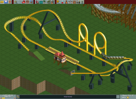
The supports of Cyclone are a bit weird. The main coaster is good I think
EDIT: The supports of Thunder are a bit weird. The main coaster is good I think

-

 Liampie
Offline
I'm liking the layout. I don't like the yellow coaster much... I think the default supports will look better than custom supports here.
 -

 BC(rct2)
Offline
The wooden coaster it's really good but the yellow...not so good, the supports are a bit awkward.
-

Airtime Offline
Yea I agree with Liam here. It's such a small coaster there isn't much point in custom supporting it. It's not bad though
 Tags
Tags
- No Tags
