(Archive) Advertising District / Au Naturel
-
 17-March 12
-

RMM Offline
^ahahaaahaa oh shit, i'll never be able to take anything you say seriously with that avatar.
fucking great. -

 Liampie
Offline
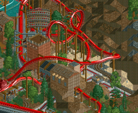
It's hard to comment on this screen but it's good to see progress. I never thought I would say this regarding LL but I hope you'll clean up those supports!
 -

 Cocoa
Offline
Is that inspires by powder keg? Maybe the color scheme is too cluttered but its hard to tell from that screen. Excited by what you make as always though
 -

Airtime Offline
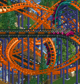
Cocoa, its not powder keg, It's Smiler esque since there's 2 lifts and ones vertical. It's also a compact layout with a few inversions and 4x4 trains.
Love it. I'm looking forward to seeing the layout since your one of the first to attempt a Smiler style layout. My interest in this project is higher than ever and it was pretty high before.
I'm not a huge fan of the climbing course structure because I think the scale is huge. It's similar to that huge building in Raven that doesn't fit. It's good don't me wrong but it's too large IMO.
Really can't wait to see this, glad to see your still building on it. -

 Loopy
Offline
Airtime hit the nail on the head. It's supposed to be a Smiler-esque Gerstlauer.
I've been trying desperately to drop the intensity rating down from 12 but I guess throwing 11 inversions onto a coaster will prevent me actually doing that.
It was probably the most fun I've had trying to build a layout given the small footprint. I'd recommend others to give it a go, it's quite a challenge. -

 Kumba
Offline
Rating eh? Any chance that means you'll have peeps in this? The Beast can freeze any rating you want in LL, but pretty much no way you can get a decent one without a hack when its got 11 inversions.
That elevated adventure course is great, just it looks like they could fall right onto guests on the path.
 Tags
Tags
- No Tags

![][ntamin22%s's Photo](https://www.nedesigns.com/uploads/profile/photo-thumb-221.png?_r=1520300638)


