(Archive) Advertising District / Au Naturel
-
 17-March 12
-

 disneylandian192
Offline
This is looking amazing! Screens like this make me so excited that a new LL disc is on its way soon.
 -
 Loopy
Offline
Better late than never to answer some replies.
Loopy
Offline
Better late than never to answer some replies.That's a huge barn, and honestly I don't like the coaster's colours very much. But otherwise well done. Very clean, yet detailed. Love the scarecrow, even though the head is way too big. No, I actually I love it especially because the head is way too big.
 />
/>
The scale of the barn was something I had a long think about when trying to design this ride. I feel if I lowered the roof level much more it would look a little too small and out of proportion. I wanted it to be large enough to be the stand out feature of the area and the building itself is the central theming element to the GIB.
I've found these coaster colours a bit of a pain to get right so they aren't the same as they were when this screen was taken. I think the new colours suit it a little better and aren't quite as dull.Are they supposed to be lockers on the left of the screen?
Great screen but I also think the barn is to big. I kind of worry that it may subtract from the area because the scale looks big. It's at least a couple of stories too tall.
You make me want to play LL. Stop it please />
/>
They are indeed lockers, well spotted!
Whilst I'm here I'll post a quick progress update and update the first post with all of the previous screens:
Wilderness Peaks: 95%
Thunderhead Canyon: 90%
The Riverbank: 75%
The Woodman's Trail: 40%
Wilderness Pass: 30%
Pine Crest Ranch: 25%
Tomahawk Ridge: 10%
Frontier City: 0%
The Fort: 0%
Potential final area (object limit depending): 0%
Overall progress: 45%
Managed to get a good chunk of the work done over the last few weeks but still a long ways to go. The thing I'm enjoying most is because of the harmony of the themes it makes flowing between areas so easy. It's really helping me speed up the build process.
One of my main concerns right now is custom supporting all of the parks coasters as the supports are going to use up a large amount of object space. My plan right now is to leave the remaining support work until the park is finished and if it seems plausible that it can be done I'll finish the job. -

 Cocoa
Offline
^seriously true. if it stops you finishing the park then forget them
 I never custom support in LL (more from a laziness perspective though)
-

 Loopy
Offline
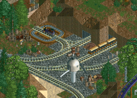
I've had quite a productive weekend on this so on a macro level it's really starting to come together. I'm splitting my time now between wider building and going back and adding little details to some of the less detailed areas. I'm currently working on a train yard for the steam train ride:
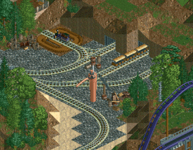
I'm not totally sold on the colour of the water tower and I may lower it down a unit so it's more flush with the train height. -

 Arjan v l
Offline
^^ love it, especially that turn bridge with the rail, if that's what it's supposed to be.
 -

 disneylandian192
Offline
I don't understand the point of the turntable as the train could technically "k Turn" as a car would. Nitpick aside, this is looking fabulous. A little unsure of the color of the water tower, but love the rest.
 -

 Louis!
Offline
I don't really think the turntable looks all that good, and you can't tell the water tower is a water tower. I think it could be so much better, especially from you!
 -

 chorkiel
Offline
you can't tell the water tower is a water tower.
This exactly. I've looked at that picture for a good while and had to read your comments saying it was a water tower to know it. -

Airtime Offline
I like it but I feel there's a massive overload with the rock land texture. I think you'd only really need it under the railroad or right next to the track. I think if you reduced some of it, it would look a lot better. I also feel like like, while the turntable is a good idea, it's in the wrong position? Great to hear this is still going Loopy. -

 Cocoa
Offline
#4carsperswag
on a serious note, we should probably stop this hashtag business before it devours us all -

 Louis!
Offline
That is a vast improvement.
Not really sure why there would be a viewing platform there, when a train yard would normally be back stage, and not actually have a lot going on in it, but hey ho. -

 Midnight Aurora
Offline
The whole park doesn't have to be filled with action, especially if the park's schtick is being a woodsy place. Some people get off on coasters. If Transport Tycoon tells us anything, it's that some get off on watching trains spin in circles. Or making parking lots, if observing this website. My point being that it's quaint, and well done for what it is. I think the foliage could be done a bit better to smooth it out some, but otherwise, it works, and I'm not sure you need more than that.
 -
 mintliqueur
Offline
This looks really promising. I can also see it winning spotlight. I especially like the train yard with the turntable, really, really well executed!
 -

 Loopy
Offline
MA nailed what I was going for. The park's attractions aren't all high tech rides, I've tried to mix them in with experiences and educational attractions for the whole family.
Speaking of family rides, I wrapped up one of them this morning that aims to appeal to all the young daredevils out there, Big Red's Aerial Adventure:
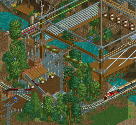
Guests can climb, test their balance and pull themselves across two levels of lumberjack style fun in the trees above the stream below.
This will probably be the last screen I show for a while but things are progressing very nicely. I get more and more worried by the object limit as I continue to build. There are still a lot of gaps in the map but hopefully it won't be as much as a problem as it was with Silver Valley.
 Tags
Tags
- No Tags


