(Archive) Advertising District / So I'm packing my bags for the Smoky Mountains
-
 02-March 12
-
 Fizzix
Offline
You've really got a grasp on this theme. Excellent, excellent screen. I agree with CP6 about the teal roofs though, I think they kinda stick out in a bad way. I would reserve those super strong and vibrant colors for the fair section(if you're building that part). Overall a really nice park you've got going on here.
 -
 Steve
Offline
I agree that both screens are pretty spectacular (the second one, more so). I'm still not sure on the coaster support colors, though. They do add a sense of originality I suppose but I still think a different color could really bring some life to the area. I'm also not sold on the station. While it's a great building, I think it's much too tall and not "open air" enough. I think by revisiting this you could pull off a pretty convincing realistic station for it. If you decide to keep it, lose some of the windows! I like everything else so far.
oh, and ps, I love your avatar, Dimi. -

 Nitrous Oxide
Offline
Wow man! This is really something special. Really look forward to seeing more.
 -

 FredD
Offline
All the screens you've showed here so far are just amazing
 Like Liampie said, they have just everything: great use of colors, great foliage, great archy, great atmosphere,... There is not 1 little thing I could find and say I didn't like.
-

 Dimi
Offline
Thanks again, everyone!
@ Pacificoaster and Cedarpoint6: I know the first screen looks pretty Disney, because it was kinda meant to be so. As I've stated, this is not a Dollywood recreation, and some areas will be very different. Because I prefer inspiring over copying, but also because I simply can't find any good picturs of some parts of the real Dollywood. The area shown in the first screen is the transition zone between the entrance, the fair zone and the Stone Rose Falls and West Ryder Pauper Lunatic Tornado area, and will look a bit like Disney's fantasyland. I've always wanted to do that theme and this seemed a nice opportunity. You'e right about the black roof, I will add some more airco's and stuff. I'm happy about the parasol colours in the second screen so I probably won't change them. I know the transfer track is a bit close to the underlying track, but this is where I prefer aesthetics over realism. It's too late too change it anyways.
@ Turtle: like Liam and Louis say, having the same support colour is what makes the coaster and unique and creates the specific atmosphere.
@ Super G: that would be awesome of course, but even if the quality is good enough, the park will probably be too small for spotlight. I'm aiming for a regular high gold.
@ Fizzix: really? I love the teal roofs. It's something different than always bright walls and dull roofs.
@ Steve: I'm pretty happy about the station but I will use your tips. Are you a Wes Anderson fan as well?
To celebrate being picked so early and in such a great team in H2H6, here's another screen. It's the oldest and probably least interesting part of the park but so be it. I have to say it looks way more brown in the screen than in-game. The wooden coaster is called Thunder for the Deaf, the enterprise's name is Exit Planet Twist.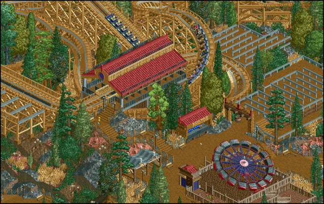
-

 Ruben
Offline
Like what I'm seeing, just not the coaster color. To me woodys should be darkish brown or white, but that's just me being narrow-minded.
Edit: P.s. is it just me or is there a piece of fence missing just next to the enterprise's entrance? Just sayin'. -
 Pacificoaster
Offline
Pretty nice screen there Dimi. It is brown, as you mentioned. Not a big fan of the queue. You could definitely liven it up a bit with some awnings or some sort of queue structure that preferably has a textured roof with an aqua or other natural color. From my understanding, GCI does not do transfer tracks like that, nor have they ever done 10 cars per train.
 -

 wheres_walto
Offline
The only thing I would change is the red mars land texture to the smooth red texture.
 -

 Dimi
Offline
So many reactions already!
@ Ruben: normally I like dark brown better as well, but it didn't fit with the foliage at all. When you see the coaster surrounded by foliage and the rest of the park I think the colour looks pretty good. The missing fence is were the peeps are supposed to get in on the attraction.
@ Pacificoaster: you might be right about the queue, some blue awnings could work really well. I don't care for the coaster company, number of cars per train or the realism of the transfer track though, as long as it looks good it's ok for me.
@ trav: cartoony? Nice!
@ wheres_walto: in some places there's smooth red texture, in others there's red rock, it probably depends a bit ofn the angle of the screen. The tiles above the white tent could use some smooth red though. -

 Ruben
Offline
''The missing fence is were the peeps are supposed to get in on the attraction.''
Of course... could have known that, nevermind. (A)
Btw, have you got a coastercount for us? Or a map size?
-

 tyandor
Offline
mmm... I like this screen and the previous ones.....
Yet this screen also makes me slightly concerned. Obviously I don't have the full picture and scope of the park to judge, but this last screen also makes me wonder how much variation this park is gonna have. The style is great, but if the whole park is going to be like that I'm not certain how the total package is gonna be. Depends a bit on how large the park is though, but too much of the same can get stale fast, keep that in mind. -

 FredD
Offline
I wouldn't want to wait for that coaster when the que is full
 Looks great, I don't think it looks too brown.
-

 Dimi
Offline
The map is 125x125, but I guess only about 70% will be occupied by the park itself, the other 30% will be surroundings, mostly forest. The coaster list:
- Squirrell & G-Man's Terror Trail (finished)
- Thunder for the Deaf (finished)
- West Ryder Pauper Lunatic Asylum (finished)
- Wild Eagle-inspired B&M Wingrider
- Blazing Fury-inspired indoor coaster
- Probably a small kiddie coaster in the fair area.
Tyandor: most of the park will be built in this 'style' (landscaping, foliage, mostly wooden architecture), but the entrance and fair area will be quite different. Don't forget this was originally meant to be a little side project, it just turned out pretty well.
-

 Fizzix
Offline
Thunderhead is my favorite woodie, and I'm glad your interpretation of it looks so good. I would suggest adding a few queue covers sparsely, because it gets hot as balls in Tennessee sometimes, but other than that, great work.
 Tags
Tags
- No Tags

