(Archive) Advertising District / Python/De Vliegende Hollander
-
 22-February 12
-

 Six Frags
Offline
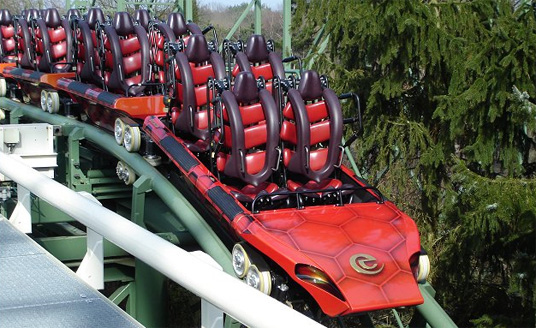
You don't do the little bunny-hump after the second loop?
 I know it's kinda impossible to get right in rct2 but there's still a bit of airtime there and it's personally one of my favorite Python bits
Anyway, I really like the atmosphere in there, especially the foliage is great! -

 Fizzix
Offline
Love the little mast on the roof of that building and those yellow flowers. Overall, just good vibes all over the place.
 -

 nin
Offline
Great sight lines from the path, looking over the flower and water to the coaster. I love that.
 -

 posix
Offline
Very nice Liam. Still thinking the greenery is too overpowering, but whatever, the screen has a charming atmosphere to it.
 -

 FredD
Online
Looks very Eftelingish, very nice job on the foliage! It has a nice atmosphere. Don't like the layout, but it's not your fault the ride designers at Vekoma suck
-

 Liampie
Offline
Thank you all! Glad you like it.
Liampie
Offline
Thank you all! Glad you like it.You don't do the little bunny-hump after the second loop?
I think this is the best solution for an aesthetics focused RCT-interpretation. I could've included the bunnyhop, but then there would be an ugly, boring 180 degree turn. I prefer it like this.
It's a stand-up coaster...nothing like the Python...
It's the closest to the previous KumbaK Python Trains:
Very nice Liam. Still thinking the greenery is too overpowering, but whatever, the screen has a charming atmosphere to it.
I didn't know you find the greenery overpowering. Do you think there's too much of it? Too dense? Too distracting?
I'm not familiar with facial golden showers but I assume it's a good thing?Completely too crazy. Like an angel is peeing in my eyes.
-

 Steve
Offline
The landscaping and foliage is unreal. It is dense and very green, yes, but I find it fitting. I love the corkscrews going next to the pond, there.
also,
What the actual fuck.Completely too crazy. Like an angel is peeing in my eyes.
-

 tyandor
Offline
The landscaping and foliage is unreal. It is dense and very green, yes, but I find it fitting.
It's more than fitting, it's also true for the real Efteling. For instance if you go on the Pagoda (observation tower), you won't see much more than trees. You hardly see any of the other stuff because the woods are so dense there. -

 Super G
Offline
The corkscrews are in the wrong way. They have to go from the outside to the inside. The real ones are diagonal, so that's impossible, but maybe you can change that? The rest = like. Really nice to see someone creates such an atmosphere that is right in the rose with athmosphere, foliage and archi.
BTW, if you ever need some photo's, just PM me, I come there every week so shouldn't be too much work .
.
-

 Faas
Offline
They're not recreations, but they are instantly recognizable and have the same feel. I'd say it's like 75% accurate.
-

 posix
Offline
I think there are too many tall trees next to each. Like forest in the middle of the park. It's a bit distracting. You've also chosen the bright green tone almost exclusively which pushes onto the eye a lot. I'd allow some bareness of land, some more ground texture work that compliments the greenery.Do you think there's too much of it? Too dense? Too distracting?
-

 Liampie
Offline
I think there are too many tall trees next to each. Like forest in the middle of the park. It's a bit distracting. You've also chosen the bright green tone almost exclusively which pushes onto the eye a lot. I'd allow some bareness of land, some more ground texture work that compliments the greenery.
Coincidentally, the next screen might please you:
95%.
 Tags
Tags
- No Tags


