(Archive) Advertising District / Python/De Vliegende Hollander
-
 22-February 12
-

 Liampie
Offline

The Concept
Eftel Towers was my first 'good' park. At least it was the first one I finished, back in early 2007. The idea of merging The Efteling and Alton Towers still interests me. Both parks are very spacious with lots of tranquil areas. Both are theme parks, but not in the usual way of having themed areas. Yes, Alton Towers and to a lesser extent the Efteling pretend to have theme areas, but actually almost every ride has it's own theme or little area.
Over the years I gathered many new ideas and inspiration, and more skills to pull off things I couldn't do in 2006. Eftel Towers 2 was inevitable all the time. Looks like the end result will be more Efteling-oriented than Alton Towers though, I think the inspiration-ratio is 60/40. I'd also like to add that my Alton Tower interpretation is from the Tussaud's era. Although I haven't visited the park since 2005 it looks like they're raping the park with shit rides now pretending to be tough and shit. Like Thorpe Park. Hate it.
Notable rides/areas under construction
- The Python
- De Vliegende Hollander / The Flying Dutchman
- Joris en de Draak
- Eftel Towers Railway
- Anton Pieck Square
- Katanga Canyon / Diorama merge
- Air
- The Fairytale Valley
Notable rides/areas/ideas planned
- Gondoletta + Pagoda
- Nemesis
- Duel
- The Towers
- Vogel Rok with Fata Morgana exterior
Advertising
I realised that advertising is more fun than releasing. The amount of screens posted will rise exponentially as the park is progressing. I will keep no (or little) secrets, as long as I'm not showing highly unfinished stuff.
23/02/2012
This is what I made just today. A stream of consciousness that worked out well, another of my playgrounds, no hacking involved. With a new object.

Of course, the screen is likely to change in the upcoming months/years. I'm not quite pleased with the timber framed section, but what the fuck.
The map so far. It looks more finished than it is. Progress: 10%?
Enjoy. -

 SSSammy
Offline
real nice! i feel as though the place where your work falls down is the rides/ride interaction. i'm sure you are capable and humble enough to reach out to other members of the community to help this become the park it deserves to be.
 -

 coasterfreak101
Offline
Love the building, especially the arches underneath the awning! The small foliage area the train passes through feels really awkward though.
 -

 leonidas
Offline
I love it, the Efteling-architecture is flawless, although I think there's too much brown.
(A weird habit of many Dutchies) Especially the roofs could use another color.
I really like this atmosphere. Keep it up! -

 JJayMForce
Offline
Looking good. Looks like the custom object would be the quarter hedges?
I will definitely keep an eye on this, and good luck! -

 Louis!
Offline
The use of fisherman's arch object as a diagonal hedge is great, I think two smaller ones would work better though as the arch would then be less pronounced and more easily hidden.
Great work though, this is the Liam I like to see. -

 posix
Offline
I think it's a very nice and solid topic by the way, not lacking all that grandiosity you mentioned.this is the Liam I like to see.
Very nice screen as well. Showcases your ability to capture subtle atmospheres which is so rare these days and always impresses me when you do it. I like also how you balance the right amount of details. It's very detailed but still feels right and not overladen. -

 FredD
Offline
That building is just great, I love that gray rooftop you build there. Make sure you build more attractions than the Efteling (because I think they have too few attractions).
 -

 Dimi
Offline
Great screen of what is going to be a fantastic park. I'm not sure yet if I like the brown path or not, it bothers me that it's the same colour as most of the walls of the building. I also don't like the many different ground textures in the playground, but I guess isn't finished yet over there.
 -

 highroll3r
Offline
i love your style!!i hate the diag arches as a hedge tho. i dont think its a problem squaring it inwards.
something i can consider is like, foam floor tiles in the park. all parks around where i live have this safety floor tiled areas. i think itll look better than just using ground textures. up to you. -

 Liampie
Offline
Thank you all!
Don't worry man. 1; maybe I'm not as bad as you think, I've never tried heavy ride interaction yet. Let Nemesis be the judge. 2; I will deinfately call in someone when I need help. Legacies was prestige, this time I just want to make a good park. Not the park for my benefit, but myself for the park's benefit.real nice! i feel as though the place where your work falls down is the rides/ride interaction. i'm sure you are capable and humble enough to reach out to other members of the community to help this become the park it deserves to be.
Maybe.I love it, the Efteling-architecture is flawless, although I think there's too much brown. (A weird habit of many Dutchies) Especially the roofs could use another color.
 I think this area's colours are very well balanced, although the timber framed building kills the flow.
Yes! A quarter block version and a wall/fence.Looks like the custom object would be the quarter hedges?
Haha, I placed that arch there hoping that nobody would notice.The use of fisherman's arch object as a diagonal hedge is great, I think two smaller ones would work better though as the arch would then be less pronounced and more easily hidden.
 I will make a diagonal hedge object, because there will be many more diagonal hedges in the park and I won't get away with arches all the time.
I think the real Efteling will have more rides in number, but my park will have more 'ride'-rides (Alton Towers influences!) if you know what I mean.That building is just great, I love that gray rooftop you build there. Make sure you build more attractions than the Efteling (because I think they have too few attractions).
Good point. I already thought of using casual crazy paving but the rest of the area has a lot of these dark brown paths so I automatically continued this. Having trouble with diagonal sections, so I think I'll ban the dark paths from the whole park actually. There's nothing wrong with casual crazy paving except fot being casual.Great screen of what is going to be a fantastic park. I'm not sure yet if I like the brown path or not, it bothers me that it's the same colour as most of the walls of the building.

As I said... I hoped nobody would notice.i love your style!!i hate the diag arches as a hedge tho. i dont think its a problem squaring it inwards.
 Don't worry there will be a diagonal hedge.
Sand is perfectly realistic and 100000x more atmospheric than foam. I'm sticking with sand.something i can consider is like, foam floor tiles in the park. all parks around where i live have this safety floor tiled areas. i think itll look better than just using ground textures. up to you.
 Thanks for the suggestion though.
-

 ScOtLaNdS_FiNeSt
Offline
Looking real good LP. As someone else said the use of the diagonal arches is a good idea...Someone should make diagonal hedges
 . If there is any GS pm me
-

 Cena
Offline
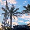
Give me a goddamn screen about DvH. I see you are almost done completing that little area. Thanks
(looking forward to the rest, but this the most since many have tried, and everyone failed at recreating it ...) -

 Super G
Offline
As someone who visits the Efteling every week, I think you've just got that Anton Pieck style!
 -

 Liampie
Offline
I will make diagonal hedges when I find some motivation to draw the new texture. For shading reasons I can't copypaste the existing texture. I wouldn't mind if skilled object makers like Kumba, Cena or K0NG volunteer.Looking real good LP. As someone else said the use of the diagonal arches is a good idea...Someone should make diagonal hedges
 . If there is any GS pm me

I can post a screen very soon after I'm done with the supports. Hopefully within a couple of weeks. Can take either days or months.Give me a goddamn screen about DvH. I see you are almost done completing that little area. Thanks


It's not really an exact recreation, but to be honest, I think I won at 'most accurate', atmosphere-wise. It feels very accurate to me. I'm proud of it.(looking forward to the rest, but this the most since many have tried, and everyone failed at recreating it ...)
If it ain't broke, don't fix it.Fixed that for you.
Thanks man! The most important opinions on this come from the people who understand what style and atmosphere I'm aiming for. Wait for the Anton Pieck Square. In my opinion it's the most atmospheric architecture I've ever done and it's why I've been hyping this park recently.As someone who visits the Efteling every week, I think you've just got that Anton Pieck style!


Update #2
Anyway here's something new. First screen from the Fairytale Valley. Sleeping Beauty bitches!!
- Completed: Sleeping Beauty, The Six Servants
- Under Construction: Anton Pieck Square, Katanga Canyon/Diorama merge, The Python, De Vliegende Hollander, Joris en de Draak, Air, Rapunzel, Eftel Towers Railway
- Overall progress: 13% -

 Cocoa
Offline
I LOVE the atmosphere thats going on there. so simple and perfect... and the foliage is crazy but loveable.
 -

 Liampie
Offline
What do you mean by all over the place? I admit that the foliage is actually very experimental.
 Tags
Tags
- No Tags

