(Archive) Advertising District / SWP&E
-
 01-January 12
-

 Phatage
Offline
I think you should remove the foliage completely. Any natural foliage that was there pre-coaster would've been removed during construction, and if they were to plant back anything, it would look that way rather than this 'organic' foliage. I also think there are too many flanges on the supports, i.e. that each support section is way too short.
 -

 K0NG
Offline
^ Agreed on both points. I've found that every other long support piece (one flanged, one without, repeat) usually works out just right.
 -
 gijssie1234
Offline
^ Agreed on both points. I've found that every other long support piece (one flanged, one without, repeat) usually works out just right.
i'm not agree with this, the coasters in this park have really beautiful and realistic supports, they just fit so well, -

 Liampie
Offline
I think you should remove the foliage completely. Any natural foliage that was there pre-coaster would've been removed during construction, and if they were to plant back anything, it would look that way rather than this 'organic' foliage. I also think there are too many flanges on the supports, i.e. that each support section is way too short.
Seriously? -

 highroll3r
Offline
i agree on the flanged supports. i think a better colour for the supports would work better too. yellow would look so much better.
im one who doesnt like the foilage in the middle either. the honey locust is out of place and the wrong colour. i dont think you should have foilage there all together.
sexy looking element but that grey mesh fence ruins it a bit imo.
looking at it again. if you want to be ultra realistic, the supports need to come in on the inside of corners not out. -

 Phatage
Offline
I don't know if anything before this can constitute as proof, but at least here's some evidence:
http://imgur.com/a/kad7U
Seriously I'm not trying to be a dick, well maybe except to Liampie's post because he was being that way to me, but you follow enough construction (not just roller coasters) and you start to pick up on things. There are some people on this site who post stuff to get praise and they take offense if anybody gives them criticism. Robbie and CP6 are not those kind of people - they both have achieved a lot of success on this site yet they are both still always aiming to improve, and if I or anybody else with useful advice can be a part of that in any way, the community is better as a result. -

 Sephiroth
Offline
I agree with Phatage. If the creators are aiming for realism (which to me it looks like they are), then the more realistic option would be to have the supports come together at the location of the foliage. For those of you that don't think this would be more realistic, Phatage has 7 pictures of different B&M hypers that ALL do this or something similar in the link he posted.
 -

 highroll3r
Offline
looking at it again. if you want to be ultra realistic, the supports need to come in on the inside of corners not out.
[/quote]
PEOPLE NEED TO READ MORE. -

 Milo
Offline
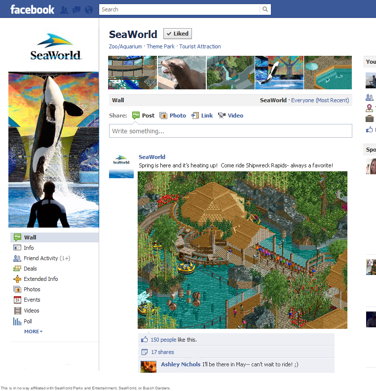
Who is this Ashley person?
The screen is great though. I just can't move past the innuendo. -
 Fizzix
Offline
Wow. Just wow. Excellent advertising. I cannot describe in words how much I love that screen. Also, the waterfall in the top(center) and the dolphin encounter(?)(top right) are stunning as well. Can't wait to see this completed!
 -

 Steve
Offline
Holy shit that rapids is fucking sick. Great composition throughout the whole screen, dude. I love the foliage too.
 -
 Gwazi
Offline
Makes me want to play RCT2. Damn good screen, a perfect balance of composition and detail.
 -

 K0NG
Offline
C'mon Milo.....hit on someone from your own Facebook. Jeez...Who is this Ashley person?
 Tags
Tags
- No Tags


