(Archive) Advertising District / Avonturenpark Montferland
-
 23-December 11
-

 Liampie
Offline
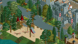
This is a vast improvement on my castle in Legacies. I never liked it much, but this is great again. Good playground as well, though you might want to give it more space to breathe (seesaw is too close to the slide in my opinion) and maybe add some benches for the parents. But yeah, overall great work.
 -

 Seb
Offline
This is a vast improvement on my castle in Legacies. I never liked it much, but this is great again. Good playground as well, though you might want to give it more space to breathe (seesaw is too close to the slide in my opinion) and maybe add some benches for the parents. But yeah, overall great work.
Thanks, actually breathing space is an issue in this park since the map is only 100x100 size and things look cramped very quickly. I thought I was smart to choose a small map to avoid the object data limit, but oh well, you're never too old to learn. -

 Liampie
Offline
It's not a bad thing if your park is cramped if you cramp evenly.
 /> But anyway here's a solution to the playground problem:
- Make the shortcut path a part of the playground. You can expand in the foliage directions too. You might worry about a gap in the foliage appearing, but it's no crime to put a high, half-open tree on bare ground, so you can use a few strategically placed trees to bridge the gap. -

 Seb
Offline
Hellehond, the park's oldest coaster takes you on a thrilling journey through the 'Bergherbos'
At the speed I'm building at this moment the park can be submitted somewhere end 2013! -

 Seb
Offline
Thanks, glad you like the park so much.Yes! My favourite park in the ad is back!
Cool screens. I like the station.
Thank youRealy pretty
 />/>
/>/>
Thanks, I also like that station a lot.i loooove that station
Choose your knight, see him battle to the death and cheer him to victory.
Have some good times at Medieval Times:
-

 WhosLeon
Offline
The info kiosk sign popping out of the awning looks really cool, the rest is great as well
 -

 Luketh
Offline
That looks fantastic.
 I like how you've made a medieval area so colorful while still maintaining a medieval atmosphere; typically they're just gray and brown and rather boring to look at.
The red mine ride track might need another support midway through that turn, by the way! -

 Faas
Offline
^ I actually think the support is there, but just behind that little pine tree. Or do you mean another support between those two?
 -

 Louis!
Offline
My only issue with that last screen is that I think you need to vary the height of some of those buildings. Currently everything is all built to the same height, which in RCT tends to make the screen a bit boring.
I think it would help add some livelyness to the screen and to the area, something which a medieval area should have. -

 scarywaffles
Offline
Now please finish this whilst you still can, before you get sucked into New Element properly and start doubting everything you build, constantly wanting reassurance and eventually not finishing and releasing anything.
that feels, hit me right to the very center of my soul and sanity, so true T_T
 Tags
Tags
- No Tags


