(Archive) Advertising District / Avonturenpark Montferland
-
 23-December 11
-

 Seb
Offline
Hi, as a newbie here I thought it would be nice to show this park I'm currently working on. I'm not really that skilled as most people here but maybe you will like it. This is ment to be a fictionally dutch park and is my first serious attempt in RCT2.
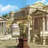
The entrance and the railroad station, also the gate to the park
Welcome Plaza

the other side of the square
The other side of the entrance (exit)
Part of a wooden coaster, Callaghan's Curse
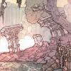
Square in the medieval section
Montferland Theater
An updated pic of the Welkom Plaza
Candy store at the end of the Plaza
As you can see, a lot of the spaces are still unfinished. It's a 100 x 100 map so it shouldn't be to difficult to complete the park.
Looking forward to your comments! -

 Liampie
Offline
Wow, where did you come from? Sick stuff man! Looks like you took some inspiration from me and Fisch (and Xophe?), but not in a rip-off way. I can see you know what you're doing. Loving the theatre!
Looking forward to seeing more.
-

 Brent
Offline
I'm not really that skilled as most people here
lolwut
Quit kidding yourself, these screens prove otherwise. This is great stuff. -

 Cocoa
Offline
wow I am so loving this so far. everything is really cute and tidy and the archicecture is pretty. it looks like something I would make it I was dutch.
 -

 Louis!
Offline
Fantastic work.
Now please finish this whilst you still can, before you get sucked into New Element properly and start doubting everything you build, constantly wanting reassurance and eventually not finishing and releasing anything. -

 tyandor
Offline
I'm not really that skilled as most people here
Ah, good old modesty Seriously though, don't underestimate yourself as there is quite some quality work in your screens. The only thing I don't get is why you show the same things multiple times as you show the work in progress screen as well as the finished screen. It's a little redundant
  . Besides that entrance plaza comes out so much better as a finished screen.
My favorites are the woodie's station and that last small but sweet building in the last screen. -

 Xophe
Offline
This looks great so far! You seem really good at path layouts - I love all the little squares and avenues of trees and seating areas etc - makes everything very cohesive.
 -
 ScOtLaNdS_FiNeSt
Offline
I think what he means by "newbie" is this is the first project here at NE, Its obvious this isn't his first attempt the quality of the screens are so good even if he said this was his first attempt i wouldn't believe him
 Welcome to NE keep the screens coming
-

 Fisch
Offline
Haha yeah I can definitely tell where the inspiration for that woodie came from but that's not a bad thing at all! Looks very very nice!
 Tags
Tags
- No Tags


