Related Games / Sky @ EarthQuest Adventures [RCT3]
-
 01-December 11
-

 leonidas
Offline
To be honest, I still don't think the station looks good, and definitely not "green".
I really like the first pic though, nice architecture and nice pavement.
Don't stick to the white everywhere though, some color in the architecture will
bring things to life.
Keep it up! -

 coasterdude5
Offline
^ Thanks for your advice. I am not overlooking it!
The Sun Sets at EarthQuest
Computer software is a really amazing thing. I've been able to simulate what a beautiful sunset will look like at EarthQuest Adventures.
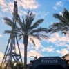
Looking towards the entry portal, there's obviously a considerable amount of work left to do.
AeroWing's sky blue track blends nicely with the warm early morning sky.
AeroWing is no match to EarthQuest's giant centerpiece mountain.
Yes, the yet-to-be-named mountain is a tad bit larger.
Here's another view of the Boeing Store.
Boeing will have a lot of room to work with once they start designing the interior of the store. The building itself is very "green" and will be LEED certified.
Stay tuned, there's more coming soon!
-Greg -

 leonidas
Offline
Amazing first screen, and respect for not editing it.
One of your best updates so far, keep it coming! -

 coasterdude5
Offline
^ Thanks leonidas!
The Sky is the Limit
Here are a few more shots of the "Sky" area of the park.
AeroWing's first dive is quite photogenic against the crystal-clear blue sky
An AeroWing train passes over the Boeing Store.
The floor-to-ceiling windows inside the Boeing Store will provide guests with some up-close shots of AeroWing.
Here's one more overview of the Boeing Store.
An AeroWing train crests the massive lifthill.
Stay tuned for more updates!
-Greg -

 leonidas
Offline
I like it so far, but try to avoid having an industrial nucleus -look.
Create some small buildings, connect them, instead of having
different giant boxes apart from each other.
And I'd still recommend using some color to spice things up, but as you said,
you're not nearly finished. I can't wait to see this come to life a bit.
Nice update! -

 coasterdude5
Offline
^ Thanks leonidas for the continued feedback.
Reach Towards the Sky
The "sky" area of the park continues to take shape. I'm pleased with how it's turning out.
The entrance to "AeroWing" isn't complete, but it's progressing nicely.
The AeroWing trains will be blue rather than red as per Boeing's request.
Ride lockers have been added outside the AeroWing entrance. We don't want guests losing their valuables while riding!
Here's a preview of what will be showcased in this week's updates.
Air panorama.
More soon!
-Greg -

 Cocoa
Offline
honestly, I'm sort of just finding this park boring. there are a couple cubic grey structures and a mediocre layout. it doesn't have the charm of proper theme park architecture because you're going for this "science-y" learning adventure theme and it just doesn't seem to be working, at least for me.
 -

 coasterdude5
Offline
Cocoa, can you offer any suggestions how I can improve the park? I appreciate your opinion, but "it just doesn't seem to be work" doesn't help me all that much. Also, keep in mind that this is just one section of the park. Each of the other "lands" will have different feels.
 -

 Louis!
Offline
It's very plain, very boring and just doesn't look good. If this was in RCT2 we could offer more help, but as we don't know RCT3 we can't offer anything more than what it looks like, and this looks like a complete step back from your other work.
This doesn't feel like a theme park. It has no atmosphere, no charm.
It's almost as if your previous work wasn't your work, it was someone else's and you were just advertising it. Because this really isn't on the same level one bit. -

 coasterdude5
Offline
Just keep in mind that this can't be compared to SFSC. It's a completely different style of park, and it's being presented in an entirely different way. This park is being "designed," whereas SFSC (then Charleston Gardens) was being presented with the charm, peeps, etc. already there. There's going to be a lack of "atmosphere," and that's because I'm showing an incomplete park (and only one section of it for that matter).
I try to do something different with every new park. I don't want any two of my parks to look like they came from the same person. Why would I do something that looked just like my last park? I guarantee you there would be people complaining that it would "look just like Six Flags South Carolina."
Give this park some time. I think you'll find that its atmosphere will come, albeit not all at once. -

 Louis!
Offline
I'm showing an incomplete park (and only one section of it for that matter).
Exactly. That's my point. There is rarely anything nice to look at because it just looks unfinished and doesn't look terribly skillful. It would be the same if anyone started posting an incomplete park in RCT2 like this. But most people dont. They ensure that the screenshots are complete enough to garner decent feedback.I try to do something different with every new park. I don't want any two of my parks to look like they came from the same person. Why would I do something that looked just like my last park? I guarantee you there would be people complaining that it would "look just like Six Flags South Carolina."
It's called style. You look at all the work by J K and you can see that it's been done by J K. No park is the same or looks the same, but it's built in the same style because it's how J K builds and builds well. I don't get why you would want your parks to look like they are made by 2 different people. It's not about looking like the same park, it's about the building style and skill. It doesn't look like you've put the same amount of skill into this park that you did in the other.
A good RCT3 example of this is Leonidas. Everything he does clearly looks like his work, but it's all different. And all at the same skill level, or getting better each time. -

 coasterdude5
Offline
Thanks for the feedback, Louis. Hopefully as this park progresses you'll see more detail and atmosphere.
An Updraft Strikes EarthQuest
The "sky" area at EarthQuest Adventures will be home to some of the park's most exhilerating attractions, and Updraft is no exception
Updraft will be the first of its kind in the U.S.
The original EarthQuest design had all of the "Sky" attractions spread out. I think having these rides interact will prove to be much more exciting for guests.
I still have a lot of work left to do around the ride, but the foundation and queue is nearly complete.
Random AeroWing track shot for grins and giggles.
There are two more major thrill rides left to be added to the Sky area. Stay tuned!
-Greg -

 coasterfreak101
Offline
I actually do really enjoy watching the area come together, I think it's a very interesting take on advertising a park!
I still don't like everything after the first barrel roll on that coaster, though.
-

 coasterdude5
Offline
^ Maybe it'll look better once it's all filled in.
The EarthQuest Adventure Skyline Grows
Below is just a sneak preview of what I've been working over the past couple of days.
This attraction will surely be one of the more exhilarating rides at the park.
Check back soon for more details.
-Greg -

 Louis!
Offline

The original EarthQuest design had all of the "Sky" attractions spread out. I think having these rides interact will prove to be much more exciting for guests.
Now this is much, much better. -

 coasterfreak101
Offline
^
coasterfreak101
Offline
^Hopefully as this park progresses you'll see more detail and atmosphere.
Looks like somebody was right. -

 coasterdude5
Offline
Stratosphere Station
I've been working on STRATOSPHERE, a launched free-fall tower that will call the "Sky" area home at EarthQuest Adventures.
Above you can see the basic structure of the enclosed station. There's still a lot of work left to be done on the building as well as the surrounding plaza.
The "Sky" area is slowly starting to come to life. Once EarthQuest Adventures opens this will surely be a popular photo to take.
Check back soon. I'm working on a lot this week!
-Greg -

 coasterdude5
Offline
Reaching Towards the Sky
You may have heard the EarthQuest resort mentioned in the news lately. As of this posting, my work has not been affected by the bankruptcy blabber. I'll keep you all updated as this progresses. I know we all want to see the park come to fruition.
The entrance to AeroWing looks very nice at dusk.
Stratosphere's 180-foot-tall tower will provide some excellent views of the park.
Stay tuned!
-Greg
 Tags
Tags
- No Tags

