RCT Discussion / Architcture Improvement Thread
-
 07-November 11
-

 JJayMForce
Offline
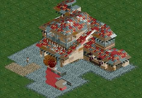
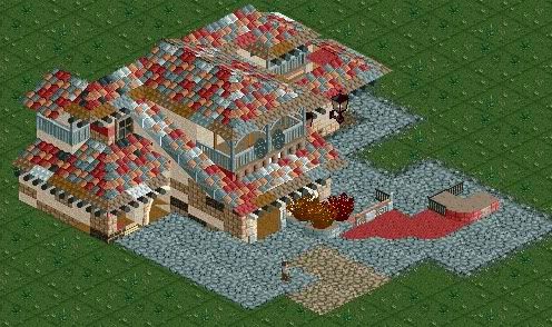
This is my try... I think with more time I could have added more of the wall textures though.
The paths underneath the building might also be glitching, because I accidentally started on the lowest level of land >.<


-

 Liampie
Offline
That looks accurate, but jesus christ, the roof! This is where you have to sacrifice accuracy for aesthetics.
 -

 Cocoa
Offline
agreed on the roof, it makes it seem so cluttered and incohesive, I have no idea what is going on in that screen detail wise, as I can't see anything.
also the wall is not helping. I'd say choose one wall texture/color and stick with it. then use the various stone detail pieces and whatever to make it seem more haphazard. Also I'd say scale it up a bit so you have space for all of the details (windows, poles, etc.) that you need. -

 chorkiel
Offline
I'm actually pretty sure that's a perfect recreation. But it looks really ugly with this roof coloring.
 -

 JJayMForce
Offline
Thanks guys, takin note of everything said.
So I think I should of made the roof tiles all red I guess, instead of using 3 different colors on each... lol. Also the second story, with the balcony looks a little higher because I wanted to show those spandrels.
I guess I could have raised the ground level roof up a little higher too, so you could see the arches in the front better and some of the other details right under the roof. Its funny how you have to sacrifice scale for detail sometimes because the game only gives you a specific shot to view from.
And also Liam, I think your right with sacrificing accuracy for aesthetics. We should bring reality into RCT, not the other way around. -

 Liampie
Offline
So I think I should of made the roof tiles all red I guess, instead of using 3 different colors on each... lol.
Pick peach.
 Tags
Tags
- No Tags

