RCT Discussion / Architcture Improvement Thread
-
 07-November 11
-

 nin
Offline
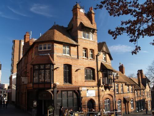
This is more of a "when the time comes" thing, but I just found this building super interesting and would love to see you guys' take on it:
-

 That Guy
Offline
^Considering no one had done anything for nin's picture, I figured a new one might be better.
 -

 K0NG
Offline
I think the way that it works is....since it's SSSammy's thread, we stay with the present picture until he decides that it's time for the next one. At which time, we post new pictures and SSSammy then decides which one we'll do next. nin's did say "This is more of a "when the time comes" thing" although I'd still consider it premature.
 -

 Xtreme97
Offline
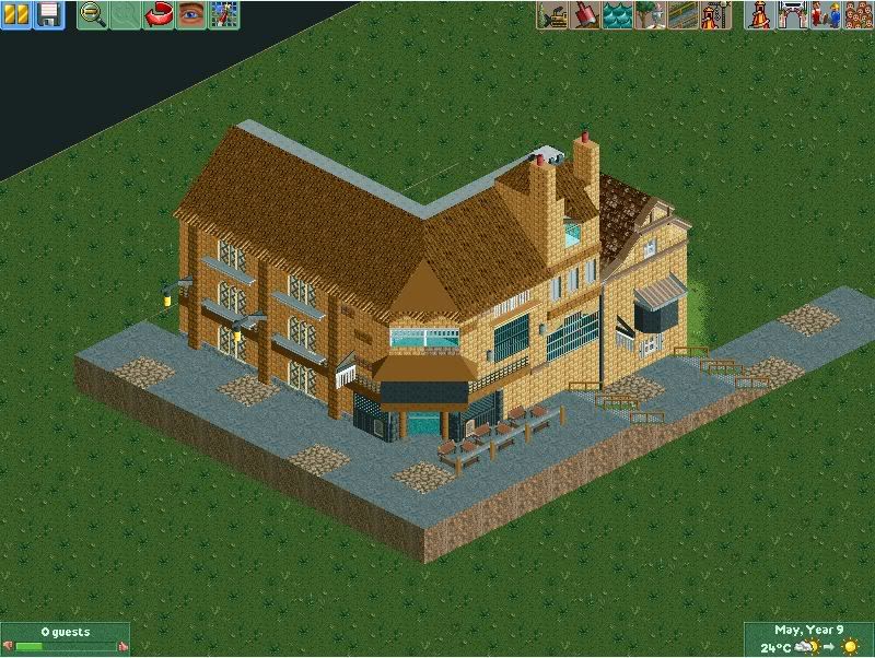
My take on Nin's image. Feedback is welcome. I'll try That Guy's image soon (because IOA is my favourtie theme park)

-

 posix
Offline
Interesting. While I think it looks nice, the height variations don't work at all for me. I think maybe it's because you're missing the big windows there? They would indicate that the ground floor is actually used. Right now there's only a wall.
 -

 Cocoa
Offline
I'm actually surprised that you went with tan bricks. I guess I can see that, but it still feels red to me. To improve that, you need to clarify your details. That is, the bits and bobs on your building don't really mean anything to me. that sticky outy black bit on yours? make that a proper window. those deco blocks under the windows? make those be something I would actually expect to see on a building, not just sticky outy bits for the sake of sticky outy bits. those fences you used for shutters? make it look like a window and not a hole that has been covered in wire.
so yah, what I'm saying is, make your details realistic and meaningful. -

 chorkiel
Offline
yours is way to stretched out. needs to be a lot more compact.
Exactly my thougts.
The part upfront shouldn't take 2 tiles at max, I think. -

 posix
Offline
sammy i just love how your posts make me burst out in laughter over and over
fr3ak, wtf ... that's insane. it's sooo spot on! how long did that take?! -

 SSSammy
Offline
it's a shame this thread turned into a fuckfest.
NO MORE POSTING NEW INSPIRATION PIECES. YOU ARE AT LIBERTY TO POST RECREATIONS OF ANY BUILDING IN THE THREAD CURRENTLY.
lets turn this into the fun, informative thread it deserves to be!
-

 Xtreme97
Offline
I might give it a go but i'm a bit busy (and i've done almost all of the pictures already). I do hope this thread turns out well though.
 Tags
Tags
- No Tags


