RCT Discussion / Architcture Improvement Thread
-
 07-November 11
-

 Dotrobot
Offline
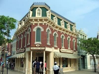
Since the appointed pics except for SSSammy's don't have much reasoning behind them.
I'll post a few.
The extremity of detailing on that. I can go as far as making a decent building, but I wanna make it go over-the-top as with gijisse's or prodigy's buildings.
Another good example.
-

 Wanted
Offline
Love the idea of this thread. However I have a few questions. Does it have to be architecture? Can it be beautiful landscapes, seascapes, waterfalls, ect? Cause I'd love to see people improve in this aspect of parkmaking as well.
Anyway, I'll throw in my favorite form of architecture: That beautiful wooden architecture that ski resorts/log cabins consist of!
-

 K0NG
Offline
Actually, I thought this would be more like one picture and everyone does their thing with it so we could get various takes on it until it's run it's course...and then move on. Not just toss out 40 different pictures and have a free-for-all.
 -

 Brent
Offline
I'd say keep it to one building every 4-5 days, or each week give out 2-3 examples and choose which one(s) you'd like to do.
 -

 deanosrs
Offline
This thread is actually kind of pointless unless people who are not architectural masters come and have a go. It's a great idea, but let's encourage some newer members in other topics to come here and get some advice rather than trying to post the best photos.
 -

 AvanineCommuter
Offline
This thread is actually kind of pointless unless people who are not architectural masters come and have a go. It's a great idea, but let's encourage some newer members in other topics to come here and get some advice rather than trying to post the best photos.
I agree with you deano. Perhaps a group would be nice? Like a small group of 3-4 people who takes turns giving out photos of architecture and then have members submit screens and get feedback. Maybe we should recruit all the newbies to make sure we have enough activity to sustain the thread and that they actually improve from building it? -

 Xtreme97
Offline
I think just 1 or 2 pics per week would be nice, as it gives time for people to build.
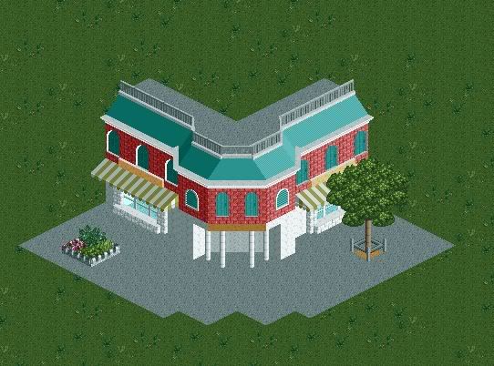
My attempt on Dotrobots 2nd image. The scale is a bit off and I know it's not perfect (for example the roof window thing and the diagonal door)

-

 chorkiel
Offline
As a direct recreation, you have left a lot of details apart.
If it's just meant as inspired work, I'd only say;
Change the roofs, that texture is soo boring ! -

 SSSammy
Offline
Actually, I thought this would be more like one picture and everyone does their thing with it so we could get various takes on it until it's run it's course...and then move on. Not just toss out 40 different pictures and have a free-for-all.
this. i thought it would be clear that 408 different pictures would be too confusing but i guess you have to cater to the lowest denominator.
please could all posts not containing construction of the first image be edited out, please. nobody wants to scroll for 40 mins to find the bottom of the page. yours can stay, xtreme. nice attempt, btw.
please continue on the first image recreations. once we get a couple more we can analyse the differences, similarities and suggest improvements. -

 wheres_walto
Offline

Shit...I'm supposed to be studying. Also, Architecture is misspelled in the topic title. -

 Dotrobot
Offline
Thanks walto. That was what I was looking for.
Also I love the idea of the tree clothes and the little ditches.
How'd you create the tree ditches effect? -

 wheres_walto
Offline
Lower the land and then put one layer of building blocks, then put the tree on top of the blocks. Then zero clearance the crown moulding at the same height as the base of the tree.
 -

 Cocoa
Offline
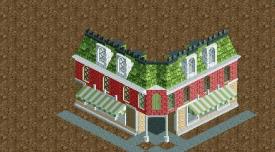
those are both nice. for the first one, definitely some detailing on the bottom floor is neccessary, and the jutty out corner is way too big. In general, there are some key details missing.
for the second one, it is very pretty. my only complaints are the grey castle pieces used on the windows and the fact that there is no corner bit over the door. I would have made that bit using three diagonal pieces, forming the tree sides of a square.
_/\
---/
---]
^thats the best I can do with text. -

 AvanineCommuter
Offline

Shit...I'm supposed to be studying. Also, Architecture is misspelled in the topic title.
I like it Walto! Although the color mismatch is unsettling for me, would love to see it in the greenish color it's supposed to be and to have the windows match the roof.
 Tags
Tags
- No Tags


