RCT Discussion / Architcture Improvement Thread
-
 07-November 11
-

 SSSammy
Offline
It's really arbitrary where this post goes, so i'll put it discussion RCT as it's not strictly advertising related.
Aim of the Thread:
The ultimate goal of this thread is to improve the architectural skill of all who want or need the help. this is achieved through a user posting an image which any number of people can choose to imitate to get the grasp of proportions, design and realism in their work. I understand that not all people are into realism, but good RCT is convincing RCT. Immersion is essential for a good park, and believability is essential for immersion.
How it will Work
A user will post an image of their choosing for others to stylistically represent in RCT. It does not have to be a perfect 1:1 image, as this is rarely doable in RCT. what the player must do is Translate the architecture into RCT, noticing the key features, proportions and details to make the work fit well into RCT. This skill comes more fluently with practice, and once learned enough, one can use this knowledge of architecture to further their themes and buildings.
I will begin with an image. anyone can enter with a screen using any objects they wish. this is not a competition, this is an educational exercise. there is no wrong answer, only constructed reponses. purposefully hateful comments are unnecessary and unwelcome.
NEW SOURCE IMAGES MUST ONLY BE POSTED ONCE THE OLD ONE IS EXHAUSTED
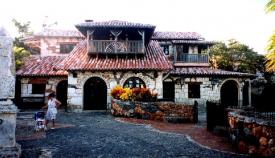
This first image is a spanish house which could be used well as an information building or small food outlet.
let us begin.
Additional Rules
Please include the picture you are building from in your post. this helps the readability of the topic. -

 posix
Offline
Very amazing topic. I hope this will get the deserving response. I would consider turning it into a competition though where people can vote on entries for "best translation" as a motivational aid.
 -

 wheres_walto
Offline
I disagree with any type of voting. To me, this is much like an art class. No competition, just individual creation, helpful critiques, and appreciation of quality work.
 -

 SSSammy
Offline
i have a lot of work to do tonight, so tomorrow evening i will come and finish what i started and give genuine advice on this matter.
all i have to say on your screen at the moment, xtreme, is good job! that would be a nice addition to any park. one issue i can see is scale. if you look at the lady, how many times do you think she could stand on her own head before being as tall as that building? i'd say four or five. in yours, it seems more like twenty! it does look smashing, though. i will give greater detail at a later time, though. maybe someone else could give some feedback? -

 robbie92
Offline
Sam, I wouldn't use RCT peeps as a scale for this if you're also using a real-life scale. Generally, Xtreme97's fits as a good balance between real-life and RCT scale.
I also agree that voting would ruin the idea of the topic itself. I'll be back in a bit with an interpretation and my reasoning behind it. -

 gir
Offline
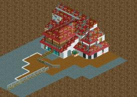
I think this is a phenomenal idea. I'm supposed to be studying, so I just put this together in 15 minutes or so. It's not an exact replica but just my quick interpretation. The only hacking I did was zero clearancing, but if I had more time I would do some minor things in Codex to pull it together. I think what's more important here is the form rather than getting every detail right. Left a few things off like windows obviously.

-

 deanosrs
Offline
For Xtreme's, I'd say it's not the total height that's off as much as the ratio between the ground floor height and the rest of the building.
In the photo, the building is clearly a two floored building. So (and I have to apologise for not having the time to open RCT2 and visualize this), I would immediately think that in RCT2 I'm going to have two floors, each will be the height of a standard wall (ie, 4 smallest walls high).
The roof going from the lower floor to the upper floor at the front would then add for me maybe 2 small walls between these two floors.
At the moment, Xtreme, you kind of have two levels, and then two half levels which reduce your opportunities for detail at the top. Gir has this ratio alot better; one level at the bottom, then another equal-ish level where the balcony is.
The only other thing I'd comment would be that glass in RCT makes something look so... office-blocky. There's certainly glass in the photo at the front so I can totally see why it's there, but I'd go with Toon's Spanish archways everywhere instead. If you wanted, you could even put the spanish archway on the outside wall and then glass on the inside.
Major props on this topic too btw. Maybe later on today I will have time to have a go myself. -

 posix
Offline
Lovely stuff gir. I've always had an issue with paths as roof textures though. My head saved them as "path" too firmly and I'm having a hard time to interpret them otherwise.
Could we make it a habit that people take the original photo and place it next to their screen? Then you won't have to scroll up to compare with the original all the time. -

 SSSammy
Offline
edited first post to include this rule. will definitely be needed in when this becomes multi-paged. thanks posix.
 -

 Coaster Cow
Offline
Let's keep it realistic, bud. I'd shoot for quick exercises that can actually help peoples' archy.
 -

 Nitrous Oxide
Offline
Sam, I wouldn't use RCT peeps as a scale for this if you're also using a real-life scale. Generally, Xtreme97's fits as a good balance between real-life and RCT scale.
I also agree that voting would ruin the idea of the topic itself. I'll be back in a bit with an interpretation and my reasoning behind it.
Pretty sure he was talking abou the lady in the real photo. Love the thread though. Definitely could improve on my buildings. Making shops and restraunts has always been my weak point.. it's all about the coasters for me lol.
-

 GigaG
Offline
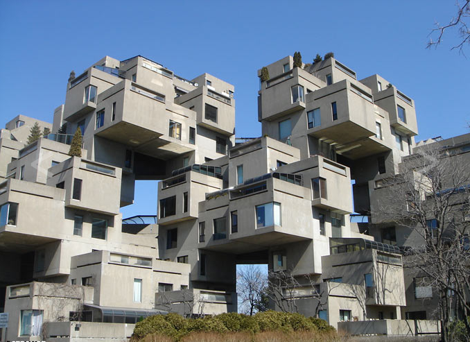
How about the Toledo office building One SeaGate- the tallest building in Toledo-
This is something easy for RCTNW lol. For you scale freaks, real-life height is 411 feet. -

 Midnight Aurora
Offline
The most interesting thing about that building is the road in front of it. I think the architect's son made it with legos first.
 -

 Maverix
Offline
Go Ohio! Cleveland for me tho
 But where I live has some of the most boring archy ever...
-

 Midnight Aurora
Offline
Simple and practical are generally not used as the inspiration for art. Unless you're one of those guys that makes a point of showing off how creative you are by being uncreative.simple and practical, ma.
giga, are you also from Toledo?
 Tags
Tags
- No Tags


