(Archive) Advertising District / Design: Scream
-
 25-September 11
-

 K0NG
Offline
Lower one corner of the land tile, color it (yellow grid, etc.) then lower it 2 units with Map Object Manipulation. Place your "floating" diagonal path tile in position, then raise the colored land tile back up 2 units with MOM. Re-color the land and you're all set.
 -

 Xtreme97
Online
yeah, it's not working...
Ok, so I colour a square yellow (grid). I then lower one corner of it. Then i go into MOM and click: raise/lower, height offset -2, Yellow Grid, Apply. Then there's a confirmation. I click Ok but when i go into the game nothing has happened to the land tile. -

 Fizzix
Offline
You can't build first and landscape last. Flatness is a huge drawback for me with these screens.
 -

 wildroller
Offline
yeah, it's not working...
Ok, so I colour a square yellow (grid). I then lower one corner of it. Then i go into MOM and click: raise/lower, height offset -2, Yellow Grid, Apply. Then there's a confirmation. I click Ok but when i go into the game nothing has happened to the land tile.
Make sure to click land in the middle section! -

 Xtreme97
Online
Voila! It works, finally. Thanks K0NG and windroller (i can't believe i didn't see that)
 -

 AvanineCommuter
Offline
It's a good start, but maybe try not having your planning surrounded around path + rides leading from the path. You should try to integrate them into the area, so the path winds around a ride or there is interaction between the peeps and the ride. This means less square paths, don't just have a 2 width path going straight, use diagonals and landscaping to make interesting areas, use buildings as purposeful landmarks in the map so they cut up the area and make it cohesive.
 -

 Nitrous Oxide
Offline
I have been working on a new project, this time a design. It has no name yet but i've started on it already.
Are those supports white? Because they look darker than RCT's white but lighter than the grey. -

 DictatorOfFrenchToast
Offline
I have a question about your lighthouse. Is there going to eventually be more water around it? cause it seems really weird to have a lighthouse in the middle of a river or whatever with land so close to it.
 -

 ivo
Offline
^ ^
There is internet these days you know.
It is all charming and nice but it is also a bit dull. It would be cooler if you shake up some other colours and would use some unonthodox shapes.
But I am looking forward to see it ingame. Do you already got a name for it? -

 chorkiel
Offline
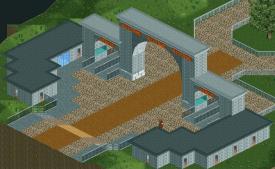
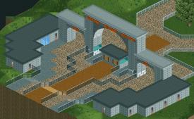
wait a second, can't guests just walk through that huge-ass arch, without buying a ticket ? :S
 -

 Xtreme97
Online
ATM the coaster's called Scream, but i'm undecided about it. If anyone has any suggestions, please tell me.Do you already got a name for it?
I might post a picture of the layout because I've no idea whether it's good or bad, so it might be a major flaw.
Edit: Just read the comments and have just realised what chorkiel said. How did i miss it? Anyway i've made some changes, i'll update the screen in a minute. -
 ScOtLaNdS_FiNeSt
Offline
Agree ^, All you need is a few horse statues on top and you have the brandenburg gate
-

 Cena
Offline
You need more than horse statues for the BB-Gate.
And I would recommand trying to break up the full-tile building thingy. Try using quarter tile objects and stuff. Full tile building is so ... 2007. -

 K0NG
Offline
Yeah, have exit gates that people have to go through to get hand stamps or whatever and remove all that fencing in the path that makes it seem like cattle are being herded in.try adding fences to the exit.
 Tags
Tags
- No Tags
