(Archive) Advertising District / Design: Scream
-
 25-September 11
-

 wildroller
Offline
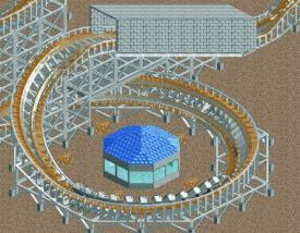
Not much to comment on, no foliage or landscaping. The building seems random and without any purpose. The tunnel is nice.
 -

 CoolCody
Offline
Just a quick question, what is the purpose of that building(like what is that building tended for?)
I really love that tunnel! I can't wait til you add landscaping and more foliage! -

Airtime Offline
Nice but I think you need to try and break up the sand texture on the land, try adding different land textures under and near the coaster itself and little shrubs and bushes. Don't forget landscaping as well please
-

 Xtreme97
Offline
I've just realised that i haven't planned any of this out...
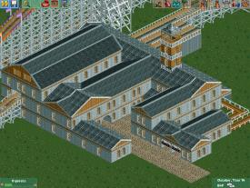
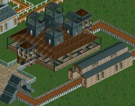
I have started on the station building but it's more or less looking alot like a catle or medieval building, which is not what i wanted at all. I basically wanted a generic, grey brick building, but now i've extended the entire building and added wooden rooves.
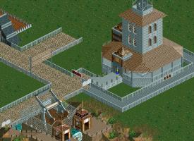
Also, i've changd the landscape to green, added a path and a mini lake with an island. The coaster itself is coming together OK, and i hope to have it completed soon
-

 Xtreme97
Offline
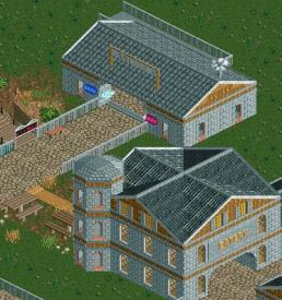
I have been slowly progressing on the station, but have not added any lanscape or foliage. Here is a screen of the station building. It now looks like a haunted mansion and that sounds like a good idea for a dark ride, but i'm not so sure. As i said, foliage is becoming a problem because i can't get it perfect, but other than that nothings gone wrong yet.
 -
 ScOtLaNdS_FiNeSt
Offline
Yeah its looking promising
 My only concern is the amount of windows, But other than that very nice
-

 Xtreme97
Offline
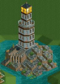
I have added a small island and upon it have placed a Lighthouse. I don't what it is with me and lighthouses, i can never building a structure without it having a lighthouse somewhere. Probably gonna have to somehow stop doing that otherwise it'll get boring. But here's one anyway!On the other side i have a small tunnel/cave thing. I think i could change the foliage too. Enjoy it while it lasts, i'll probably end up abandoning this project one way or another. Oh well
-

 Flap
Offline
It has too many windows for a lighthouse. Looks OK other than that.
Never saw a lighthouse in Zeeland Luigi??
It's Cool.
We have lighthouse here which has windows too and even a diner room
I't looks good! -

 chorkiel
Offline
^looking at it, it's not public..
so the windows are not needed for guests in there!
a diner would be even weirder to build in there
-

 That Guy
Offline
It's actually pretty good, but I have a few general suggestions for you to follow.
Make your main pathways wider, and less straight/square (Use diagonal paths, preferably) Add more foliage, vary land textures more and add more hills for your paths and rides to be build around/on. -

 Xtreme97
Offline
Thanks, i'll take in what you said and do my best with the advice given. I can't however make the paths diagonal because the bench doens't come with path blocks but only the flotaing ones which i can't use because when i lower the land and put them in I can't raise the land, even with ZC on. I'll try my best to vary the path layouts though.
 Tags
Tags
- No Tags
