(Archive) Advertising District / Forrest Hall Amusement park
-
 17-September 11
-

 Cena
Offline
Kerel, waarom post je nu nog dan, hij reageert niet meer op ons, zullen we nu zijn topic bashen door in het nederlands verder te gaan?
 -
 ScOtLaNdS_FiNeSt
Offline
Well no verti but APOSTROTHES if you can not use them right do not use them at all lol
-

 verti
Offline
Well no verti but APOSTROTHES if you can not use them right do not use them at all lol

If you dont have anything to say about the park please refrain from commenting about "apostrophes" This is not an apostrophes thread

SO. CONFUSED. -

 ScOtLaNdS_FiNeSt
Offline
Well if you read the thread you will not be. Its just your brain that is like a burst couchSO. CONFUSED.
 End of discussion if you are mature your comments about my 2nd screen would be much appreciated
-

 Wanted
Offline
Well no verti but APOSTROTHES if you can not use them right do not use them at all lol

lOl what is going on? troll? -

 Lowenaldo
Offline
Two things I notice right off the bat are the blocky buildings as well as the foliage. You should try looking at some accolades and see how foliage, archy, and overall layout are done.
 -

 RCTMASTA
Offline
That's a fucking stereotype, and you're perpetuating it.Clearly you have been smoking to much of that wacky backy
...I don't even know if that's a compliment, or and insult, or a statement, or what... 'Burst couch'?!Its just your brain that is like a burst couch
...Seriously, What?
Don't even start that argument.if you are mature
And Cena...how does the posting glitch occur...17 times?!
On topic:
This is pretty much how both of my RCT Fairs looked...I would just agree with Lowenaldo in this case; he said it already. It may seem difficult to make buildings with varied shapes, since in real life lots of buildings are blocky, especially if you live in Hollywood like me...excluding Capitol Records, of course.
A simple, repetitive sentence:
Practice, advertise, improve, practice, advertise, improve, lather, rinse, repeat...
Look in Ask the Experts too, all the hacking help you may ever need is in guides there. If you searched and searched and truly can't find an answer to your question, then start a new topic.
...whew. That was a lot of typing; hope I could help. -

 SSSammy
Offline
god damn, cena. we may not see eye to eye sometimes but that seventeen post streak just made my day.
 -

 JDP
Offline
Cena's one of those members who needs to be suspended because i feel a slap on the wrist wont do shit. im sorry but all those post were uncalled for
-JDP -

 Liampie
Offline
ScOtLaNdS_FiNeSt, I love you. Unlike most new members you're not a 'flat character'.
ScOtLaNd''''S_MeDiOcRe was fucking hilarious by the way. Very subtle
Translation for all non-Dutch speakers: "Dude, why are you still posting then, he's not responding to us anymore, shall we bash his topic in Dutch now?"Kerel, waarom post je nu nog dan, hij reageert niet meer op ons, zullen we nu zijn topic bashen door in het nederlands verder te gaan?
Another screen :
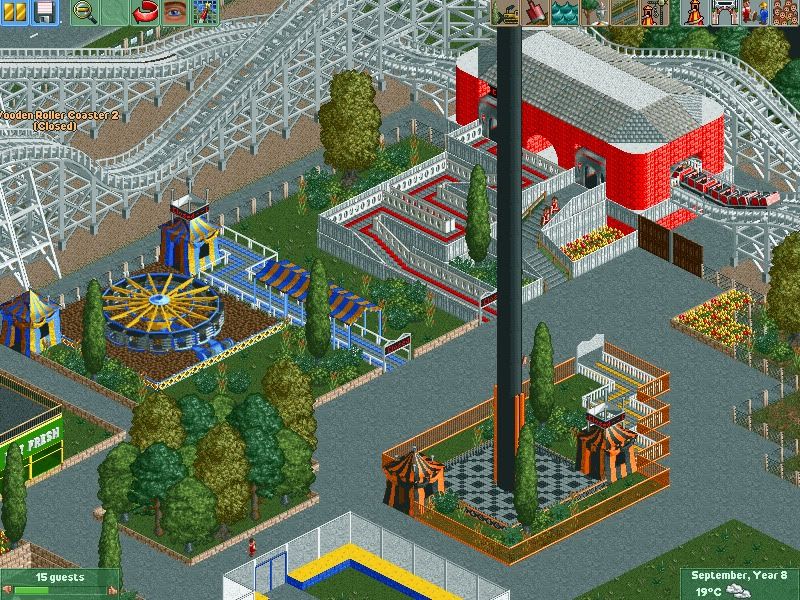
Un-finished obvcourse, Added footer's to the coaster .. the station is a bit to red so any suggestions on colour or archy ?. Added a Enterprise called 'Cyclone' & a drop tower called 'Drop Zone, The building at the very bottom of the screen will be a burger king.
This park is small but im hoping to add another coaster and a couple of flat ride's hopefully .. I am busy the rest of this week so this weekend or next week sometime for the next update
That's not too bad. What I don't like is that each ride/building (or cell, as everything is seperated from eachother) has its own colours and style and there is no cohesion at all. You need a few constants.
Also the patch of trees looks ridiculously out of place! You better place something more interesting on such a prominent spot and move the trees back to the coaster. The empty space between the enterprise, the coaster and the coaster's station could use some trees for example.
Good luck! -

 Flap
Offline
On the Screenshot Liampie posted to stay by the topic, instead of really doing childish
 You can maybey do something more with the flatrides, or do you want to keep it basic?
-

 ScOtLaNdS_FiNeSt
Offline
Thank You ^^^ Screen numero uno
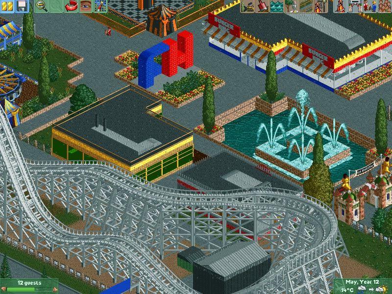
Liampie : I removed the trees & put a fh(forest hall) logo thing, Put more trees up in the space between enterprise & the coaster & finished burger king .. Still to add some finishing touches to that part of the park.
Screen numero dos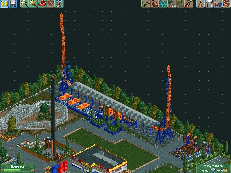
Obviously still unfinished, Do not have custom steel supports on the vertical part because i messed around with it for a ages and didnt find away to make them look good & i dont know how to zero clearance, Hoping to learn soon though.
Should be finished in the next week or so
-

 RCTMASTA
Offline
Yeeaahh...search there.Look in Ask the Experts too, all the hacking help you may ever need is in guides there.
Better yet, I'll give you a quick run down:
1.) Open up 8cars (Preferably 1.302)
2.) Look in the Misc. tab.
3.) There should be an option titled "Zero All Clearances"
4.) Hovering over it will show two options, "Relative" and "Absolute".
Relative clearancing reduces the clearances, but does not eliminate them. This also tends to make white objects occur more often.
Absolute clearancing completely removes the clearances, as the name suggests.
However, when using ZCs, keep in mind that you want to avoid letting a scenery placement preview (the white shadow) that is the same size as a piece of scenery or over any MT objects, period. Due to the size conversion, MT objects tend to make white objects more common. This scenery placement preview is what causes white objects.
In most cases, the white objects can be removed by:
Deleting all scenery from the same tile as the white object.
Placing the same scenery piece the white object is in the exact same orientation.
Deleting those placed scenery pieces.
Also, any objects with a significant amount of height (eg coaster track) will glitch, and usually become invisible. This is normal, but even though it interferes with custom support placement, raising the scenery piece to the track usually makes it temporarily visible.
And the mismatched-ness was my mistake when I first started building too; if you need proof, well...
1st RCT Fair,
2nd RCT Fair,
And to some extent, Canon Park.
'nuff said.
-

 posix
Offline
Your style so far is extremly simple and amateurish, without wanting to sound condescending. My advice for you is to finish this project and then ask people how to improve. Individual screens of everything little new thing you add will almost "annoy" people, I'm afraid, as there are many other topics that offer more exciting stuff for people to see. Thus, try to finish, and then look for feedback on the end product.
 -

 ScOtLaNdS_FiNeSt
Offline
Yeah i know your not trying to be condescending your just being honest, The reason its amateurish is because i am an amature at this game
 , This park is nearly done anyway so i will keep posting screens, Im not making people go out of their way to look at it so it should not annoy anyone
-

 BelgianGuy
Offline
i'd say try learning some basic hacks to be able to make everything more detailed, refined and cleaner, that should get you a lot further in terms of getting a better cohesive style of building...
 -

 ScOtLaNdS_FiNeSt
Offline
Last update
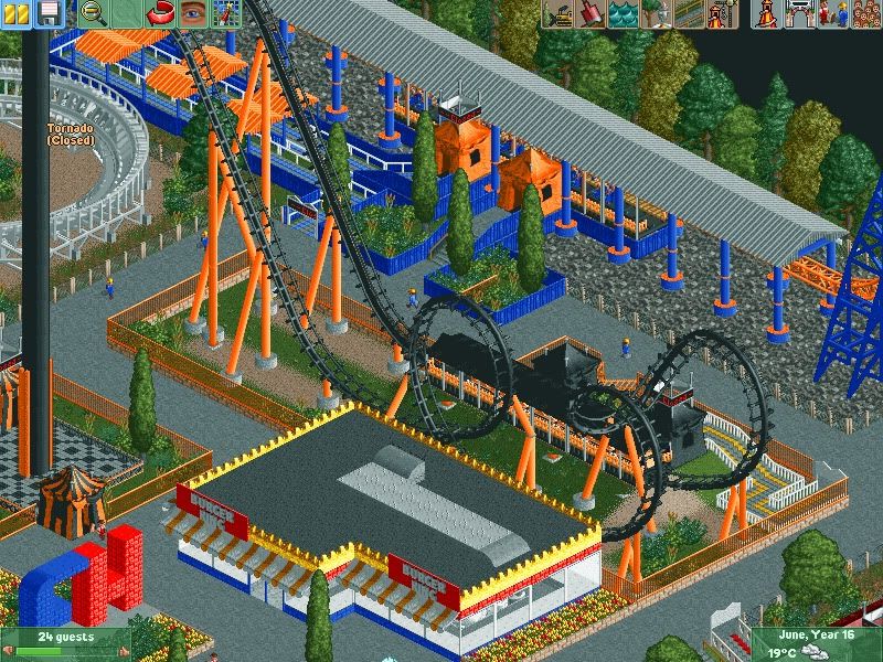
A coaster called : Black Adder, The supports are the best i could do without zero clearances from this angle they look like they connect but they dont in other angles, I had a little problem with the support blocker that i didnt have before ... When i used the support blocker on a tile it would not let me place a support footer on the ground because the support blocker was there, Which never happend before when i tryed it ?
?
The overview of the park : I think it looks good from a distance but doesnt everything you build
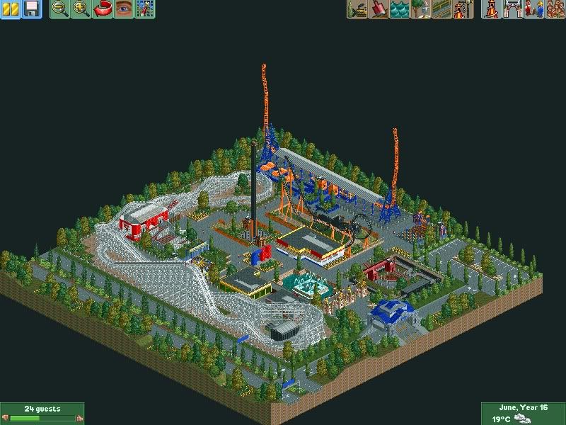
This is the last update for this park, Still a few things to be done but the layout & rides will stay the same ... I am going to submit this park to see what score i get & to see where i am in conjunction to the Accolade winners, I will be looking at learning some hacks in the next few weeks & hopefully improve Some of you have said that their is potential in me & i believe that as well so hopefully that Accolade isnt to far away. Cheers for your replys
-

 Maverix
Offline
I hate, how big and clunky looking that blue and grey bridge thing is, but everything else isn't to bad, just very flat and minimalistic.
 -
 rct2isboss
Offline
^Kind of reminds me of Hillsburg park to a certain extent.
The level of detail seems much lower here but the landscaping with flat grounds seems the same. Whats the problem with zero clearancing though? It would look much better using it. -

 ScOtLaNdS_FiNeSt
Offline
^^^ Because i dont have the 1.32 thing to do zero clearance, Hillsburg park ? never seen it
 Im not using it as a excuse but this is only my 2nd park ... In a 'hopefully competitive nature'. I thank you for your comment
  I hope i can become a better park maker
 Tags
Tags
- No Tags