(Archive) Advertising District / Marley Point
-
 01-September 11
-
 Neropegasus
Offline
I've been browsing these forums for years but was always too afraid to post my creations. Yesterday I finally decided to just sign up and do it.
Neropegasus
Offline
I've been browsing these forums for years but was always too afraid to post my creations. Yesterday I finally decided to just sign up and do it.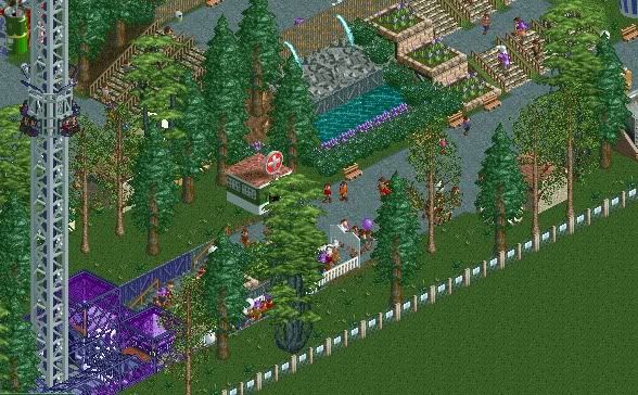
The actual map size is 120x120, however I started off smaller (about 1/6th of the map is the park size now). I figured it'd be a good way to start small and if I want I can expand (which I plan to do!).
Thanks for taking the time to look at it and thanks in advance for the criticism! -
 nin
Offline
First off, welcome to NE!
nin
Offline
First off, welcome to NE!
I'm loving the old-school charm present in these screens, but to really get a sense of what we're about here check some of the accolades and such in the NE database. Simply studying those parks (along with some others in the Ad) will really guide you to create similar work. I'm not suggesting you copy anything, but merely think of it as an art gallery, where you look and see what works you l,Ike, why you like them, and applying similar methods to your own work.
Now, in your screens I really like the terrain changes, it shows that you're not afraid of using the land tool, which is a good thing. Perhaps build structures around your shops and stalls? People tend not to like the defaults showing, though there are exceptions. Ever considered place a different lnd texture under your paths? It tends to look better and make them pop a bit, plus helps break up the amount of grass (or other dominating land texture). -
 Luketh
Offline
Yeah, I'm with what nin said. I like it, it feels old school; it feels like a scenario. Those are always fun. However, if you're here to get some criticism then you might wanna start adding more buildings and stuff -- things we can comment on and help you improve.
Luketh
Offline
Yeah, I'm with what nin said. I like it, it feels old school; it feels like a scenario. Those are always fun. However, if you're here to get some criticism then you might wanna start adding more buildings and stuff -- things we can comment on and help you improve.
I totally like what I'm seeing here, though. Really liking the subtle use of purple and land variation. Work on making your foliage (plants and whatnot) seem to grow in clumps together, not randomly placed. It helps aesthetically and it also looks more realistic.
Welcome to NE!
-
 chorkiel
Offline
Welcome to NE !
chorkiel
Offline
Welcome to NE !
I agree with nin, you need to know what you're good on and what you aren't good at and improve (both). -
Neropegasus
Offline
Thanks everyone for the warm welcome and tips!

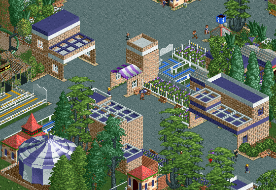
I've been working on this park a little bit yesterday and today - covered up all the shops. I've also been looking at a lot of accolades and it seems like I have a lot of work ahead of me, but it's definitely fun work. I wanted to post these 2 screen shots before I got too deep into building things and then find out I'm a bit off the mark.
I know there are different building styles and such, but if there's something that needs dire attention please let me know! I understand (at least from what I see of the accolades) that I need to make buildings and stations for the rides too.
Enough of my ramblings, enjoy (?) the screens and I welcome criticism. Much appreciated 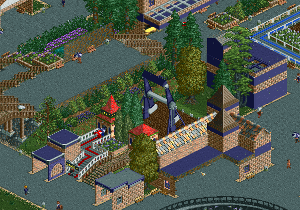
-
 mardy
Offline
Great job! It seems like you having a lot fun while building this-and Thats the important thing.
mardy
Offline
Great job! It seems like you having a lot fun while building this-and Thats the important thing.
Maybe you should try other types of walls and roofes, because it al looks the same now.
Btw: Welcome! -
 Cena
Offline
You have a weird obsession with purple, and you don't build six flags style. I think you are cool.
Cena
Offline
You have a weird obsession with purple, and you don't build six flags style. I think you are cool. -
 Bolliger & Mabillard
Offline
^ I guess purple cans of paint were on sale the day this place was built.
Bolliger & Mabillard
Offline
^ I guess purple cans of paint were on sale the day this place was built.
I likey.
-
Neropegasus
Offline
Thanks for the comments everyone! Your input definitely keeps me motivated to work on this.
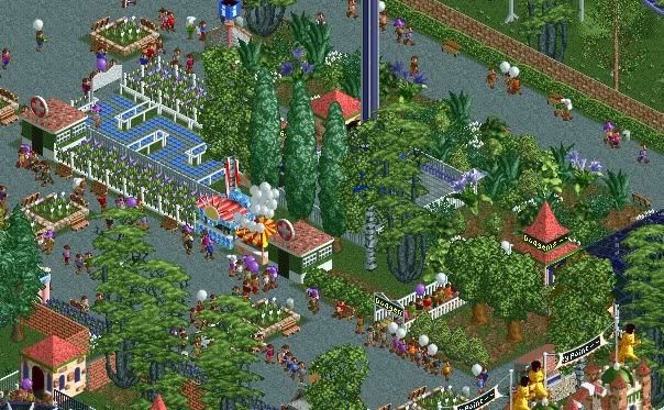
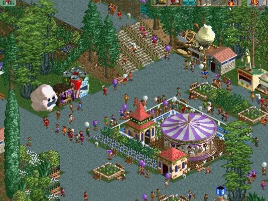
I've been touching up the buildings and tried to hide as best I could the original park entrances/exits of the rides I'm also clleaning up some foliage and adding some fences. Hopefully there's some improvement in these 2 screens: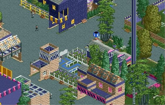
-
musicman
Offline
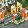
I wouldn't rely just on naked path for the bridge, make it more defined. The buildings around the topspin may be too much actually, they're starting to really overpower the ride itself and block views of it from the midway. I like what you're doing with the purple as long as it stays within a fairly small area, if the map is much larger than 50*50 I would shake up the architecture a bit more in different area. It really looks quite nice though.
When are we going to see some coaster layouts, I see a couple poking out of the corners.
-
Neropegasus
Offline
Yay for reviving zombie threads.
Sorry for the sudden killing of this thread - I've been highly distracted by school and starcraft 2.
Without further ado, here's two coasters I made. The wooden one is named Thor. Then there's a kiddie coaster, named VioleNt (see what I did there?).
Thor: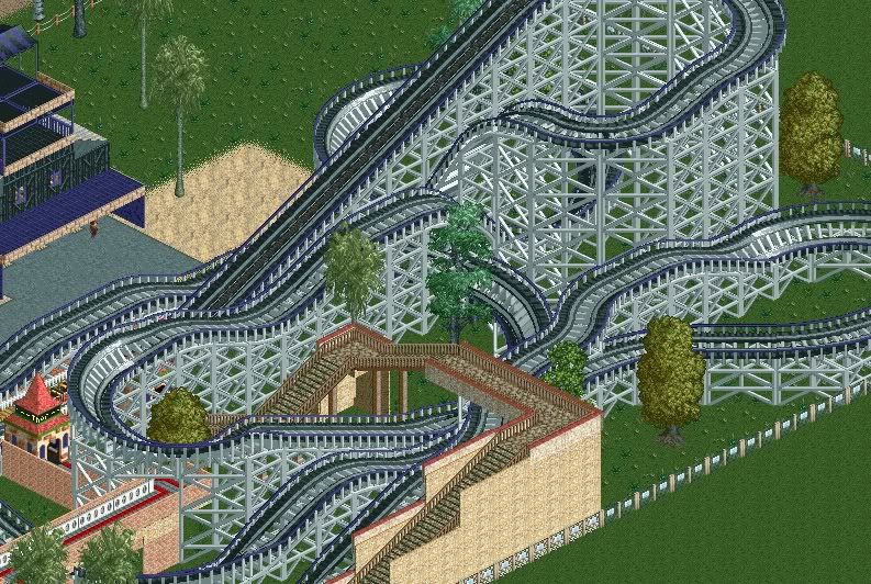
VioleNt: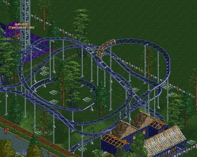
-
 highroll3r
Offline
everythings nice except the white floweres, they stick out too much. build some custom supports for that kiddy coaster and its sorted.
highroll3r
Offline
everythings nice except the white floweres, they stick out too much. build some custom supports for that kiddy coaster and its sorted. -
 Chocotopian
Offline
I like the ‘richness’ that’s given off by these screens. I think the structures could do with some more definition, but I’m liking the texture/foliage combinations.
Chocotopian
Offline
I like the ‘richness’ that’s given off by these screens. I think the structures could do with some more definition, but I’m liking the texture/foliage combinations. -
Neropegasus
Offline
Thanks for the comments everyone! They're very encouraging and helpful! I'll definitely work on the buildings. I plan to have a lot of experimentation with that. Also, if that was to me, Corey, then no, I am not Prince.
I'll try and get a lot more done with my park and give another update by next weekend!


Tags
- No Tags