(Archive) Advertising District / Maverick
-
 28-July 11
-

 Maverix
Offline
I've always wanted to do this, and now I feel that I've got the skill, and resources, to do it. I, just like Kumba, am going to recreating my name-sake coaster. I visited Cedar Point recently and gathered a bunch of pictures of the surrounding areas and the ride it self to try to be as accurate as possible to the real thing, and if you have some pictures yourself, please feel free to share them.
First things first, here is the best layout I could come up with using the limits of the game. If you have an suggestions about tweaks in the layout does hesitate to say anything.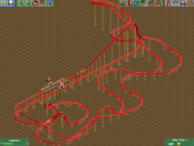
Enjoy! -

inVersed Offline
Hey thats a pretty good rendition of the ride. Like you said its not perfect, but pretty solid given the limitations of RCT -

 Comet
Offline
The turnaround after the launch that will eventually be over a pond just seems a little too compact
Other than that, looks great -
 Coaster Cow
Offline
I like it. The only thing missing is that awesome overbank at the very end, I'd at least try for a little elevation change if possible.
 -

 dr dirt
Offline
Not bad. I think the whole thing could be compacted with tighter turns though. And the vertical portion of the first drop is awfully short; I'd either extend it into a flat turn or into the smaller twisting drop. Also the second stengel dive looks basically nonexistent, it could be accentuated a little more.
 -

 wheres_walto
Offline
This is all good feedback above, I've got nothing new to ctritique other than a future issue- the color of the supports, but I don't know if RCT can really capture the ambiguity of the color.
They look gray in this image
Closer to the tan brown you currently have here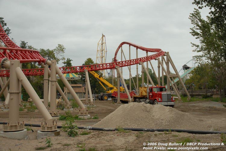
The greyish brown seems to fit here
And now they look white -

 geewhzz
Offline
i had a layout for this ride that i perfected but i lost it a while ago. needless to say there are some improvements that should be made. the brake run at the end of the ride should be diagonal crossing right over where the first half cork is on the horseshoe roll.
i think on my version i had the drop bigger and the turn out of the drop flat instead of inclined. -

 musicman
Offline
^^ I think white would be best; the in-game grey is too dark, and I think the 2nd picture is just lit weird.
 -

 Liampie
Offline
If you use B&M supports tan should be best, white and grey is too colourless and thus cold. which doesn't fit the atmosphere at all.
 -
 GigaG
Offline
Good layout. I think that you need to extend the area over the lake to spread out more. Anyways, good job! Maverick is a really tricky layout.
 -

 Cocoa
Offline
My only gripe are the corkscrews, but I can't imagine any other way to do it. maybe make them not exactly parallel so it doesn't look as funky? and white supports would probably go better.
 -

 Kumba
Offline
Some nice stuff. I don't know the layout, so I don't think I can be much help there. Still let me know if you need any feedback, or some (hopefully simple) objects for it. I have been helping a couple of parkmakers with their recs lately and it's quite fun to follow them
-

 funkeymon
Offline
Maybe make the drop one more vertical piece? It might look convincing. Just a thought. But other than that, it looks great!
-

 wheres_walto
Offline
One more thing, you can see it on the fourth screen I posted. Right as the train enters the dark portion, the track thins out like on the brake run.
 -

 JDP
Offline
i hope your not serious about losing that design.i had a layout for this ride that i perfected but i lost it a while ago. needless to say there are some improvements that should be made. the brake run at the end of the ride should be diagonal crossing right over where the first half cork is on the horseshoe roll.
i think on my version i had the drop bigger and the turn out of the drop flat instead of inclined.
it looks good maverix but you have to stop being scared to spread your design out more.
-JDP -

 Maverix
Offline
Wow thanks for all the comments guys! I didn't expect to get 17 replies just posting a layout so thanks! I redid the layout, I tried to make it more spread out/ bigger. Right now the only thing I'm not totally sure about is hill and dropping turn over the to-be pond. I think it looks better than the first version, I just wish I could get it to go diagonally without looking ugly as hell. Also, I'm not going to Merge the giga track in until I get the layout as perfect as possible.
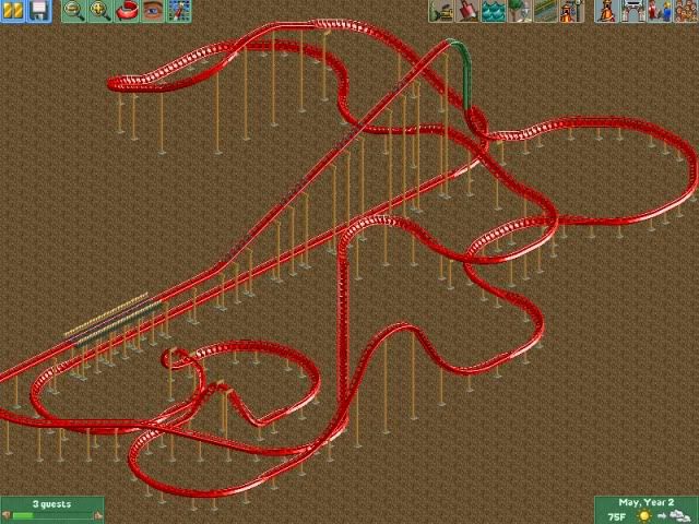
Enjoy! -

 GigaG
Offline
The turn after the launch is just over 1/4 turn - not a 180 degree turn. However, I do understand that the 2nd part of Maverick is hard to recreate in RCT (I've tried it).
 Tags
Tags
- No Tags
