(Archive) Advertising District / DEATH MATCHx6: Free For All
-
 12-July 11
-

 Luigi
Offline
Awesome. I just don't like how the fences at the bottom have exact the same color as the foliage.
 -

 Phatage
Offline
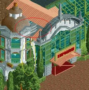
It really is innovative and tasteful at the same time, great job. So far, you've also been doing well in avoiding graphic glitches considering all the deco scenery you're using, but in this screen there is that one tree that messes things up in front (?) of the window. Probably removing the tree altogether (something shorter maybe could go there without glitching) is the best option. But the attention to detail is actually making the slow progress on this one pretty damn exciting and I can't wait to see more.
 -

inVersed Offline
Ok, Robbie, I see you bringing out the big guns after everyone hated on SFSF in the spotlight thread -

 K0NG
Offline
Gonna agree with pretty much everything Phatage said there. It's hard to envision exactly how this is turning out because of the disconnected area (red circle) and because of only seeing it from this angle, it appears as though the one tree is growing up into the building itself (yellow circle). Otherwise, I'm loving every bit of it.
BTW...nice use of the monster truck track, lol.
Oh yeah, I noticed that I took the poll lead back. But, that's probably because it's obvious that this won't get finished in time...which is funny, with my track record and all. -

 robbie92
Offline
^Haha, yes, it's quite obvious this won't be finished in time. InVersed got it spot-on about my intentions with this. Everyone saying "Do a theme," or telling me that generic realism isn't interesting, hopefully this'll get them to see what I can really do. The red circe is definitely unfinished, but'll probably be a flat roof w/ HVAC, while the tree will go. I have to rework the all-glass portion as well into something more coherent.
 -

 Timothy Cross
Offline
Just a thought Robbie, though your latest batch of screens have been extraordinary,
[ik-strawr-dn-er-ee, ek-struh-awr-]
1. beyond what is usual, ordinary, regular, or established: extraordinary costs.
Think of the content within the building. Research and create a wondrous expo inside which is fun and both educates and fascinates. [interpreted with RCT2].

(this post has been edited). :>-FantastiCause -

 Cena
Offline
Didn't knew that, but had a look at the object list, he only made 1 of them, that is no where to be found ... the two others are different (gridlines/landscape smoothing) and the last one he didn't make at all.
I couldn't find any of them before, thats why I made them myself. -

 robbie92
Offline
Sorry for posting yet another screen, but I redid the glass portion of the building and am hoping on getting some pointers from all of you.
-

 robbie92
Offline
^Cas, this is Disney. What, you didn't recognize Mickey up there on top of the piers?
 Tags
Tags
- No Tags


