(Archive) Advertising District / Carolina Bay [NCS]
-
 29-June 11
-

 TwiDragon
Offline
Hello New Element, I have a park to show you all! Now, I'm not looking for any kind of award with this park, or rank. This is just a park that I wanted to do for the hell of it :3
This is a park based on an earlier park of mine from coaster-net = http://coaster-net.c...s-carolina-bay/
I'm not sure if I want to keep it with the same name as Six Flags Carolina Bay, definitely going to get rid of six flags title.
Here are some screens, but they are poorly edited ,so excuse me for that.
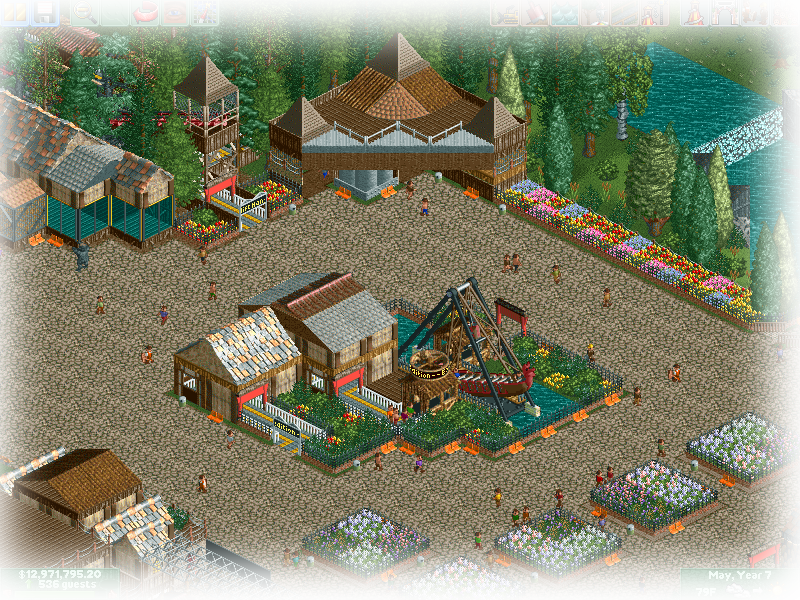
^The adventure are of the park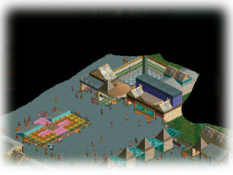
^A bit of the entrance area.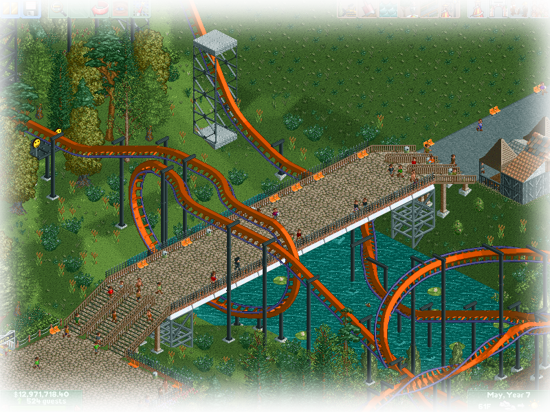
^The signature shot of the flying coaster.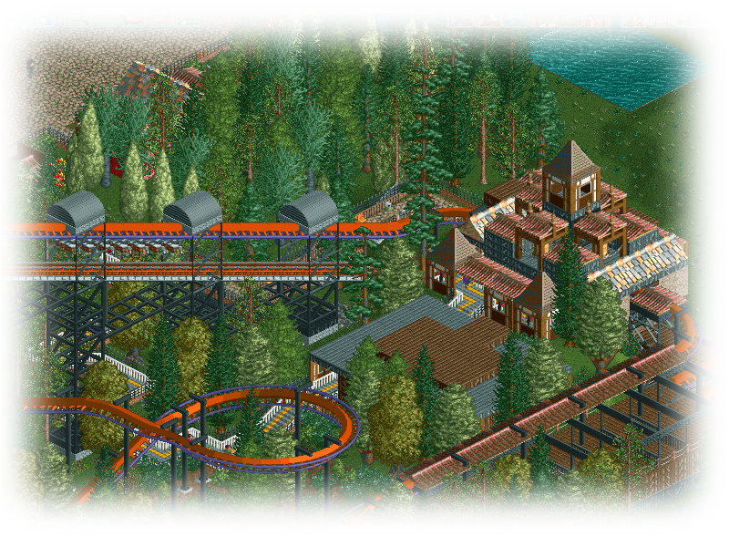
^Some of the station area
Any comments would be awesome, glad your viewed my park :3 -

 Looper
Offline
Judging by the few pictures you showed, I would say that this park looks pretty good! I dont see many mods, which is a plus to know that u did this all on your own skill!! I tell you what my friends, this is a nively done park. When i get the chance i will download this A.S.A.P!! I give it an 8/10 for now only because i can't see all of the park.
 -

 funkeymon
Offline
As I stated on themeparkreview, put different ground textures underneath your paths! But pretty good looking! (Probably better then anything I'll ever do...)
 -

 Luigi
Offline
The first screen is actually pretty good. It gives off a nice atmosphere. I hate how you did the flowers in this screen. The foliage around the pirate ship is really weak to be honest. Also, like funkeymon pointed out, you should put sand/dirt underneath your paths. Lastly I'm not really a fan of the benches you have used.
The second screen is the worst of the four you posted. The flowerbed is really awkward, especially the two roofs are really strange. The architecture in the top is a bit awkward. Watch out you don't have too much path in this area, break it up a little.
In the third screen I love the interaction between the path and the coaster, nice element. The foliage around the pond is a bit weak in my opinion. Again I'm not really a fan of the benches and put sand/dirt underneath your path.
The last screen is my favorite of the four you have posted. Nice foliage in this screen, the coaster looks nice and I really like the station. I'm not really sure on the building in front of it though. It looks too under-detailed compared to the station. -

 Cocoa
Offline
the screens are sort of pleasent, although drab and generic.
it kills me a little inside when new members show up with "ncs park" in the title... you really need to get a grasp on rct2's full potential before you can scale it back and still make everything beautiful. it just feels so lazy to come here without anything proper, saying "meh, its ncs so they will criticize less harshly". first you show us what you can do, and if you can't do anything, then you show us what level you are on and we will help you to get there. i'll respect the decision to go "ncs" when you show us you can do something with regular rct2. -

 TwiDragon
Offline
Looper - thanks
Funkeymon - Alright, I gotta. I'll fix that up.
Luigi - Foliage will always be my weak spot so I need to work on that; The second screen is the entrance area, I can fix up the buildings as the roof on the one with the purple wall are a bit odd. Benches have been placed sloppy ins some areas, but rather better in other areas. Improvement will be shown on this in the future for sure. The small building in front of the station for the Flyer; I'm actually still trying to figure out what to do with that. The line never piles up.
Cocoa - Well I kinda knew that NCS has a lot more critisum with it. I got inspired by nin and SF Houiser Station, as well as a lot of older RCT2 parks. I do have old parks posted up, and if you care to look you can see my last completed park = http://coaster-net.c...ted-adventures/ (2009), ever sense I put this park out there, I haven't really done much with the game to really show, but I have followed the community. My attempts with custom scenery go even further park to something like this = http://i40.photobuck...rkOverview2.jpg (2008).
Thanks for all the critisum and what not. I knew I'd get it here if I posted this here.The othere sites I advertise this on just say "looks good" and move on
Heres two more screens, and damn my editing sucks on the first picture, lol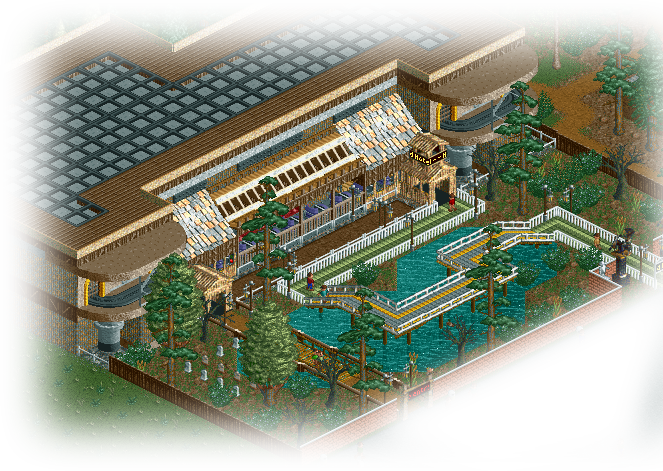
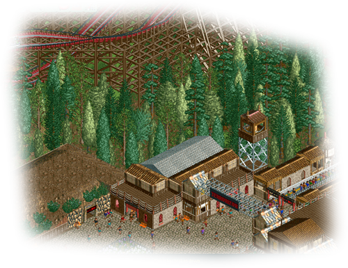
-

 Hex
Offline
That's very creative! The only thing I don't like is how the queue line changes over the water. But it's very cool!

-

 Cocoa
Offline
^seriously? its ok... no ground breaking ideas or architecture, just some very generic structures and path layouts... i mean, its ok, but not "very good"
 -

 RCTMASTA
Offline
Nice to see some faces from the other sites around here.
Just...don't do that with the pictures. Post them unmolested please.
About the park...
I can't really call this "good" or "bad", it's sort of inbetween. Also, do it the LL way with those supports; use some ZC'd twister/vertical coaster track (or maybe even flying in certain inversions) instead of the ugly thing you did with the invert there.
And also, welcome to NE!
-

 Luigi
Offline
First screen is Ok, perhaps a bit chaotic, but likable. I'm not really a fan of how the path goes above the water.
Second screen is better. I like the architecture and the foliage is good too. I'm not sure on the ''cave?'' though. -

 Jaguar
Offline
^seriously? its ok... no ground breaking ideas or architecture, just some very generic structures and path layouts... i mean, its ok, but not "very good"
Sorry for being nice. -
tdub96 Offline
^^^he's been here longer than you have, believe it or not...
I like it matt, I think its the best I've seen from you. Youre really getting much better at archy, those are some solid screens. -

 TwiDragon
Offline
Suicidecarz - thanks
Jaguarkid140 - thanks as well
Cocoa - Well I'm not really out here to make this park the perfect park or to start some new groundbreaking idea. I know this isn't seen as anything but meh' to the people who vote on the parks for NE, but its a lot better than my previous stuff.
RCTMasta - Well what should I use? Photobucket and Imageshack turned out to be unreliable, any option. Also, I never really liked the coaster track as supports for coasters. If its the box support thats bothersome, I can just use the pipes to do the same thing.
Luigi - At KD there is this adventure cave, I kinda recreated that here as its the "adventure" section
tdub - Yup, Oh yeah, much better than the last NCS park I did.
 Tags
Tags
- No Tags