(Archive) Advertising District / The Kraken
-
 28-June 11
-
 Maverix
Offline
With Steel being released today, it seemed only fitting that I start a topic about my next design.
I've always loved the Dive Machine concept and there layouts and "theme-ability" and after adding Swara to Oak Point Creek I wanted to make a bigger, badder, more unique coaster while still being realistic by today's standards. This led me to making "Kraken" a dive machine inspired by the new coaster Krake at Hiedi Park. I know you will say that I'm just copying the theme but while it will seem similar because of the name, the themes for the rides are quite different.
This design will be themed around the British Virgin Islands which I was fortunate enough to have visited over spring break and got some great inspiration. The ride itself will be themed to the sinking of the RMS Rhone, which sunk off the coast of Salt Island in 1867. The story goes that rather than being sunk by the storm that is said to have sent the ship to the bottom of the deep, a beast was the cause of the might Rhone to sink down into it's watery grave. That beast is the Kraken. And the coaster takes you back in time to that fateful night on which the Rhone sank down into the sea.
If you wish to read more about the RMS Rhone see HERE.
Lastly here are some screens of the progress.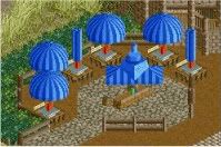
A seating area located outside of the Pirates Bite Restaurant.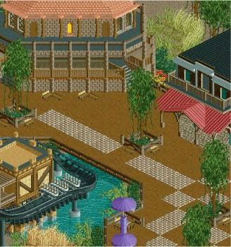
The Pirates Bite Restaurant and Salty Souvenir Shop.
Thanks for viewing. -

 Comet
Offline
Looks good
I'm really wondering what kind of layout the coaster has to make it both unique and realistic, Dive Machines seem pretty limited -

 Luigi
Offline
First screen is okay, I only think the foliage is too repetitive.
Second screen is nice. I especially like the fencing. I'm not really a fan of the path though. The benches in the top of the screen are kinda weird in my opinion. -

 Todd Lee
Offline
I think both screens look great. The foliage seems fine to me, it's ok to have areas of "clean" looking foliage of the same variety.
 -

 TwiDragon
Offline
Maybe its just me, but I don't really care for the different types of path blended together like that. Other than that everything checks out perfectly awesome.
I hope this ride isn't fully inspired by Krake, as far as I know the whole ride is the drop, inversion, and a turn to the brake run. Seems rather basic to me.
Can't wait to see the full result. -

 Maverix
Offline
Reply Time:
Thanks Comet. DM's are limited yes but I thought of that as an extra challenge when making the ride and I think it turned out great.Looks good
I'm really wondering what kind of layout the coaster has to make it both unique and realistic, Dive Machines seem pretty limited
The Foliage around area's like the seating area are supposed to be planted, thus, it is repetitive.First screen is okay, I only think the foliage is too repetitive.
Second screen is nice. I especially like the fencing. I'm not really a fan of the path though. The benches in the top of the screen are kinda weird in my opinion.
Thanks man glad you like it!I think both screens look great. The foliage seems fine to me, it's ok to have areas of "clean" looking foliage of the same variety.
Thanks!I really like the brown building in the second screen.
Thanks man! About the paths, I think that if it's all to much of the same path it overwhelms the area. This something I learned from Oak Point Creek and I'm trying to mix the paths a bit to avoid the overwhelming feeling. Don't worry, the ride does a lot more than KrakeMaybe its just me, but I don't really care for the different types of path blended together like that. Other than that everything checks out perfectly awesome.
I hope this ride isn't fully inspired by Krake, as far as I know the whole ride is the drop, inversion, and a turn to the brake run. Seems rather basic to me.
Can't wait to see the full result.
Thanks for the comments guy! I should have an update sometime this weekend! -

 Maverix
Offline
Here's the update I promised.
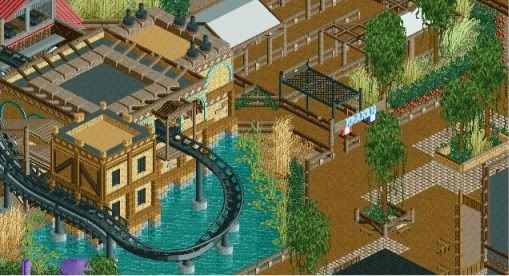
Here's the entrance area to the Kraken.
There is no escape... -

 nin
Offline
Screen 1 seems like it's just a slightly different take on your usual stuff, but better.
Screen 2 is in the right direction, just needs more work. Make the Kraken live. -

 JDP
Offline
^agree. i feel the mouth is too simple and should at least connect to the legs some how. other then that i like where this is going
-JDP -

 posix
Offline
VERY good exposure of the station curve to the main path. Also loving the colours. Great stuff.
 -

 Cocoa
Offline
I think you could make the kraken look a bit more alive and animal-looking than what it currently is. instead of rooves, put round stuff and eyes etc. your architecture is also a bit blocky... its just buildings with flat rooves on square bases. use some actuall rooves and stuff maybe, and definitely add things like balconies, chimneys, spires, watchtowers, etc. i think the arabian area of highballs disneysea is a good example of this, especially around the area for sinbad. also, the egypt area in epws is a good example.
i think most importantly however, is that you don't need to frame every window and wall. leave some blank walls!
 Tags
Tags
- No Tags
