(Archive) Advertising District / SuicideCarz' Work Room
-
 02-June 11
-

 Xeccah
Offline
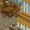
isin't this on TPR? I do not have an account there but I've felt like I had seen this exact screen before.
The building is pretty good, but I do not really like the color scheme. -
 Fizzix
Offline
I don't like the random stone walls, or the hedges. They don't make sense on a building. There is great queue interaction, so good job there. Paths don't always have to be 2 wide or 3 wide, vary it, let it flow. Same goes for 90* angles, try doing 45* or really just a curve of path instead.
 -

 Hex
Offline
Been awhile since I posted on this thread. Here's some screens from the new park I've been working on. If you have any names in mind please let me know!


-S.C.
P.S. A big thanks to tdub for getting me motivated to play again, along with Corkscrewey, RCT2day, and of course X250. -

 MCI
Offline
I dont like the Giga-Coaster :/
Everything else looks really nice.
I know I´m not the right person to tell you that, but I would try to use different kind of architecture.
This hughe building at the first picture is just the same thing over and over again. Just different colors. -

 Liampie
Offline
I'm not always the biggest fan of individual buildings, rides or other components, but I appreciate the density and I also appreciate the fact that you got balls to do some things different. For example, when you look at the first two screens you'd never expect a massive cliff with a badass giga coaster on it. The more balls the better.
 -

 Hex
Offline
Thanks for all your feedback, guys! Liam, I hope you don't mind me using that quote in my sig. If you do, let me know and I'll take it off.
I update the foliage in this area... Let me know your thoughts on the flume station, 'cause I'm thinking of changing it.
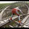
Also, here's a different angle on "Patriot" the park's wooden coaster.
-

 111112oo
Offline
Some of the interaction there on the 1st screen is a bit off, mainly with the highest section of the Log flume. If it went all the way down and did some stuff there it might look better.
EDIT: also change the glass colour on the station if you keep that design. -
![][ntamin22%s's Photo](https://www.nedesigns.com/uploads/profile/photo-thumb-221.png?_r=1520300638)
 ][ntamin22
Offline
The woodie screen is nice enough, but is actually fairly dull compared to all the cool stuff going on in your other shots. The foliage looks like it could use a little more consideration in the log flume screen, but the thing really puzzling me is the fountains. Aren't you supposed to get wet on the ride, not standing in line?
-

 Hex
Offline
I normally never use the Designer part of the game, but I was inspired. Feedback would be nice.
-S.C.
-

 Hex
Offline
Messy and unfinished screen, but I need some opinions on it before I continue. How do the supports look?
-S.C. -

 nin
Offline
I'm kinda mixed on that first drop. I like it for being different, but I don't know, at the same time it's a bit weird.
Hopefully the cobra roll is somewhat showcased, that's a pretty big build up for an inversion that's only to be surrounded by landscaping.
 Tags
Tags
- No Tags


