(Archive) Advertising District / SuicideCarz' Work Room
-
 02-June 11
-

 Hex
Offline
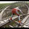
It flies through that little tiny hill right before the cobra roll, but runs smoothly through the roll itself. It looks better at the other angle, but you can't see the supports from the other side, hence why I took the screen from this side. Thanks for the feedback, nin!
 -

 Hex
Offline
Some progress on the area the last screen was from. Nin picked the name Alpen Blitz and it stuck. So here are the mountains surrounding Alpen Blitz.
-S.C. -

 RCT2day
Offline
Love that gray chimney and the roof on each building. Not crazy about the supports for the cobra roll though.
 -

 Sephiroth
Offline
Oh look, another blue and white B&(*JIOEFaoidsjanaO:j - ooops fell asleep on my keyboard there, sorry about that.
Joking aside, I really don't have much of a comment, but I do kind of agree with RCT2day. -

 Hex
Offline
Is that a good thing, Liam?
Here's a new restaurant I built. Fizzix knows a little about this new chain... Thoughts?
-S.C. -

 Xeccah
Offline
i think it is far too unclean and to messy with textures
think about where to put wood (and also the color of said wood) instead of shoving in there for variety -

 RCT2day
Offline
Try changing the colors of your glass windows to something not brown or gold. Love the screen and your latest work.
 -

RMM Offline
i think it is far too unclean and to messy with textures
think about where to put wood (and also the color of said wood) instead of shoving in there for variety
take school more seriously. -

 Hex
Offline
Me too, man!I really love this screen!
 />
/>
Thanks! Credit for the name goes to my 23 year old brother.Love the restaurant. Name included.
I thought so too, would you like me to re-make yours more similar to this?Looks even better than the one I have!
Thanks, buckeye!yeah suicide your really getting there.
I debated between the impulse coaster and the giga. Glad you like it!The giga track on the roof actually looks good. Nice work.
I'm honestly surprised because I thought this looked clean for NCSO work.i think it is far too unclean and to messy with textures
think about where to put wood (and also the color of said wood) instead of shoving in there for variety
Yeah I did gold cause I thought a more dimmed area would be neat for like a wing place similar to Smokey Bones, Texas Roadhouse, etc. Also, thanks!Try changing the colors of your glass windows to something not brown or gold. Love the screen and your latest work.
Edit: RMM, I honestly don't get what you said, but okay. I have 5 majors this year instead of my usual 4, and I am going to take school more seriously. If it was directed at Shotguns? then carry on. />
/>
-S.C.
 Tags
Tags
- No Tags


