(Archive) Advertising District / Fränkisches Abenteuerland
-
 02-May 11
-

 BelgianGuy
Offline
I believe that coaster is undersupported to say the least, the rest is good but the foliage looks too messy for my taste, it detracts from the classyness of the rest
 -

 Jonny93
Offline
@chorkiel: Do you mean what % of the screen or the park?
@BelgianGuy? How can i tidy up the foliage?
Greets Jonny93 -

 Cocoa
Offline
there's a difference between randomly placing trees and bushes to setting up a realistic and atmospheric set of trees and plants.
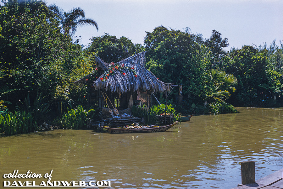
here is a good example of purposefully placed foliage that creates a thick jungle atmosphere (jungle cruise at disneyland)
and this is sort of like how you have it. it may be more like what a forest is, but it isn't really attractive aesthetically and definitely doesn't fit in a heavily themed amusement park like this. (man it was hard to find a picture of ugly foliage, nobody uploads bad pictures to google images )
)
what you're going to hear a lot of in terms of improving foliage is setting up clumps of trees. the thickest and tallest ones should be in the center of what area you are filling with foliage, with it getting sparser and smaller towards the edges, eventually ending in 1/4 tile bushes and flowers etc.
also make sure that your trees do not obstruct buildings- put trees around them in such a way that it does not cover the feautres of the building, but in fact enhances the atmosphere and mood of the building. for example, say I built a bland-ish french-style building. put some palm trees near it, and I have a colonial outpost mood (think pirates). put some evergreen trees next to it, and I have a Northern European aesthetic. of course there's a lot more to it than that, but its hard to put aesthetics into words.
hope this helped!
-

 Jonny93
Offline
Yes thanks so much for your help cocoa!
I will present a new picture in a few days.
Greets Jonny93 -

 RRP
Offline
I think the foliage is fine to be honest.It sets a good mood and is much nicer than the usual choice of cramming an area with the default jungle bush selection.
Good ground coverage and variety is what makes good jungle foliage. -

 Cocoa
Offline
I think there probably needs to be 1-2 more supporting pillars underneath the tan bridge building. Other than that, its awesome. Maybe a bit heavy on those wooden poles though?
 -

 Cena
Offline
^ Hell no. The bridge part is 6 tiles, that is about 15 to 18 meters in reality. That is easy to do with a steel supporting structure under it (in the now themed dirt) to handle the gravity forces from the structure above it. Plus, what he has now looks much cooler. There are no earthquakes in Germany, remember that.
Looks fantastic Jonny, not sure about the grey airco/air units in the top middle of the screen. Peeps will see that from a distance and it looks weird because all the other things are brown, while that is grey. Maybe make the wall around it from the building a bit higher to cover it up, or re-color it so it doesn't stand out from a peep-perspective.
Another thing I would like to adress; please remove the gridlines before you take a picture like this, it looks really ugly when you have the grass with the grid-lines on it.
On the dark brown colors, the windows are difficult to notice, maybe a small accent color could help here, but nothing extreme please.
Oh, the final thing, remove that jungle bush, in the left of the screen, just under the building that is most to the left. The bush stands there on its own, draws too much attention too it and the brown land (pillar) looks good from it self too.
... I should comment more often with good critique I think ... -

 Jonny93
Offline
Thanks for all your coments!
@cocoa: I dont agree with you. I think the supports are enough.
But I removed some wooden poles and I changed some details:
Coments are welcome!
Greets Jonny93 -

 Jonny93
Offline
Thanks for your coment Luigi!
I have a new picture from the hotel in Deep in Africa:
I hope you like it.
Greets Jonny93 -

 posix
Offline
Very high class theming. Impressive job. I suggest you don't focus too much on details though and try to perfect everything out. Else you'll never finish anything. The learning aspect in RCT comes from finishing many projects that may not be "perfect", but which will then allow you with time and hindsight to reflect upon them, which for me usually was how I learned about my shortcomings.
 -

 Luigi
Offline
Wow...awesome screen, again! The only thing I don't like is the row of tiles connected to the hotel. Too plain compared to the other foliage.
 -

 Jonny93
Offline
I worked at last at the new western area called silvercity. Silvercity has two attractions. A breakdancer called squaredancer and a vekoma mine train called colorado adventure. The western area is adjacent to the mexico area. Here are two pictures:

Comments are welcome!
Greets Jonny93 -

 chorkiel
Offline
Looking great, the themeing is done really well!
I only dislike that 2x2 building in the first screen, it seems as if it was squished between the other ones..
 Tags
Tags
- No Tags


